In today’s tutorial, we will create alert message in bootstrap 5. For this section we will create simple alert, alert message with icon, alert message with dismiss, alert message with border style. We will not use any custom css classes or any other css library. first you need to setup bootstrap 5 project. you can use cdn or read below article.
How to install & setup bootstrap 5
Bootstrap 5 Alert Message Example
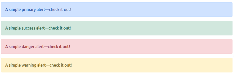
1. Bootstrap 5 simple alert message.
<!DOCTYPE html>
<html lang="en">

    <head>
        <meta charset="UTF-8" />
        <meta http-equiv="X-UA-Compatible" content="IE=edge" />
        <meta name="viewport" content="width=device-width, initial-scale=1.0" />
        <title>Bootstrap 5 Simple Alert Messages</title>
        <link href="https://cdn.jsdelivr.net/npm/[email protected]/dist/css/bootstrap.min.css" rel="stylesheet">
    </head>

    <body>
        <div class="alert alert-primary" role="alert">
            A simple primary alert—check it out!
        </div>
        <div class="alert alert-success" role="alert">
            A simple success alert—check it out!
        </div>
        <div class="alert alert-danger" role="alert">
            A simple danger alert—check it out!
        </div>
        <div class="alert alert-warning" role="alert">
            A simple warning alert—check it out!
        </div>

        <script src="https://cdn.jsdelivr.net/npm/[email protected]/dist/js/bootstrap.min.js"></script>
    </body>

</html>
bootstrap 5 alert message
2. Bootstrap 5 border style alert message.
<div class="alert alert-primary border border-2 border-start-0 border-bottom-0 border-end-0 border-primary"
  role="alert">
  A border primary alert—check it out!
</div>

bootstrap border style alert
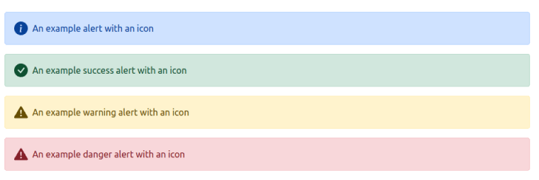
3. Bootstrap 5 alert message with icon.
<svg xmlns="http://www.w3.org/2000/svg" style="display: none;">
  <symbol id="check-circle-fill" fill="currentColor" viewBox="0 0 16 16">
    <path
      d="M16 8A8 8 0 1 1 0 8a8 8 0 0 1 16 0zm-3.97-3.03a.75.75 0 0 0-1.08.022L7.477 9.417 5.384 7.323a.75.75 0 0 0-1.06 1.06L6.97 11.03a.75.75 0 0 0 1.079-.02l3.992-4.99a.75.75 0 0 0-.01-1.05z" />
  </symbol>
  <symbol id="info-fill" fill="currentColor" viewBox="0 0 16 16">
    <path
      d="M8 16A8 8 0 1 0 8 0a8 8 0 0 0 0 16zm.93-9.412-1 4.705c-.07.34.029.533.304.533.194 0 .487-.07.686-.246l-.088.416c-.287.346-.92.598-1.465.598-.703 0-1.002-.422-.808-1.319l.738-3.468c.064-.293.006-.399-.287-.47l-.451-.081.082-.381 2.29-.287zM8 5.5a1 1 0 1 1 0-2 1 1 0 0 1 0 2z" />
  </symbol>
  <symbol id="exclamation-triangle-fill" fill="currentColor" viewBox="0 0 16 16">
    <path
      d="M8.982 1.566a1.13 1.13 0 0 0-1.96 0L.165 13.233c-.457.778.091 1.767.98 1.767h13.713c.889 0 1.438-.99.98-1.767L8.982 1.566zM8 5c.535 0 .954.462.9.995l-.35 3.507a.552.552 0 0 1-1.1 0L7.1 5.995A.905.905 0 0 1 8 5zm.002 6a1 1 0 1 1 0 2 1 1 0 0 1 0-2z" />
  </symbol>
</svg>

<div class="alert alert-primary d-flex align-items-center" role="alert">
  <svg class="bi flex-shrink-0 me-2" width="24" height="24" role="img" aria-label="Info:">
    <use xlink:href="#info-fill" />
  </svg>
  <div>
    An example alert with an icon
  </div>
</div>
<div class="alert alert-success d-flex align-items-center" role="alert">
  <svg class="bi flex-shrink-0 me-2" width="24" height="24" role="img" aria-label="Success:">
    <use xlink:href="#check-circle-fill" />
  </svg>
  <div>
    An example success alert with an icon
  </div>
</div>
<div class="alert alert-warning d-flex align-items-center" role="alert">
  <svg class="bi flex-shrink-0 me-2" width="24" height="24" role="img" aria-label="Warning:">
    <use xlink:href="#exclamation-triangle-fill" />
  </svg>
  <div>
    An example warning alert with an icon
  </div>
</div>
<div class="alert alert-danger d-flex align-items-center" role="alert">
  <svg class="bi flex-shrink-0 me-2" width="24" height="24" role="img" aria-label="Danger:">
    <use xlink:href="#exclamation-triangle-fill" />
  </svg>
  <div>
    An example danger alert with an icon
  </div>
</div>
bootstrap 5 alert message with icons
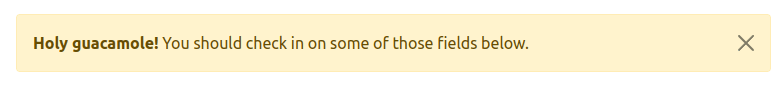
4. Bootstrap 5 dismissing alert message with cross icon.
<!DOCTYPE html>
<html lang="en">


    <head>
        <meta charset="UTF-8" />
        <meta http-equiv="X-UA-Compatible" content="IE=edge" />
        <meta name="viewport" content="width=device-width, initial-scale=1.0" />
        <title>Bootstrap 5 Dismiss Alert Messages</title>
        <link href="https://cdn.jsdelivr.net/npm/[email protected]/dist/css/bootstrap.min.css" rel="stylesheet">
    </head>


    <body>
        <div class="alert alert-warning alert-dismissible fade show" role="alert">
            <strong>Holy guacamole!</strong> You should check in on some of those fields below.
            <button type="button" class="btn-close" data-bs-dismiss="alert" aria-label="Close"></button>
        </div>
        <script src="https://cdn.jsdelivr.net/npm/[email protected]/dist/js/bootstrap.min.js"></script>
    </body>


</html>
bootstrap 5 cross icon alert message
5. Bootstrap 5 dismiss alert message with border style.
<!DOCTYPE html>
<html lang="en">

    <head>
        <meta charset="UTF-8" />
        <meta http-equiv="X-UA-Compatible" content="IE=edge" />
        <meta name="viewport" content="width=device-width, initial-scale=1.0" />
        <title>Bootstrap 5 Dismiss Alert Messages with border</title>
        <link href="https://cdn.jsdelivr.net/npm/[email protected]/dist/css/bootstrap.min.css" rel="stylesheet">
    </head>

    <body>
        <div class="alert border border-2 border-primary alert-primary alert-dismissible fade show" role="alert">
            <strong>Holy guacamole!</strong> You should check in on some of those fields below.
            <button type="button" class="btn-close" data-bs-dismiss="alert" aria-label="Close"></button>
        </div>
        <div class="alert border border-2 border-warning alert-warning alert-dismissible fade show" role="alert">
            <strong>Holy guacamole!</strong> You should check in on some of those fields below.
            <button type="button" class="btn-close" data-bs-dismiss="alert" aria-label="Close"></button>
        </div>
        <div class="alert border border-2 border-success alert-success alert-dismissible fade show" role="alert">
            <strong>Holy guacamole!</strong> You should check in on some of those fields below.
            <button type="button" class="btn-close" data-bs-dismiss="alert" aria-label="Close"></button>
        </div>

        <script src="https://cdn.jsdelivr.net/npm/[email protected]/dist/js/bootstrap.min.js"></script>
    </body>

</html>
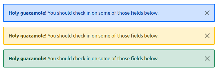
bootstrap 5 border style cross icon alert message