In today’s tutorial, we will see how to use FAQ's Accordion component in bootstrap 5. For this section we will see simple FAQ, bootstrap 5 accordion border style, FAQ's question and answer open. First you need to setup bootstrap 5 project. you can use cdn or read below article.
How to install & setup bootstrap 5
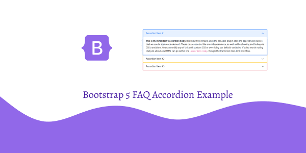
Bootstrap 5 FAQ Accordion Example
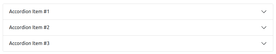
1. Bootstrap 5 simple FAQ (accordin). Click the accordions below to expand/collapse the accordion content.
<!DOCTYPE html>
<html lang="en">

  <head>
    <meta charset="UTF-8" />
    <meta http-equiv="X-UA-Compatible" content="IE=edge" />
    <meta name="viewport" content="width=device-width, initial-scale=1.0" />
    <title>Bootstrap 5 Simple FAQ</title>
    <link href="https://cdn.jsdelivr.net/npm/[email protected]/dist/css/bootstrap.min.css" rel="stylesheet">
  </head>

  <body>
    <div class="accordion" id="accordionExample">
      <div class="accordion-item">
        <h2 class="accordion-header" id="headingOne">
          <button class="accordion-button" type="button" data-bs-toggle="collapse" data-bs-target="#collapseOne"
            aria-expanded="true" aria-controls="collapseOne">
            Accordion Item #1
          </button>
        </h2>
        <div id="collapseOne" class="accordion-collapse collapse show" aria-labelledby="headingOne"
          data-bs-parent="#accordionExample">
          <div class="accordion-body">
            <strong>This is the first item's accordion body.</strong> It is shown by default, until the collapse plugin
            adds the appropriate classes that we use to style each element. These classes control the overall
            appearance, as well as the showing and hiding via CSS transitions. You can modify any of this with custom
            CSS or overriding our default variables. It's also worth noting that just about any HTML can go within the
            <code>.accordion-body</code>, though the transition does limit overflow.
          </div>
        </div>
      </div>
      <div class="accordion-item">
        <h2 class="accordion-header" id="headingTwo">
          <button class="accordion-button collapsed" type="button" data-bs-toggle="collapse"
            data-bs-target="#collapseTwo" aria-expanded="false" aria-controls="collapseTwo">
            Accordion Item #2
          </button>
        </h2>
        <div id="collapseTwo" class="accordion-collapse collapse" aria-labelledby="headingTwo"
          data-bs-parent="#accordionExample">
          <div class="accordion-body">
            <strong>This is the second item's accordion body.</strong> It is hidden by default, until the collapse
            plugin adds the appropriate classes that we use to style each element. These classes control the overall
            appearance, as well as the showing and hiding via CSS transitions. You can modify any of this with custom
            CSS or overriding our default variables. It's also worth noting that just about any HTML can go within the
            <code>.accordion-body</code>, though the transition does limit overflow.
          </div>
        </div>
      </div>
      <div class="accordion-item">
        <h2 class="accordion-header" id="headingThree">
          <button class="accordion-button collapsed" type="button" data-bs-toggle="collapse"
            data-bs-target="#collapseThree" aria-expanded="false" aria-controls="collapseThree">
            Accordion Item #3
          </button>
        </h2>
        <div id="collapseThree" class="accordion-collapse collapse" aria-labelledby="headingThree"
          data-bs-parent="#accordionExample">
          <div class="accordion-body">
            <strong>This is the third item's accordion body.</strong> It is hidden by default, until the collapse plugin
            adds the appropriate classes that we use to style each element. These classes control the overall
            appearance, as well as the showing and hiding via CSS transitions. You can modify any of this with custom
            CSS or overriding our default variables. It's also worth noting that just about any HTML can go within the
            <code>.accordion-body</code>, though the transition does limit overflow.
          </div>
        </div>
      </div>
    </div>
    <script src="https://cdn.jsdelivr.net/npm/[email protected]/dist/js/bootstrap.min.js"></script>

  </body>

</html>
bootstrap 5 faq
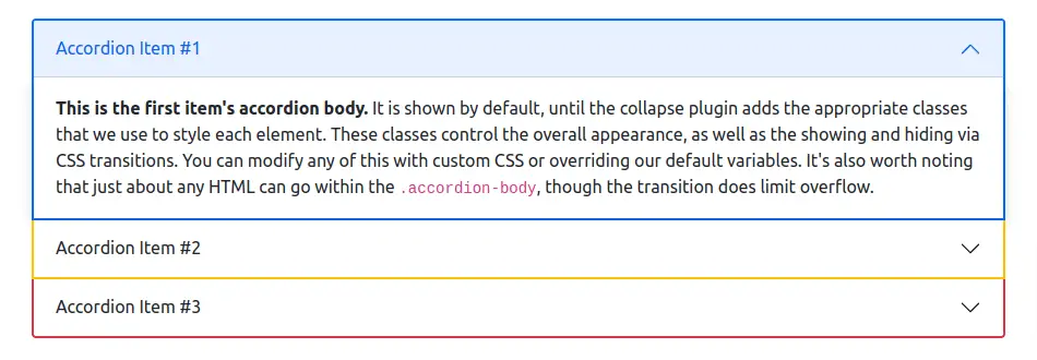
2. Bootstrap 5 FAQ (Accordion) with border style.
<div class="accordion" id="accordionExample">
  <div class="accordion-item border border-2 border-primary">
    <h2 class="accordion-header" id="headingOne">
      <button class="accordion-button" type="button" data-bs-toggle="collapse" data-bs-target="#collapseOne"
        aria-expanded="true" aria-controls="collapseOne">
        Accordion Item #1
      </button>
    </h2>
    <div id="collapseOne" class="accordion-collapse collapse show" aria-labelledby="headingOne"
      data-bs-parent="#accordionExample">
      <div class="accordion-body shadow">
        <strong>This is the first item's accordion body.</strong> It is shown by default, until the collapse plugin
        adds the appropriate classes that we use to style each element. These classes control the overall
        appearance, as well as the showing and hiding via CSS transitions. You can modify any of this with custom
        CSS or overriding our default variables. It's also worth noting that just about any HTML can go within the
        <code>.accordion-body</code>, though the transition does limit overflow.
      </div>
    </div>
  </div>
  <div class="accordion-item border border-2 border-top-0 border-warning">
    <h2 class="accordion-header" id="headingTwo">
      <button class="accordion-button collapsed" type="button" data-bs-toggle="collapse" data-bs-target="#collapseTwo"
        aria-expanded="false" aria-controls="collapseTwo">
        Accordion Item #2
      </button>
    </h2>
    <div id="collapseTwo" class="accordion-collapse collapse" aria-labelledby="headingTwo"
      data-bs-parent="#accordionExample">
      <div class="accordion-body shadow">
        <strong>This is the second item's accordion body.</strong> It is hidden by default, until the collapse
        plugin adds the appropriate classes that we use to style each element. These classes control the overall
        appearance, as well as the showing and hiding via CSS transitions. You can modify any of this with custom
        CSS or overriding our default variables. It's also worth noting that just about any HTML can go within the
        <code>.accordion-body</code>, though the transition does limit overflow.
      </div>
    </div>
  </div>
  <div class="accordion-item border border-2 border-top-0 border-danger">
    <h2 class="accordion-header" id="headingThree">
      <button class="accordion-button collapsed" type="button" data-bs-toggle="collapse" data-bs-target="#collapseThree"
        aria-expanded="false" aria-controls="collapseThree">
        Accordion Item #3
      </button>
    </h2>
    <div id="collapseThree" class="accordion-collapse collapse" aria-labelledby="headingThree"
      data-bs-parent="#accordionExample">
      <div class="accordion-body shadow">
        <strong>This is the third item's accordion body.</strong> It is hidden by default, until the collapse plugin
        adds the appropriate classes that we use to style each element. These classes control the overall
        appearance, as well as the showing and hiding via CSS transitions. You can modify any of this with custom
        CSS or overriding our default variables. It's also worth noting that just about any HTML can go within the
        <code>.accordion-body</code>, though the transition does limit overflow.
      </div>
    </div>
  </div>
</div>
bootstrap 5 faq border style
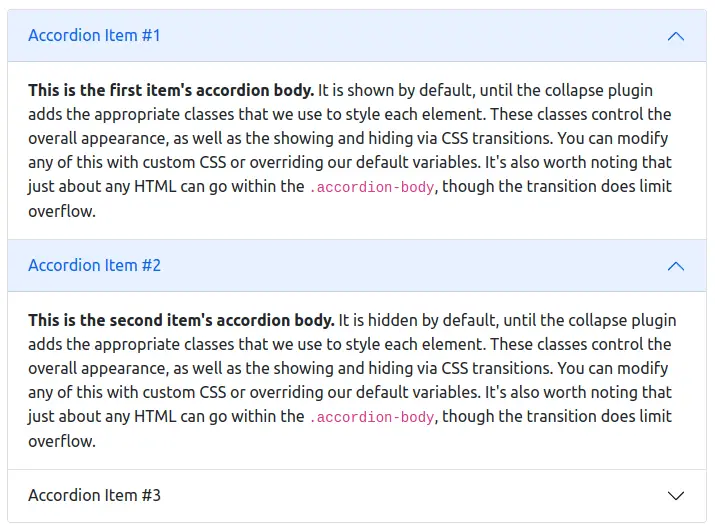
3. Bootstrap 5 Always open FAQ (Accordion). Omit the data-bs-parent attribute on each .accordion-collapse to make accordion items stay open when another item is opened.
<div class="accordion" id="accordionPanelsStayOpenExample">
  <div class="accordion-item">
    <h2 class="accordion-header" id="panelsStayOpen-headingOne">
      <button class="accordion-button" type="button" data-bs-toggle="collapse"
        data-bs-target="#panelsStayOpen-collapseOne" aria-expanded="true" aria-controls="panelsStayOpen-collapseOne">
        Accordion Item #1
      </button>
    </h2>
    <div id="panelsStayOpen-collapseOne" class="accordion-collapse collapse show"
      aria-labelledby="panelsStayOpen-headingOne">
      <div class="accordion-body">
        <strong>This is the first item's accordion body.</strong> It is shown by default, until the collapse plugin adds
        the appropriate classes that we use to style each element. These classes control the overall appearance, as well
        as the showing and hiding via CSS transitions. You can modify any of this with custom CSS or overriding our
        default variables. It's also worth noting that just about any HTML can go within the
        <code>.accordion-body</code>, though the transition does limit overflow.
      </div>
    </div>
  </div>
  <div class="accordion-item">
    <h2 class="accordion-header" id="panelsStayOpen-headingTwo">
      <button class="accordion-button collapsed" type="button" data-bs-toggle="collapse"
        data-bs-target="#panelsStayOpen-collapseTwo" aria-expanded="false" aria-controls="panelsStayOpen-collapseTwo">
        Accordion Item #2
      </button>
    </h2>
    <div id="panelsStayOpen-collapseTwo" class="accordion-collapse collapse"
      aria-labelledby="panelsStayOpen-headingTwo">
      <div class="accordion-body">
        <strong>This is the second item's accordion body.</strong> It is hidden by default, until the collapse plugin
        adds the appropriate classes that we use to style each element. These classes control the overall appearance, as
        well as the showing and hiding via CSS transitions. You can modify any of this with custom CSS or overriding our
        default variables. It's also worth noting that just about any HTML can go within the
        <code>.accordion-body</code>, though the transition does limit overflow.
      </div>
    </div>
  </div>
  <div class="accordion-item">
    <h2 class="accordion-header" id="panelsStayOpen-headingThree">
      <button class="accordion-button collapsed" type="button" data-bs-toggle="collapse"
        data-bs-target="#panelsStayOpen-collapseThree" aria-expanded="false"
        aria-controls="panelsStayOpen-collapseThree">
        Accordion Item #3
      </button>
    </h2>
    <div id="panelsStayOpen-collapseThree" class="accordion-collapse collapse"
      aria-labelledby="panelsStayOpen-headingThree">
      <div class="accordion-body">
        <strong>This is the third item's accordion body.</strong> It is hidden by default, until the collapse plugin
        adds the appropriate classes that we use to style each element. These classes control the overall appearance, as
        well as the showing and hiding via CSS transitions. You can modify any of this with custom CSS or overriding our
        default variables. It's also worth noting that just about any HTML can go within the
        <code>.accordion-body</code>, though the transition does limit overflow.
      </div>
    </div>
  </div>
</div>
bootstrap 5 always open accordion faq section