In today’s tutorial, we will see how to use shadow classes in bootstrap 5. For this section we will use shadow button, bootstrap card with shadow we will not use any custom css classes or any other css library. first you need to setup bootstrap 5 project. you can use cdn or read below article.
How to install & setup bootstrap 5
Bootstrap 5 Shadow Example
1. Bootstrap 5 small, regular and large shadow example.
<div class="shadow-none p-3 mb-5 bg-light rounded">No shadow</div>
<div class="shadow-sm p-3 mb-5 bg-body rounded">Small shadow</div>
<div class="shadow p-3 mb-5 bg-body rounded">Regular shadow</div>
<div class="shadow-lg p-3 mb-5 bg-body rounded">Larger shadow</div>
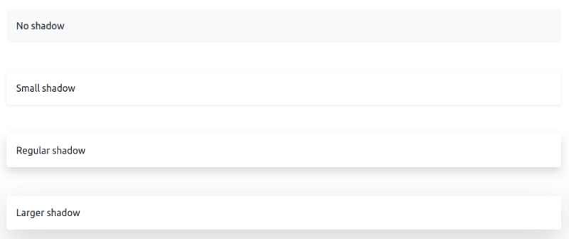
bootstrap 5 shadow style
2. Bootstrap 5 shadow button.
<button type="button" class="btn btn-primary shadow">Primary</button>
<button type="button" class="btn btn-secondary shadow-lg">Secondary</button>
<button type="button" class="btn btn-success shadow-sm">Success</button>
<button type="button" class="btn btn-danger shadow-lg">Danger</button>

bootstrap 5 shadow style button
3. Bootstrap 5 shadow card.
<div class="card shadow" style="width: 18rem;">
    <div class="card-body">
        <h5 class="card-title">Card width Shadow</h5>
        <p class="card-text">Some quick example text to build on the card title and make up the bulk of the card's
            content.</p>
        <a href="#" class="btn btn-primary">Go somewhere</a>
    </div>
</div>

bootstrap 5 card with shadow