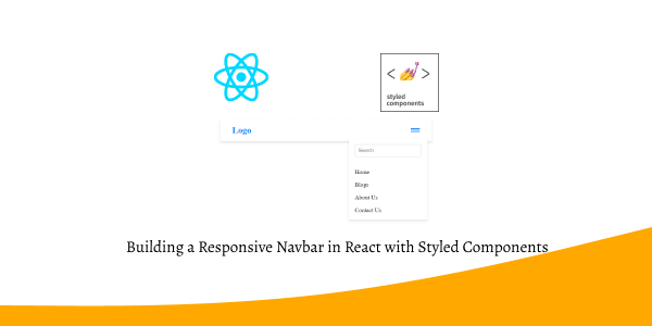
In this section, we'll create a responsive navbar in a React app using Styled Components. We'll also add a hamburger menu icon and a search bar. To get started, ensure you have Styled Components set up in your React app.
Install & Setup Styled Components + React + Typescript + Vite
1. We will create a responsive navbar in React using styled-components and usestate hook, which displays a full menu on desktop and a toggleable dropdown menu on mobile devices, complete with a logo and a 'Get Started' button.
import { useState } from "react";
import styled from "styled-components";

const Navbar = styled.div`
  display: flex;
  justify-content: space-between;
  align-items: center;
  padding: 1rem 2rem;
  background-color: #ffffff;
  box-shadow: 0 4px 6px rgba(0, 0, 0, 0.1);
`;

const Logo = styled.div`
  display: flex;
  align-items: center;
  font-size: 1.5rem;
  font-weight: bold;
  color: #007bff;
`;

const Menu = styled.div`
  display: flex;
  gap: 1.5rem;

  @media (max-width: 768px) {
    display: none;
  }
`;

const MobileMenu = styled.div`
  display: none;
  flex-direction: column;
  gap: 1rem;
  position: absolute;
  top: 60px;
  right: 20px;
  background-color: #ffffff;
  box-shadow: 0 4px 6px rgba(0, 0, 0, 0.1);
  padding: 1rem;

  div {
    cursor: pointer;
  }

  @media (max-width: 768px) {
    display: ${(props) => (props.open ? "flex" : "none")};
  }
`;

const Hamburger = styled.div`
  display: none;
  flex-direction: column;
  gap: 4px;
  cursor: pointer;

  div {
    width: 25px;
    height: 3px;
    background-color: #007bff;
  }

  @media (max-width: 768px) {
    display: flex;
  }
`;

const Button = styled.button`
  background-color: #007bff;
  color: #ffffff;
  padding: 0.5rem 1rem;
  border: none;
  border-radius: 4px;
  cursor: pointer;
`;

const App = () => {
  const [menuOpen, setMenuOpen] = useState(false);

  return (
    <Navbar>
      <Logo>Logo</Logo>
      <Menu>
        <div>Home</div>
        <div>Careers</div>
        <div>Blog</div>
        <div>About Us</div>
      </Menu>
      <Hamburger onClick={() => setMenuOpen(!menuOpen)}>
        <div></div>
        <div></div>
        <div></div>
      </Hamburger>
      <MobileMenu open={menuOpen}>
        <div onClick={() => setMenuOpen(false)}>Home</div>
        <div onClick={() => setMenuOpen(false)}>Careers</div>
        <div onClick={() => setMenuOpen(false)}>Blog</div>
        <div onClick={() => setMenuOpen(false)}>About Us</div>
      </MobileMenu>
      <Button>Get Started</Button>
    </Navbar>
  );
};

export default App;

react styled components navbar
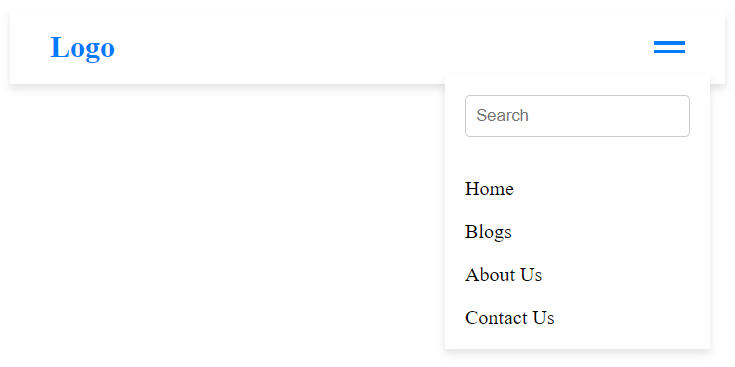
2. Building a responsive navigation with a hamburger menu and a search bar using React and Styled Components.
import { useState } from "react";
import styled from "styled-components";

const Navbar = styled.div`
  display: flex;
  justify-content: space-between;
  align-items: center;
  padding: 1rem 2rem;
  background-color: #ffffff;
  box-shadow: 0 4px 6px rgba(0, 0, 0, 0.1);
`;

const Logo = styled.div`
  display: flex;
  align-items: center;
  font-size: 1.5rem;
  font-weight: bold;
  color: #007bff;
`;

const Menu = styled.div`
  display: flex;
  align-items: center;
  gap: 1.5rem;

  @media (max-width: 768px) {
    div:not(:nth-last-child(-n + 2)) {
      display: none;
    }
  }
`;

const SearchBar = styled.input`
  padding: 0.5rem;
  border-radius: 4px;
  border: 1px solid #ccc;
  flex-grow: 1;

  @media (max-width: 768px) {
    display: none;
  }
`;

const Hamburger = styled.div`
  display: none;
  cursor: pointer;

  div {
    width: 25px;
    height: 3px;
    background-color: #007bff;
    margin-bottom: 4px;
    &:last-child {
      margin-bottom: 0;
    }
  }

  @media (max-width: 768px) {
    display: block;
  }
`;

const MobileMenu = styled.div`
  display: none;
  flex-direction: column;
  gap: 1rem;
  position: absolute;
  top: 60px;
  right: 20px;
  background-color: #ffffff;
  box-shadow: 0 4px 6px rgba(0, 0, 0, 0.1);
  padding: 1rem;

  @media (max-width: 768px) {
    display: ${(props) => (props.open ? "flex" : "none")};
  }
`;

const MobileSearchBar = styled(SearchBar)`
  display: block;
  margin-bottom: 1rem;
`;

const App = () => {
  const [menuOpen, setMenuOpen] = useState(false);

  return (
    <Navbar>
      <Logo>Logo</Logo>
      <Menu>
        <div>Home</div>
        <div>Blogs</div>
        <div>About Us</div>
        <div>Contact Us</div>
        <SearchBar type="text" placeholder="Search" />
        <Hamburger onClick={() => setMenuOpen(!menuOpen)}>
          <div></div>
          <div></div>
          <div></div>
        </Hamburger>
      </Menu>
      <MobileMenu open={menuOpen}>
        <MobileSearchBar type="text" placeholder="Search" />
        <div onClick={() => setMenuOpen(false)}>Home</div>
        <div onClick={() => setMenuOpen(false)}>Blogs</div>
        <div onClick={() => setMenuOpen(false)}>About Us</div>
        <div onClick={() => setMenuOpen(false)}>Contact Us</div>
      </MobileMenu>
    </Navbar>
  );
};

export default App;
react styled components hamburger menu