In this tutorial, we will create dark mode in react with material ui (mui 5). We will see mui 5 dark mode toggle button example with react material UI 5.
Install & Setup Vite + React + Typescript + MUI 5
React Material UI 5 Dark Mode Example
1. Create react mui 5 simple by default dark mode.
import { ThemeProvider, createTheme } from "@mui/material/styles";
import CssBaseline from "@mui/material/CssBaseline";
import { Container, Typography } from "@mui/material";

const darkTheme = createTheme({
  palette: {
    mode: "dark",
  },
});

export default function App() {
  return (
    <ThemeProvider theme={darkTheme}>
      <CssBaseline />
      <Container maxWidth="md" sx={{ mt: 8 }}>
        <Typography variant="h3" gutterBottom>
          React Mui 5 Dark Mode
        </Typography>
        <Typography variant="body1" gutterBottom>
          This app is using the dark mode
        </Typography>
      </Container>
    </ThemeProvider>
  );
}
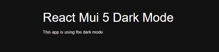
react mui 5 dark mode
2. react mui 5 dark mode toggle button with light mode, dark mode.
import * as React from 'react';
import IconButton from '@mui/material/IconButton';
import Box from '@mui/material/Box';
import { useTheme, ThemeProvider, createTheme } from '@mui/material/styles';
import Brightness4Icon from '@mui/icons-material/Brightness4';
import Brightness7Icon from '@mui/icons-material/Brightness7';

const ColorModeContext = React.createContext({ toggleColorMode: () => {} });

function MyApp() {
  const theme = useTheme();
  const colorMode = React.useContext(ColorModeContext);
  return (
    <Box
      sx={{
        display: 'flex',
        width: '100%',
        alignItems: 'center',
        justifyContent: 'center',
        bgcolor: 'background.default',
        color: 'text.primary',
        borderRadius: 1,
        p: 3,
      }}
    >
      {theme.palette.mode} mode
      <IconButton sx={{ ml: 1 }} onClick={colorMode.toggleColorMode} color="inherit">
        {theme.palette.mode === 'dark' ? <Brightness7Icon /> : <Brightness4Icon />}
      </IconButton>
    </Box>
  );
}

export default function ToggleColorMode() {
  const [mode, setMode] = React.useState<'light' | 'dark'>('light');
  const colorMode = React.useMemo(
    () => ({
      toggleColorMode: () => {
        setMode((prevMode) => (prevMode === 'light' ? 'dark' : 'light'));
      },
    }),
    [],
  );

  const theme = React.useMemo(
    () =>
      createTheme({
        palette: {
          mode,
        },
      }),
    [mode],
  );

  return (
    <ColorModeContext.Provider value={colorMode}>
      <ThemeProvider theme={theme}>
        <MyApp />
      </ThemeProvider>
    </ColorModeContext.Provider>
  );
}

react mui 5 light mode

react mui 5 dark mode toggle
Related Posts
create a chat ui in react with mui 5
create a blog section in react mui 5
create a footer in react mui 5
create a responsive navbar in react with mui 5
react mui 5 search bar example
react mui 5 login page example
react mui 5 image list example
react mui 5 toggle switch example
react mui 5 registration form example
react mui 5 contact us page example
react mui 5 loading skeleton example
react mui 5 gradient button example
react mui 5 social media icons example
react mui 5 snackbar toast notification example
how to use autocomplete react mui 5
dynamically multiple input fields in react mui 5
how to use dropdown menu in react mui 5
how to use background image in react mui 5
how to use pricing table in react mui 5
how to use file upload in react mui 5
how to use sticky navbar in react mui 5
how to use box shadow in react mui 5
how to use multi step form in react mui 5
how to use loading button in react mui 5