In this tutorial, we will create dropdown menu in react with material ui (mui 5). We will see mui 5 dropdown menu items, dropdown menu with icon example with react material UI 5.
Install & Setup Vite + React + Typescript + MUI 5
React Material UI 5 Dropdown Menu Example
1. Create react mui 5 simple dropdown menu using react-mui Menu, MenuItem component.
import * as React from 'react';
import Button from '@mui/material/Button';
import Menu from '@mui/material/Menu';
import MenuItem from '@mui/material/MenuItem';

export default function BasicMenu() {
  const [anchorEl, setAnchorEl] = React.useState<null | HTMLElement>(null);
  const open = Boolean(anchorEl);
  const handleClick = (event: React.MouseEvent<HTMLButtonElement>) => {
    setAnchorEl(event.currentTarget);
  };
  const handleClose = () => {
    setAnchorEl(null);
  };

  return (
    <div>
      <Button
        id="basic-button"
        aria-controls={open ? 'basic-menu' : undefined}
        aria-haspopup="true"
        aria-expanded={open ? 'true' : undefined}
        onClick={handleClick}
      >
        Dashboard
      </Button>
      <Menu
        id="basic-menu"
        anchorEl={anchorEl}
        open={open}
        onClose={handleClose}
        MenuListProps={{
          'aria-labelledby': 'basic-button',
        }}
      >
        <MenuItem onClick={handleClose}>Profile</MenuItem>
        <MenuItem onClick={handleClose}>My account</MenuItem>
        <MenuItem onClick={handleClose}>Logout</MenuItem>
      </Menu>
    </div>
  );
}

react mui 5 dropdown menu
2. react mui 5 dropdown selected menu using usestate hook.
import * as React from 'react';
import List from '@mui/material/List';
import ListItem from '@mui/material/ListItem';
import ListItemText from '@mui/material/ListItemText';
import MenuItem from '@mui/material/MenuItem';
import Menu from '@mui/material/Menu';

const options = [
  'Show some love to MUI',
  'Show all notification content',
  'Hide sensitive notification content',
  'Hide all notification content',
];

export default function SimpleListMenu() {
  const [anchorEl, setAnchorEl] = React.useState<null | HTMLElement>(null);
  const [selectedIndex, setSelectedIndex] = React.useState(1);
  const open = Boolean(anchorEl);
  const handleClickListItem = (event: React.MouseEvent<HTMLElement>) => {
    setAnchorEl(event.currentTarget);
  };

  const handleMenuItemClick = (
    event: React.MouseEvent<HTMLElement>,
    index: number,
  ) => {
    setSelectedIndex(index);
    setAnchorEl(null);
  };

  const handleClose = () => {
    setAnchorEl(null);
  };

  return (
    <div>
      <List
        component="nav"
        aria-label="Device settings"
        sx={{ bgcolor: 'background.paper' }}
      >
        <ListItem
          button
          id="lock-button"
          aria-haspopup="listbox"
          aria-controls="lock-menu"
          aria-label="when device is locked"
          aria-expanded={open ? 'true' : undefined}
          onClick={handleClickListItem}
        >
          <ListItemText
            primary="When device is locked"
            secondary={options[selectedIndex]}
          />
        </ListItem>
      </List>
      <Menu
        id="lock-menu"
        anchorEl={anchorEl}
        open={open}
        onClose={handleClose}
        MenuListProps={{
          'aria-labelledby': 'lock-button',
          role: 'listbox',
        }}
      >
        {options.map((option, index) => (
          <MenuItem
            key={option}
            disabled={index === 0}
            selected={index === selectedIndex}
            onClick={(event) => handleMenuItemClick(event, index)}
          >
            {option}
          </MenuItem>
        ))}
      </Menu>
    </div>
  );
}
To use material ui icons you need to install @mui/icons-material.
Install the package in your project directory with:
# with npm
npm install @mui/icons-material

# with yarn
yarn add @mui/icons-material
3. react mui 5 account dropdown menu with icon.
import * as React from "react";
import Avatar from "@mui/material/Avatar";
import Menu from "@mui/material/Menu";
import MenuItem from "@mui/material/MenuItem";
import ListItemIcon from "@mui/material/ListItemIcon";
import Divider from "@mui/material/Divider";
import IconButton from "@mui/material/IconButton";
import Typography from "@mui/material/Typography";
import Tooltip from "@mui/material/Tooltip";
import PersonAdd from "@mui/icons-material/PersonAdd";
import Settings from "@mui/icons-material/Settings";
import Logout from "@mui/icons-material/Logout";
import { Box, Container } from "@mui/material";

export default function AccountMenu() {
  const [anchorEl, setAnchorEl] = React.useState<null | HTMLElement>(null);
  const open = Boolean(anchorEl);
  const handleClick = (event: React.MouseEvent<HTMLElement>) => {
    setAnchorEl(event.currentTarget);
  };
  const handleClose = () => {
    setAnchorEl(null);
  };
  return (
    <>
      <Container maxWidth="md" sx={{ mt: 20 }}>
        <Box
          sx={{ display: "flex", alignItems: "center", textAlign: "center" }}
        >
          <Typography sx={{ minWidth: 100 }}>Contact</Typography>
          <Typography sx={{ minWidth: 100 }}>Profile</Typography>
          <Tooltip title="Account settings">
            <IconButton
              onClick={handleClick}
              size="small"
              sx={{ ml: 2 }}
              aria-controls={open ? "account-menu" : undefined}
              aria-haspopup="true"
              aria-expanded={open ? "true" : undefined}
            >
              <Avatar sx={{ width: 32, height: 32 }}>M</Avatar>
            </IconButton>
          </Tooltip>
        </Box>
        <Menu
          anchorEl={anchorEl}
          id="account-menu"
          open={open}
          onClose={handleClose}
          onClick={handleClose}
          PaperProps={{
            elevation: 0,
            sx: {
              overflow: "visible",
              filter: "drop-shadow(0px 2px 8px rgba(0,0,0,0.32))",
              mt: 1.5,
              "& .MuiAvatar-root": {
                width: 32,
                height: 32,
                ml: -0.5,
                mr: 1,
              },
              "&:before": {
                content: '""',
                display: "block",
                position: "absolute",
                top: 0,
                right: 14,
                width: 10,
                height: 10,
                bgcolor: "background.paper",
                transform: "translateY(-50%) rotate(45deg)",
                zIndex: 0,
              },
            },
          }}
          transformOrigin={{ horizontal: "right", vertical: "top" }}
          anchorOrigin={{ horizontal: "right", vertical: "bottom" }}
        >
          <MenuItem onClick={handleClose}>
            <Avatar /> Profile
          </MenuItem>
          <MenuItem onClick={handleClose}>
            <Avatar /> My account
          </MenuItem>
          <Divider />
          <MenuItem onClick={handleClose}>
            <ListItemIcon>
              <PersonAdd fontSize="small" />
            </ListItemIcon>
            Add another account
          </MenuItem>
          <MenuItem onClick={handleClose}>
            <ListItemIcon>
              <Settings fontSize="small" />
            </ListItemIcon>
            Settings
          </MenuItem>
          <MenuItem onClick={handleClose}>
            <ListItemIcon>
              <Logout fontSize="small" />
            </ListItemIcon>
            Logout
          </MenuItem>
        </Menu>
      </Container>
    </>
  );
}
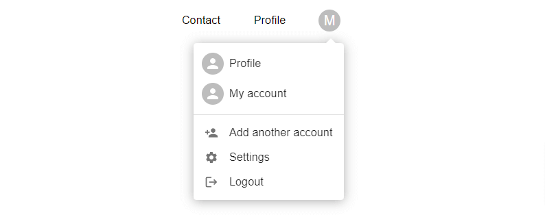
react mui 5 dropdown menu with icon
4. react mui 5 customization dropdown menu with icon.
import * as React from "react";
import { styled, alpha } from "@mui/material/styles";
import Button from "@mui/material/Button";
import Menu, { MenuProps } from "@mui/material/Menu";
import MenuItem from "@mui/material/MenuItem";
import EditIcon from "@mui/icons-material/Edit";
import Divider from "@mui/material/Divider";
import ArchiveIcon from "@mui/icons-material/Archive";
import FileCopyIcon from "@mui/icons-material/FileCopy";
import MoreHorizIcon from "@mui/icons-material/MoreHoriz";
import KeyboardArrowDownIcon from "@mui/icons-material/KeyboardArrowDown";
import { Container } from "@mui/material";

const StyledMenu = styled((props: MenuProps) => (
  <Menu
    elevation={0}
    anchorOrigin={{
      vertical: "bottom",
      horizontal: "right",
    }}
    transformOrigin={{
      vertical: "top",
      horizontal: "right",
    }}
    {...props}
  />
))(({ theme }) => ({
  "& .MuiPaper-root": {
    borderRadius: 6,
    marginTop: theme.spacing(1),
    minWidth: 180,
    color:
      theme.palette.mode === "light"
        ? "rgb(55, 65, 81)"
        : theme.palette.grey[300],
    boxShadow:
      "rgb(255, 255, 255) 0px 0px 0px 0px, rgba(0, 0, 0, 0.05) 0px 0px 0px 1px, rgba(0, 0, 0, 0.1) 0px 10px 15px -3px, rgba(0, 0, 0, 0.05) 0px 4px 6px -2px",
    "& .MuiMenu-list": {
      padding: "4px 0",
    },
    "& .MuiMenuItem-root": {
      "& .MuiSvgIcon-root": {
        fontSize: 18,
        color: theme.palette.text.secondary,
        marginRight: theme.spacing(1.5),
      },
      "&:active": {
        backgroundColor: alpha(
          theme.palette.primary.main,
          theme.palette.action.selectedOpacity
        ),
      },
    },
  },
}));

export default function CustomizedMenus() {
  const [anchorEl, setAnchorEl] = React.useState<null | HTMLElement>(null);
  const open = Boolean(anchorEl);
  const handleClick = (event: React.MouseEvent<HTMLElement>) => {
    setAnchorEl(event.currentTarget);
  };
  const handleClose = () => {
    setAnchorEl(null);
  };

  return (
    <Container maxWidth="md" sx={{ mt: 20 }}>
      <Button
        id="demo-customized-button"
        aria-controls={open ? "demo-customized-menu" : undefined}
        aria-haspopup="true"
        aria-expanded={open ? "true" : undefined}
        variant="contained"
        disableElevation
        onClick={handleClick}
        endIcon={<KeyboardArrowDownIcon />}
      >
        Options
      </Button>
      <StyledMenu
        id="demo-customized-menu"
        MenuListProps={{
          "aria-labelledby": "demo-customized-button",
        }}
        anchorEl={anchorEl}
        open={open}
        onClose={handleClose}
      >
        <MenuItem onClick={handleClose} disableRipple>
          <EditIcon />
          Edit
        </MenuItem>
        <MenuItem onClick={handleClose} disableRipple>
          <FileCopyIcon />
          Duplicate
        </MenuItem>
        <Divider sx={{ my: 0.5 }} />
        <MenuItem onClick={handleClose} disableRipple>
          <ArchiveIcon />
          Archive
        </MenuItem>
        <MenuItem onClick={handleClose} disableRipple>
          <MoreHorizIcon />
          More
        </MenuItem>
      </StyledMenu>
    </Container>
  );
}

react mui 5 customization dropdown menu
5. react mui 5 long dropdown menu with icon.
import * as React from "react";
import IconButton from "@mui/material/IconButton";
import Menu from "@mui/material/Menu";
import MenuItem from "@mui/material/MenuItem";
import MoreVertIcon from "@mui/icons-material/MoreVert";
import { Container } from "@mui/material";

const options = [
  "None",
  "Atria",
  "Callisto",
  "Dione",
  "Ganymede",
  "Hangouts Call",
  "Luna",
  "Oberon",
  "Phobos",
  "Pyxis",
  "Sedna",
  "Titania",
  "Triton",
  "Umbriel",
];

const ITEM_HEIGHT = 48;

export default function LongMenu() {
  const [anchorEl, setAnchorEl] = React.useState<null | HTMLElement>(null);
  const open = Boolean(anchorEl);
  const handleClick = (event: React.MouseEvent<HTMLElement>) => {
    setAnchorEl(event.currentTarget);
  };
  const handleClose = () => {
    setAnchorEl(null);
  };

  return (
    <Container maxWidth="md" sx={{ mt: 20 }}>
      <IconButton
        aria-label="more"
        id="long-button"
        aria-controls={open ? "long-menu" : undefined}
        aria-expanded={open ? "true" : undefined}
        aria-haspopup="true"
        onClick={handleClick}
      >
        <MoreVertIcon />
      </IconButton>
      <Menu
        id="long-menu"
        MenuListProps={{
          "aria-labelledby": "long-button",
        }}
        anchorEl={anchorEl}
        open={open}
        onClose={handleClose}
        PaperProps={{
          style: {
            maxHeight: ITEM_HEIGHT * 4.5,
            width: "20ch",
          },
        }}
      >
        {options.map((option) => (
          <MenuItem
            key={option}
            selected={option === "Pyxis"}
            onClick={handleClose}
          >
            {option}
          </MenuItem>
        ))}
      </Menu>
    </Container>
  );
}

react mui 5 dropdown menu with icon
Related Posts
create a chat ui in react with mui 5
create a blog section in react mui 5
create a footer in react mui 5
create a responsive navbar in react with mui 5
react mui 5 search bar example
react mui 5 login page example
react mui 5 image list example
react mui 5 toggle switch example
react mui 5 registration form example
react mui 5 contact us page example
react mui 5 loading skeleton example
react mui 5 gradient button example
react mui 5 social media icons example
react mui 5 snackbar toast notification example
how to use autocomplete react mui 5
dynamically multiple input fields in react mui 5
how to use background image in react mui 5
how to use pricing table in react mui 5
how to use dark mode in react mui 5
how to use file upload in react mui 5
how to use sticky navbar in react mui 5
how to use box shadow in react mui 5
how to use multi step form in react mui 5
how to use loading button in react mui 5