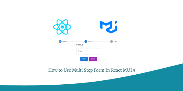
In this section we will see how to use multi step form in react with material ui (mui 5). We will see multi step with Stepper Component, multi step sign up, example with react material UI 5.
Install & Setup Vite + React + Typescript + MUI 5
Multi Step Form with React MUI 5
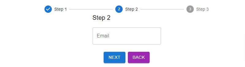
To use multi step form you need Stepper, Step, StepLabel, TextField Component.
import { useState } from "react";
import {
  Container,
  Grid,
  Typography,
  Button,
  TextField,
  Stepper,
  Step,
  StepLabel,
} from "@mui/material";

const steps = ["Step 1", "Step 2", "Step 3"];

const MultiStepForm = () => {
  const [activeStep, setActiveStep] = useState(0);
  const [formData, setFormData] = useState({});

  const handleNext = () => {
    setActiveStep((prevActiveStep) => prevActiveStep + 1);
  };

  const handleBack = () => {
    setActiveStep((prevActiveStep) => prevActiveStep - 1);
  };

  const handleChange = (event) => {
    setFormData({
      ...formData,
      [event.target.name]: event.target.value,
    });
  };

  return (
    <Container maxWidth="sm" sx={{ mt: 8 }}>
      <Stepper activeStep={activeStep}>
        {steps.map((label) => (
          <Step key={label}>
            <StepLabel>{label}</StepLabel>
          </Step>
        ))}
      </Stepper>
      <Grid container direction="column" alignItems="center" spacing={2}>
        <Grid item xs={12}>
          {activeStep === 0 && (
            <>
              <Typography variant="h6">Step 1</Typography>
              <TextField
                label="Name"
                name="name"
                onChange={handleChange}
                fullWidth
                margin="normal"
              />
            </>
          )}
          {activeStep === 1 && (
            <>
              <Typography variant="h6">Step 2</Typography>
              <TextField
                label="Email"
                name="email"
                onChange={handleChange}
                fullWidth
                margin="normal"
              />
            </>
          )}
          {activeStep === 2 && (
            <>
              <Typography variant="h6">Step 3</Typography>
              <TextField
                label="Phone"
                name="phone"
                onChange={handleChange}
                fullWidth
                margin="normal"
              />
            </>
          )}
        </Grid>
        <Grid item xs={12}>
          <Button
            variant="contained"
            color="primary"
            onClick={handleNext}
            disabled={activeStep === steps.length - 1}
          >
            {activeStep === steps.length - 1 ? "Submit" : "Next"}
          </Button>
          {activeStep > 0 && (
            <Button
              variant="contained"
              color="secondary"
              onClick={handleBack}
              sx={{ marginLeft: 8 }}
            >
              Back
            </Button>
          )}
        </Grid>
      </Grid>
    </Container>
  );
};

export default MultiStepForm;
multi step form in react material ui 5
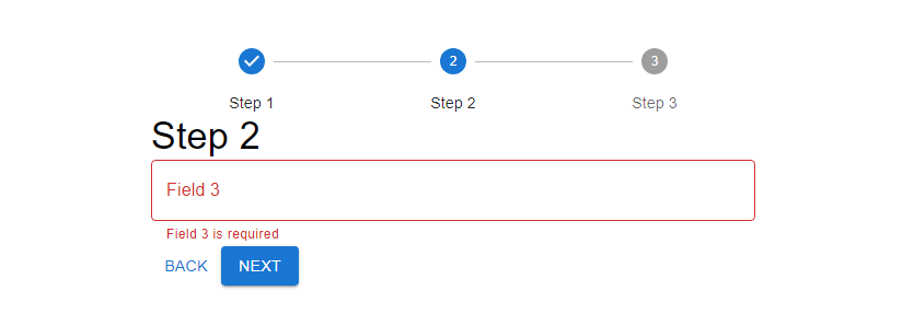
Build a multi-step form wizard with validation using ReactJS and MUI 5 with TypeScript.
import { useState } from 'react';
import {
  Button,
  Container,
  Stepper,
  Step,
  StepLabel,
  Typography,
  TextField,
} from '@mui/material';

interface FormData {
  field1: string;
  field2: string;
  field3: string;
}

function App() {
  const [activeStep, setActiveStep] = useState<number>(0);
  const [formData, setFormData] = useState<FormData>({
    field1: '',
    field2: '',
    field3: '',
  });
  const [errors, setErrors] = useState<Record<string, string>>({});

  const steps = ['Step 1', 'Step 2', 'Step 3'];

  const handleNext = () => {
    const validationErrors = validateForm(formData);
    if (Object.keys(validationErrors).length === 0) {
      setErrors({});
      setActiveStep((prevActiveStep) => prevActiveStep + 1);
    } else {
      setErrors(validationErrors);
    }
  };

  const handleBack = () => {
    setActiveStep((prevActiveStep) => prevActiveStep - 1);
  };

  const handleChange = (field: string, value: string) => {
    setFormData((prevData) => ({ ...prevData, [field]: value }));
  };

  const handleFieldFocus = (field: string) => {
    setErrors((prevErrors) => ({ ...prevErrors, [field]: '' }));
  };

  const validateForm = (data: FormData): Record<string, string> => {
    const errors: Record<string, string> = {};
    if (activeStep === 0) {
      if (!data.field1.trim()) {
        errors.field1 = 'Field 1 is required';
      }
      if (!data.field2.trim()) {
        errors.field2 = 'Field 2 is required';
      }
    } else if (activeStep === 1) {
      if (!data.field3.trim()) {
        errors.field3 = 'Field 3 is required';
      }
    }
    return errors;
  };

  const getStepContent = (step: number) => {
    switch (step) {
      case 0:
        return (
          <div>
            <TextField
              label="Field 1"
              fullWidth
              value={formData.field1}
              onChange={(e) => handleChange('field1', e.target.value)}
              onFocus={() => handleFieldFocus('field1')}
              error={!!errors.field1}
              helperText={errors.field1}
            />
            <TextField
              label="Field 2"
              fullWidth
              value={formData.field2}
              onChange={(e) => handleChange('field2', e.target.value)}
              onFocus={() => handleFieldFocus('field2')}
              error={!!errors.field2}
              helperText={errors.field2}
            />
          </div>
        );
      case 1:
        return (
          <TextField
            label="Field 3"
            fullWidth
            value={formData.field3}
            onChange={(e) => handleChange('field3', e.target.value)}
            onFocus={() => handleFieldFocus('field3')}
            error={!!errors.field3}
            helperText={errors.field3}
          />
        );
      case 2:
        return (
          <Typography variant="h6">
            Thank you for completing the form!
          </Typography>
        );
      default:
        return 'Unknown step';
    }
  };

  return (
    <Container maxWidth="sm" sx={{ mt: 8 }}>
      <Stepper activeStep={activeStep} alternativeLabel>
        {steps.map((label) => (
          <Step key={label}>
            <StepLabel>{label}</StepLabel>
          </Step>
        ))}
      </Stepper>
      <div>
        <Typography variant="h4">{steps[activeStep]}</Typography>
        {getStepContent(activeStep)}
        <div>
          <Button disabled={activeStep === 0} onClick={handleBack}>
            Back
          </Button>
          <Button
            variant="contained"
            color="primary"
            onClick={handleNext}
            disabled={activeStep === steps.length - 1 && !formData.field3}
          >
            {activeStep === steps.length - 1 ? 'Finish' : 'Next'}
          </Button>
        </div>
      </div>
    </Container>
  );
}

export default App;
mui multi-step form wizard validation
Related Posts
create a chat ui in react with mui 5
create a blog section in react mui 5
create a footer in react mui 5
create a responsive navbar in react with mui 5
react mui 5 search bar example
react mui 5 login page example
react mui 5 image list example
react mui 5 registration form example
react mui 5 contact us page example
react mui 5 loading skeleton example
react mui 5 gradient button example
react mui 5 social media icons example
react mui 5 snackbar toast notification example
how to use autocomplete react mui 5
dynamically multiple input fields in react mui 5
how to use dropdown menu in react mui 5
how to use background image in react mui 5
how to use pricing table in react mui 5
how to use dark mode in react mui 5
how to use file upload in react mui 5
how to use sticky navbar in react mui 5
how to use box shadow in react mui 5
how to use loading button in react mui 5