In this tutorial, we will create buttons in react with ant design 5. We will see ant design 5 button component, button with icon example with react ant design 5.
install & setup vite + react + typescript + ant design 5
React Ant Design 5 Buttons Example
1. Create react ant design 5 simple button using react-antd Button component.
import React from 'react';
import { Button, Space } from 'antd';

const App: React.FC = () => (
  <Space wrap>
    <Button type="primary">Primary Button</Button>
    <Button>Default Button</Button>
    <Button type="dashed">Dashed Button</Button>
    <Button type="text">Text Button</Button>
    <Button type="link">Link Button</Button>
  </Space>
);

export default App;
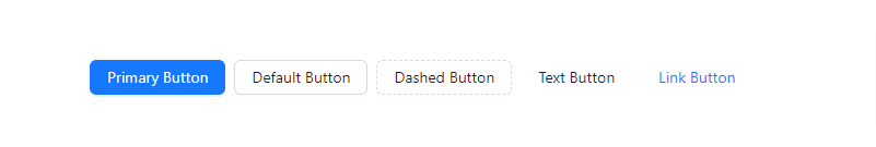
react ant design 5 buttons
2. react ant design 5 ghost buttons. ghost property will make button's background transparent, it is commonly used in colored background.
import React from 'react';
import { Button, Space } from 'antd';

const App: React.FC = () => (
  <Space className="site-button-ghost-wrapper" wrap>
    <Button type="primary" ghost>
      Primary
    </Button>
    <Button ghost>Default</Button>
    <Button type="dashed" ghost>
      Dashed
    </Button>
    <Button type="primary" danger ghost>
      Danger
    </Button>
  </Space>
);

export default App;
3. react ant design 5 disabled buttons. To mark a button as disabled, add the disabled property to the Button.
import React from 'react';
import { Button, Space } from 'antd';

const App: React.FC = () => (
  <Space direction="vertical">
    <Space>
      <Button type="primary">Primary</Button>
      <Button type="primary" disabled>
        Primary(disabled)
      </Button>
    </Space>
    <Space>
      <Button>Default</Button>
      <Button disabled>Default(disabled)</Button>
    </Space>
    <Space>
      <Button type="dashed">Dashed</Button>
      <Button type="dashed" disabled>
        Dashed(disabled)
      </Button>
    </Space>
    <Space>
      <Button type="text">Text</Button>
      <Button type="text" disabled>
        Text(disabled)
      </Button>
    </Space>
    <Space>
      <Button type="link">Link</Button>
      <Button type="link" disabled>
        Link(disabled)
      </Button>
    </Space>
    <Space>
      <Button type="primary" href='https://ant.design/index-cn'>
        Href Primary
      </Button>
      <Button type="primary" href='https://ant.design/index-cn' disabled>
        Href Primary(disabled)
      </Button>
    </Space>
    <Space>
      <Button danger>Danger Default</Button>
      <Button danger disabled>
        Danger Default(disabled)
      </Button>
    </Space>
    <Space>
      <Button danger type="text">
        Danger Text
      </Button>
      <Button danger type="text" disabled>
        Danger Text(disabled)
      </Button>
    </Space>
    <Space>
      <Button type="link" danger>
        Danger Link
      </Button>
      <Button type="link" danger disabled>
        Danger Link(disabled)
      </Button>
    </Space>
    <Space className="site-button-ghost-wrapper">
      <Button ghost>Ghost</Button>
      <Button ghost disabled>
        Ghost(disabled)
      </Button>
    </Space>
  </Space>
);

export default App;
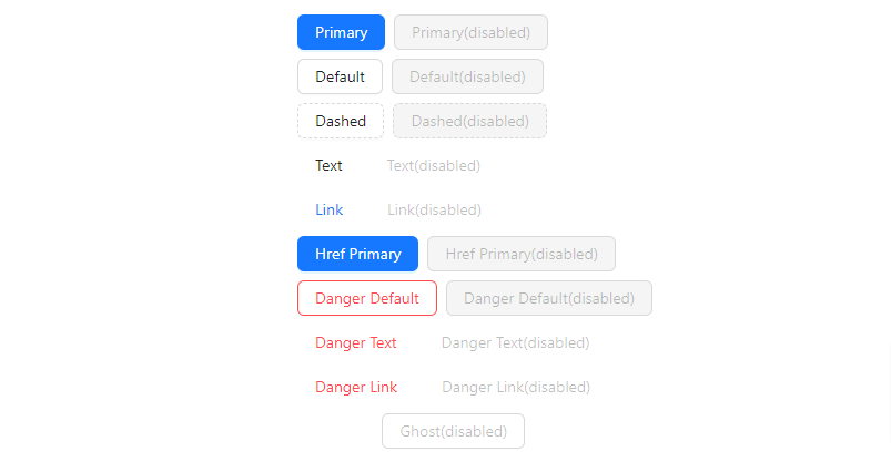
react ant design 5 disabled buttons
4. react ant design 5 block buttons. block property will make the button fit to its parent width.
import React from 'react';
import { Button, Space } from 'antd';

const App: React.FC = () => (
  <Space direction="vertical" style={{ width: '100%' }}>
    <Button type="primary" block>
      Primary
    </Button>
    <Button block>Default</Button>
    <Button type="dashed" block>
      Dashed
    </Button>
    <Button disabled block>
      disabled
    </Button>
    <Button type="text" block>
      text
    </Button>
    <Button type="link" block>
      Link
    </Button>
  </Space>
);

export default App;
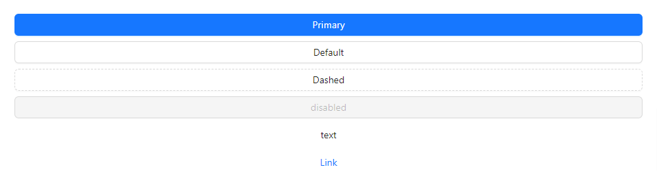
react ant design 5 block buttons
5. react ant design 5 buttons sizes. Ant Design supports a default button size as well as a large and small size.
import React, { useState } from "react";
import { DownloadOutlined } from "@ant-design/icons";
import { Button, Radio, Space, Divider } from "antd";
import type { SizeType } from "antd/es/config-provider/SizeContext";

const App: React.FC = () => {
  const [size, setSize] = useState<SizeType>("large"); // default is 'middle'

  return (
    <>
      <Radio.Group value={size} onChange={(e) => setSize(e.target.value)}>
        <Radio.Button value="large">Large</Radio.Button>
        <Radio.Button value="default">Default</Radio.Button>
        <Radio.Button value="small">Small</Radio.Button>
      </Radio.Group>
      <Divider orientation="left" plain>
        Preview
      </Divider>
      <Space direction="vertical">
        <Space wrap>
          <Button type="primary" size={size}>
            Primary
          </Button>
          <Button size={size}>Default</Button>
          <Button type="dashed" size={size}>
            Dashed
          </Button>
        </Space>
        <Button type="link" size={size}>
          Link
        </Button>
        <Space wrap>
          <Button type="primary" icon={<DownloadOutlined />} size={size} />
          <Button
            type="primary"
            shape="circle"
            icon={<DownloadOutlined />}
            size={size}
          />
          <Button
            type="primary"
            shape="round"
            icon={<DownloadOutlined />}
            size={size}
          />
          <Button
            type="primary"
            shape="round"
            icon={<DownloadOutlined />}
            size={size}
          >
            Download
          </Button>
          <Button type="primary" icon={<DownloadOutlined />} size={size}>
            Download
          </Button>
        </Space>
      </Space>
    </>
  );
};

export default App;
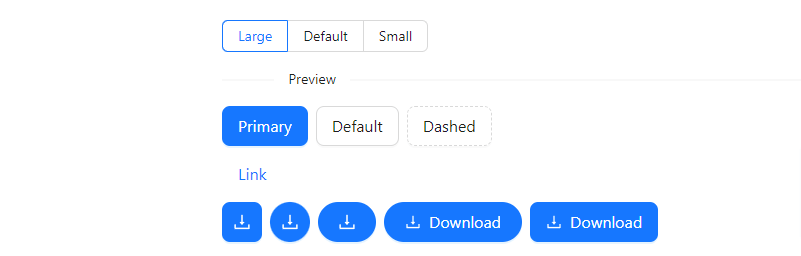
react ant design 5 buttons sizes
6. react ant design 5 buttons with icon and icon button only.
import React from 'react';
import { SearchOutlined } from '@ant-design/icons';
import { Button, Tooltip, Space } from 'antd';

const App: React.FC = () => (
  <Space direction="vertical">
    <Space wrap>
      <Tooltip title="search">
        <Button type="primary" shape="circle" icon={<SearchOutlined />} />
      </Tooltip>
      <Button type="primary" shape="circle">
        A
      </Button>
      <Button type="primary" icon={<SearchOutlined />}>
        Search
      </Button>
      <Tooltip title="search">
        <Button shape="circle" icon={<SearchOutlined />} />
      </Tooltip>
      <Button icon={<SearchOutlined />}>Search</Button>
    </Space>
    <Space wrap>
      <Tooltip title="search">
        <Button shape="circle" icon={<SearchOutlined />} />
      </Tooltip>
      <Button icon={<SearchOutlined />}>Search</Button>
      <Tooltip title="search">
        <Button type="dashed" shape="circle" icon={<SearchOutlined />} />
      </Tooltip>
      <Button type="dashed" icon={<SearchOutlined />}>
        Search
      </Button>
      <Button icon={<SearchOutlined />} href="https://www.google.com" />
    </Space>
  </Space>
);

export default App;

react ant design 5 buttons with icon