In this tutorial, we will create typography in react with ant design 5. We will see ant design 5 typography with typescript, typography h1 h2 h3 h4 h5 example with react ant design 5.
install & setup vite + react + typescript + ant design 5
React Ant Design 5 Typography Example
1. Create react ant design 5 typography using react-antd Title component.
import React from "react";
import { Typography } from "antd";
const { Title } = Typography;
const App: React.FC = () => (
<>
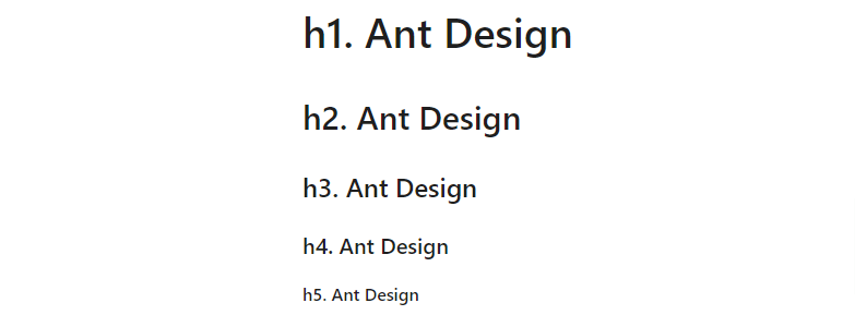
<Title>h1. Ant Design</Title>
<Title level={2}>h2. Ant Design</Title>
<Title level={3}>h3. Ant Design</Title>
<Title level={4}>h4. Ant Design</Title>
<Title level={5}>h5. Ant Design</Title>
</>
);
export default App;
react ant design 5 typography
2. react ant design 5 typography with text , color, mark, links, underline.
import React from 'react';
import { Space, Typography } from 'antd';
const { Text, Link } = Typography;
const App: React.FC = () => (
<Space direction="vertical">
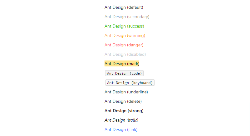
<Text>Ant Design (default)</Text>
<Text type="secondary">Ant Design (secondary)</Text>
<Text type="success">Ant Design (success)</Text>
<Text type="warning">Ant Design (warning)</Text>
<Text type="danger">Ant Design (danger)</Text>
<Text disabled>Ant Design (disabled)</Text>
<Text mark>Ant Design (mark)</Text>
<Text code>Ant Design (code)</Text>
<Text keyboard>Ant Design (keyboard)</Text>
<Text underline>Ant Design (underline)</Text>
<Text delete>Ant Design (delete)</Text>
<Text strong>Ant Design (strong)</Text>
<Text italic>Ant Design (italic)</Text>
<Link href="https://ant.design" target="_blank">
Ant Design (Link)
</Link>
</Space>
);
export default App;
react ant design 5 typography color, mark, links, underline
3. react ant design 5 typography with icon, typography editable, typography text copy etc.
import React, { useState, useMemo } from 'react';
import { CheckOutlined, HighlightOutlined, SmileFilled, SmileOutlined } from '@ant-design/icons';
import { Divider, Radio, Typography } from 'antd';
const { Paragraph } = Typography;
const App: React.FC = () => {
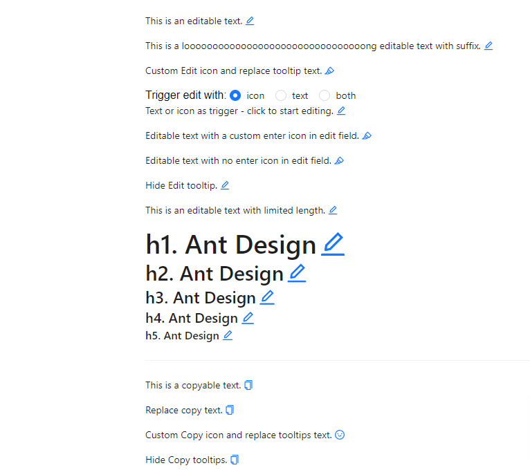
const [editableStr, setEditableStr] = useState('This is an editable text.');
const [editableStrWithSuffix, setEditableStrWithSuffix] = useState(
'This is a loooooooooooooooooooooooooooooooong editable text with suffix.',
);
const [editableStrWithSuffixStartPart, editableStrWithSuffixSuffixPart] = useMemo(
() => [editableStrWithSuffix.slice(0, -12), editableStrWithSuffix.slice(-12)],
[editableStrWithSuffix],
);
const [customIconStr, setCustomIconStr] = useState('Custom Edit icon and replace tooltip text.');
const [clickTriggerStr, setClickTriggerStr] = useState(
'Text or icon as trigger - click to start editing.',
);
const [chooseTrigger, setChooseTrigger] = useState<('icon' | 'text')[]>(['icon']);
const [customEnterIconStr, setCustomEnterIconStr] = useState(
'Editable text with a custom enter icon in edit field.',
);
const [noEnterIconStr, setNoEnterIconStr] = useState(
'Editable text with no enter icon in edit field.',
);
const [hideTooltipStr, setHideTooltipStr] = useState('Hide Edit tooltip.');
const [lengthLimitedStr, setLengthLimitedStr] = useState(
'This is an editable text with limited length.',
);
const radioToState = (input: string): ('icon' | 'text')[] => {
switch (input) {
case 'text':
return ['text'];
case 'both':
return ['icon', 'text'];
case 'icon':
default:
return ['icon'];
}
};
const stateToRadio = useMemo<string>(() => {
if (chooseTrigger.includes('text')) {
return chooseTrigger.includes('icon') ? 'both' : 'text';
}
return 'icon';
}, [chooseTrigger]);
return (
<>
<Paragraph editable={{ onChange: setEditableStr }}>{editableStr}</Paragraph>
<Paragraph
editable={{
onChange: setEditableStrWithSuffix,
text: editableStrWithSuffix,
}}
ellipsis={{
suffix: editableStrWithSuffixSuffixPart,
}}
>
{editableStrWithSuffixStartPart}
</Paragraph>
<Paragraph
editable={{
icon: <HighlightOutlined />,
tooltip: 'click to edit text',
onChange: setCustomIconStr,
}}
>
{customIconStr}
</Paragraph>
Trigger edit with:{' '}
<Radio.Group
onChange={(e) => setChooseTrigger(radioToState(e.target.value))}
value={stateToRadio}
>
<Radio value="icon">icon</Radio>
<Radio value="text">text</Radio>
<Radio value="both">both</Radio>
</Radio.Group>
<Paragraph
editable={{
tooltip: 'click to edit text',
onChange: setClickTriggerStr,
triggerType: chooseTrigger,
}}
>
{clickTriggerStr}
</Paragraph>
<Paragraph
editable={{
icon: <HighlightOutlined />,
tooltip: 'click to edit text',
onChange: setCustomEnterIconStr,
enterIcon: <CheckOutlined />,
}}
>
{customEnterIconStr}
</Paragraph>
<Paragraph
editable={{
icon: <HighlightOutlined />,
tooltip: 'click to edit text',
onChange: setNoEnterIconStr,
enterIcon: null,
}}
>
{noEnterIconStr}
</Paragraph>
<Paragraph editable={{ tooltip: false, onChange: setHideTooltipStr }}>
{hideTooltipStr}
</Paragraph>
<Paragraph
editable={{
onChange: setLengthLimitedStr,
maxLength: 50,
autoSize: { maxRows: 5, minRows: 3 },
}}
>
{lengthLimitedStr}
</Paragraph>
<Typography.Title editable level={1} style={{ margin: 0 }}>
h1. Ant Design
</Typography.Title>
<Typography.Title editable level={2} style={{ margin: 0 }}>
h2. Ant Design
</Typography.Title>
<Typography.Title editable level={3} style={{ margin: 0 }}>
h3. Ant Design
</Typography.Title>
<Typography.Title editable level={4} style={{ margin: 0 }}>
h4. Ant Design
</Typography.Title>
<Typography.Title editable level={5} style={{ margin: 0 }}>
h5. Ant Design
</Typography.Title>
<Divider />
<Paragraph copyable>This is a copyable text.</Paragraph>
<Paragraph copyable={{ text: 'Hello, Ant Design!' }}>Replace copy text.</Paragraph>
<Paragraph
copyable={{
icon: [<SmileOutlined key="copy-icon" />, <SmileFilled key="copied-icon" />],
tooltips: ['click here', 'you clicked!!'],
}}
>
Custom Copy icon and replace tooltips text.
</Paragraph>
<Paragraph copyable={{ tooltips: false }}>Hide Copy tooltips.</Paragraph>
</>
);
};
export default App;
react ant design 5 typography with icon
4. react ant design 5 typography Paragraph with suffix ellipsis.
import React, { useState } from "react";
import { Slider, Typography } from "antd";

const { Paragraph } = Typography;

const App: React.FC = () => {
  const [rows, setRows] = useState(1);

  const article =
    "To be, or not to be, that is a question: Whether it is nobler in the mind to suffer. The slings and arrows of outrageous fortune Or to take arms against a sea of troubles, And by opposing end them? To die: to sleep; No more; and by a sleep to say we end The heart-ache and the thousand natural shocks That flesh is heir to, 'tis a consummation Devoutly to be wish'd. To die, to sleep To sleep- perchance to dream: ay, there's the rub! For in that sleep of death what dreams may come When we have shuffled off this mortal coil, Must give us pause. There 's the respect That makes calamity of so long life";

  return (
    <>
      <Slider value={rows} min={1} max={10} onChange={setRows} />
      <Paragraph
        ellipsis={{
          rows,
          expandable: true,
          suffix: "--William Shakespeare",
          onEllipsis: (ellipsis) => {
            console.log("Ellipsis changed:", ellipsis);
          },
        }}
        title={`${article}--William Shakespeare`}
      >
        {article}
      </Paragraph>
    </>
  );
};

export default App;