In this tutorial, we will create and design cards using Bootstrap 5 and React. We will create cards and card with image & card style with using react-bootstrap components Card, Card.body, Card.title, Card text and Button Col in react app.
Install & Setup Vite + React + Typescript + Bootstrap 5
React Bootstrap 5.2 Cards Examples
1. Create simple react bootstrap cards using react-bootstrap components Card, Card.body, Card.title, Card text and Button Col.
import React from 'react';
import { Button } from 'react-bootstrap';
import Card from 'react-bootstrap/Card';
import Col from 'react-bootstrap/Col';

export default function CardExample() {
  return (
    <>
      <Col md={3}>
        <Card>
          <Card.Body>
            <Card.Title>React bootstrap 5 card title</Card.Title>
            <Card.Text>
              React bootstrap 5 description card title and make up the bulk of
              the card's content.
            </Card.Text>
            <Button variant="primary"> Read More</Button>
          </Card.Body>
        </Card>
      </Col>
    </>
  );
}
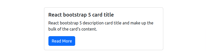
react bootstrap 5 simple cards
2. React bootstrap 5 card with border style.
import React from 'react';
import { Button } from 'react-bootstrap';
import Card from 'react-bootstrap/Card';
import Col from 'react-bootstrap/Col';

export default function CardExample() {
  return (
    <>
      <Col md={3}>
        <Card className="border border-2 border-primary">
          <Card.Body>
            <Card.Title>React bootstrap 5 card with border</Card.Title>
            <Card.Text>
              React bootstrap 5 description card title and make up the bulk of
              the card's content.
            </Card.Text>
            <Button variant="primary"> Read More</Button>
          </Card.Body>
        </Card>
      </Col>
    </>
  );
}
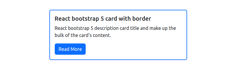
react 18 bootstrap 5 card style
3. React bootstrap 5 card with image.
import React from 'react';
import { Button } from 'react-bootstrap';
import Card from 'react-bootstrap/Card';
import Col from 'react-bootstrap/Col';

export default function CardExample() {
  return (
    <>
      <Col md={3}>
        <Card>
        <Card.Img variant="top" src="https://cdn.pixabay.com/photo/2018/06/21/13/57/clouds-3488632__340.jpg" />
          <Card.Body>
            <Card.Title>React bootstrap 5 card with image</Card.Title>
            <Card.Text>
              React bootstrap 5 description card title and make up the bulk of
              the card's content.
            </Card.Text>
            <Button variant="primary"> Read More</Button>
          </Card.Body>
        </Card>
      </Col>
    </>
  );
}
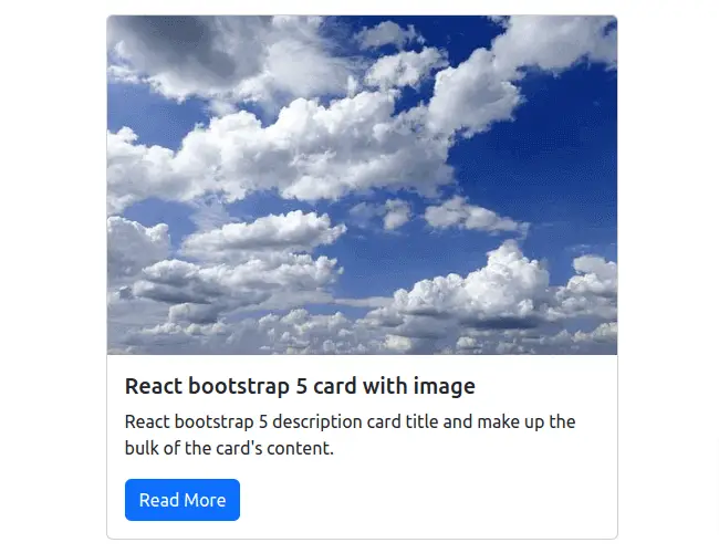
react bootstrap 5 card with image
4. React bootstrap 5 card with shadow.
import React from 'react';
import { Button } from 'react-bootstrap';
import Card from 'react-bootstrap/Card';
import Col from 'react-bootstrap/Col';

export default function CardExample() {
  return (
    <>
      <Col md={3}>
        <Card className="shadow">
          <Card.Body>
            <Card.Title>React bootstrap 5 card with shadow</Card.Title>
            <Card.Text>
              React bootstrap 5 description card title and make up the bulk of
              the card's content.
            </Card.Text>
            <Button variant="primary"> Read More</Button>
          </Card.Body>
        </Card>
      </Col>
    </>
  );
}
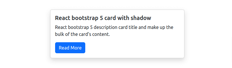
react bootstrap card shadow