In this tutorial, we will see modal popup in react with bootstrap 5. We will see modal component, Vertically centered modal, Fullscreen Modal using react bootstrap 5.
Install & Setup Vite + React + Typescript + Bootstrap 5
React Bootstrap 5 Modal Example
1. Create simple react bootstrap modal using react-bootstrap Modal, Button component with useState hook.
import { useState } from "react";
import Button from "react-bootstrap/Button";
import Modal from "react-bootstrap/Modal";

export default function ModalExample() {
  const [show, setShow] = useState(false);

  const handleClose = () => setShow(false);
  const handleShow = () => setShow(true);

  return (
    <>
      <Button variant="primary" onClick={handleShow}>
        Launch demo modal
      </Button>

      <Modal show={show} onHide={handleClose}>
        <Modal.Header closeButton>
          <Modal.Title>Modal heading</Modal.Title>
        </Modal.Header>
        <Modal.Body>Woohoo, you're reading this text in a modal!</Modal.Body>
        <Modal.Footer>
          <Button variant="secondary" onClick={handleClose}>
            Close
          </Button>
          <Button variant="primary" onClick={handleClose}>
            Save Changes
          </Button>
        </Modal.Footer>
      </Modal>
    </>
  );
}
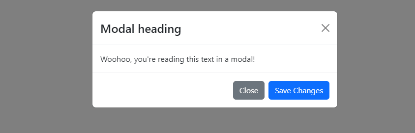
react bootstrap 5 modal example
2. react bootstrap static backdrop modal. When backdrop is set to static, the modal will not close when clicking outside it. Click the button below to try it.
import { useState } from "react";
import Button from "react-bootstrap/Button";
import Modal from "react-bootstrap/Modal";

export default function ModalExample() {
  const [show, setShow] = useState(false);

  const handleClose = () => setShow(false);
  const handleShow = () => setShow(true);

  return (
    <>
      <Button variant="primary" onClick={handleShow}>
        Launch static backdrop modal
      </Button>

      <Modal
        show={show}
        onHide={handleClose}
        backdrop="static"
        keyboard={false}
      >
        <Modal.Header closeButton>
          <Modal.Title>Modal title</Modal.Title>
        </Modal.Header>
        <Modal.Body>
          I will not close if you click outside me. Don't even try to press
          escape key.
        </Modal.Body>
        <Modal.Footer>
          <Button variant="secondary" onClick={handleClose}>
            Close
          </Button>
          <Button variant="primary">Understood</Button>
        </Modal.Footer>
      </Modal>
    </>
  );
}
3. react bootstrap 5 Vertically centered modal.
import React from 'react';
import Button from 'react-bootstrap/Button';
import Modal from 'react-bootstrap/Modal';

function MyVerticallyCenteredModal(props) {
  return (
    <Modal
      {...props}
      size="lg"
      aria-labelledby="contained-modal-title-vcenter"
      centered
    >
      <Modal.Header closeButton>
        <Modal.Title id="contained-modal-title-vcenter">
          Modal heading
        </Modal.Title>
      </Modal.Header>
      <Modal.Body>
        <h4>Centered Modal</h4>
        <p>
          Cras mattis consectetur purus sit amet fermentum. Cras justo odio,
          dapibus ac facilisis in, egestas eget quam. Morbi leo risus, porta ac
          consectetur ac, vestibulum at eros.
        </p>
      </Modal.Body>
      <Modal.Footer>
        <Button onClick={props.onHide}>Close</Button>
      </Modal.Footer>
    </Modal>
  );
}

export default function App() {
  const [modalShow, setModalShow] = React.useState(false);

  return (
    <>
      <Button variant="primary" onClick={() => setModalShow(true)}>
        Launch vertically centered modal
      </Button>

      <MyVerticallyCenteredModal
        show={modalShow}
        onHide={() => setModalShow(false)}
      />
    </>
  );
}
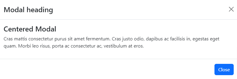
react bootstrap 5 vertically centered modal
4. react bootstrap 5 focus on specific element modal with form.
import React, { useState } from 'react';
import Button from 'react-bootstrap/Button';
import Form from 'react-bootstrap/Form';
import Modal from 'react-bootstrap/Modal';

export default function ModalExample() {
  const [show, setShow] = useState(false);

  const handleClose = () => setShow(false);
  const handleShow = () => setShow(true);

  return (
    <>
      <Button variant="primary" onClick={handleShow}>
        Launch demo modal
      </Button>

      <Modal show={show} onHide={handleClose}>
        <Modal.Header closeButton>
          <Modal.Title>Modal heading</Modal.Title>
        </Modal.Header>
        <Modal.Body>
          <Form>
            <Form.Group className="mb-3" controlId="exampleForm.ControlInput1">
              <Form.Label>Email address</Form.Label>
              <Form.Control
                type="email"
                placeholder="[email protected]"
                autoFocus
              />
            </Form.Group>
            <Form.Group
              className="mb-3"
              controlId="exampleForm.ControlTextarea1"
            >
              <Form.Label>Example textarea</Form.Label>
              <Form.Control as="textarea" rows={3} />
            </Form.Group>
          </Form>
        </Modal.Body>
        <Modal.Footer>
          <Button variant="secondary" onClick={handleClose}>
            Close
          </Button>
          <Button variant="primary" onClick={handleClose}>
            Save Changes
          </Button>
        </Modal.Footer>
      </Modal>
    </>
  );
}
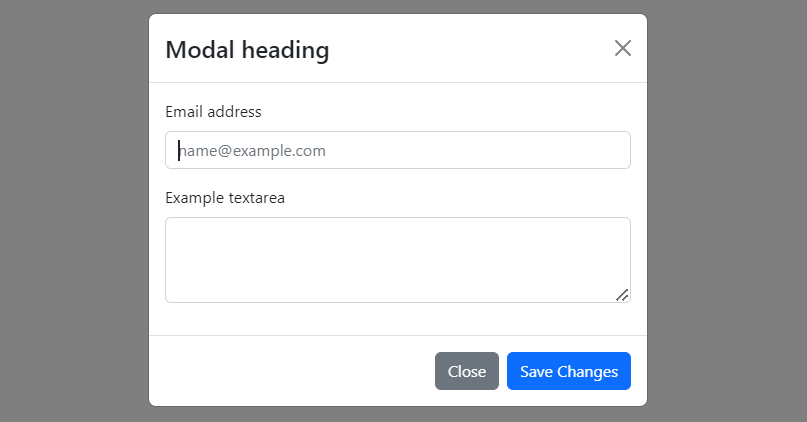
react bootstrap 5 focus modal
5. react bootstrap 5 modal with size small and large.
import React, { useState } from 'react';
import Button from 'react-bootstrap/Button';
import Modal from 'react-bootstrap/Modal';

export default function ModalExample() {
  const [smShow, setSmShow] = useState(false);
  const [lgShow, setLgShow] = useState(false);

  return (
    <>
      <Button onClick={() => setSmShow(true)} className="me-2">
        Small modal
      </Button>
      <Button onClick={() => setLgShow(true)}>Large modal</Button>
      <Modal
        size="sm"
        show={smShow}
        onHide={() => setSmShow(false)}
        aria-labelledby="example-modal-sizes-title-sm"
      >
        <Modal.Header closeButton>
          <Modal.Title id="example-modal-sizes-title-sm">
            Small Modal
          </Modal.Title>
        </Modal.Header>
        <Modal.Body>...</Modal.Body>
      </Modal>
      <Modal
        size="lg"
        show={lgShow}
        onHide={() => setLgShow(false)}
        aria-labelledby="example-modal-sizes-title-lg"
      >
        <Modal.Header closeButton>
          <Modal.Title id="example-modal-sizes-title-lg">
            Large Modal
          </Modal.Title>
        </Modal.Header>
        <Modal.Body>...</Modal.Body>
      </Modal>
    </>
  );
}
6. react bootstrap 5 Fullscreen modal. You can use the fullscreen prop to make the modal fullscreen. Specifying a breakpoint will only set the modal as fullscreen below the breakpoint size.
import React, { useState } from "react";
import Button from "react-bootstrap/Button";
import Modal from "react-bootstrap/Modal";

export default function ModalExample() {
  const values = [true, "sm-down", "md-down", "lg-down", "xl-down", "xxl-down"];
  const [fullscreen, setFullscreen] = useState(true);
  const [show, setShow] = useState(false);

  function handleShow(breakpoint) {
    setFullscreen(breakpoint);
    setShow(true);
  }

  return (
    <>
      {values.map((v, idx) => (
        <Button key={idx} className="me-2 mb-2" onClick={() => handleShow(v)}>
          Full screen
          {typeof v === "string" && `below ${v.split("-")[0]}`}
        </Button>
      ))}
      <Modal show={show} fullscreen={fullscreen} onHide={() => setShow(false)}>
        <Modal.Header closeButton>
          <Modal.Title>Modal</Modal.Title>
        </Modal.Header>
        <Modal.Body>Modal body content</Modal.Body>
      </Modal>
    </>
  );
}