In this tutorial, we will see how to use paper component in react with material ui (mui 5). paper component is use for create cards, Panels, Containers and Modal dialogs.
Install & Setup Vite + React + Typescript + MUI 5
React Material UI 5 Paper Example
1. Create react mui 5 simple paper using react-mui Paper component.
import * as React from "react";
import Paper from "@mui/material/Paper";
import { Box } from "@mui/material";

export default function SimplePaper() {
  return (
    <Box
      sx={{
        display: "flex",
        flexWrap: "wrap",
        "& > :not(style)": {
          m: 1,
          width: 128,
          height: 128,
        },
      }}
    >
      <Paper elevation={0} />
      <Paper />
      <Paper elevation={3} />
    </Box>
  );
}

react mui 5 paper component example
2. react mui 5 paper component with outlined variants.
import * as React from "react";
import Box from "@mui/material/Box";
import Paper from "@mui/material/Paper";

export default function Variants() {
  return (
    <Box
      sx={{
        display: "flex",
        "& > :not(style)": {
          m: 1,
          width: 128,
          height: 128,
        },
      }}
    >
      <Paper variant="outlined" />
      <Paper variant="outlined" square />
    </Box>
  );
}

react mui 5 paper component with outlined variants
3. react mui 5 paper component with elevation values 0, 1, 2, 3, 4, 6, 8, 12, 16, 24.
import * as React from "react";
import Grid from "@mui/material/Grid";
import Paper from "@mui/material/Paper";
import Box from "@mui/material/Box";
import { createTheme, ThemeProvider, styled } from "@mui/material/styles";
import { Container } from "@mui/material";

const Item = styled(Paper)(({ theme }) => ({
  ...theme.typography.body2,
  textAlign: "center",
  color: theme.palette.text.secondary,
  height: 60,
  lineHeight: "60px",
}));

const darkTheme = createTheme({ palette: { mode: "dark" } });
const lightTheme = createTheme({ palette: { mode: "light" } });

export default function Elevation() {
  return (
    <Container maxWidth="md" sx={{ mt: 20 }}>
      <Grid container spacing={2}>
        {[lightTheme, darkTheme].map((theme, index) => (
          <Grid item xs={6} key={index}>
            <ThemeProvider theme={theme}>
              <Box
                sx={{
                  p: 2,
                  bgcolor: "background.default",
                  display: "grid",
                  gridTemplateColumns: { md: "1fr 1fr" },
                  gap: 2,
                }}
              >
                {[0, 1, 2, 3, 4, 6, 8, 12, 16, 24].map((elevation) => (
                  <Item key={elevation} elevation={elevation}>
                    {`elevation=${elevation}`}
                  </Item>
                ))}
              </Box>
            </ThemeProvider>
          </Grid>
        ))}
      </Grid>
    </Container>
  );
}
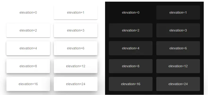
mui 5 paper component with elevation values
4. react mui 5 create simple card using paper component.
import React from "react";
import Paper from "@mui/material/Paper";
import Typography from "@mui/material/Typography";
import { Container } from "@mui/material";

export default function PaperCard(){
  return (
    <Container maxWidth="md" sx={{ mt: 20 }}>
      <Paper elevation={3} sx={{ p: 2, maxWidth: "300px" }}>
        <Typography variant="h6" component="h3">
          Card Title
        </Typography>
        <Typography variant="body1" component="p">
          This is the content of the card.
        </Typography>
      </Paper>
    </Container>
  );
};

mui 5 create simple card using paper component