In this tutorial, we will create tabs in react with material ui (mui 5). We will see mui 5 tabs component using typescript, tabs with icon example with react material UI 5.
Install & Setup Vite + React + Typescript + MUI 5
React Material UI 5 Tabs Example
1. Create react mui 5 simple tabs using react-mui Tabs component.
import * as React from "react";
import Tabs from "@mui/material/Tabs";
import Tab from "@mui/material/Tab";
import Typography from "@mui/material/Typography";
import Box from "@mui/material/Box";

interface TabPanelProps {
  children?: React.ReactNode;
  index: number;
  value: number;
}

function TabPanel(props: TabPanelProps) {
  const { children, value, index, ...other } = props;

  return (
    <div
      role="tabpanel"
      hidden={value !== index}
      id={`simple-tabpanel-${index}`}
      aria-labelledby={`simple-tab-${index}`}
      {...other}
    >
      {value === index && (
        <Box sx={{ p: 3 }}>
          <Typography>{children}</Typography>
        </Box>
      )}
    </div>
  );
}

function a11yProps(index: number) {
  return {
    id: `simple-tab-${index}`,
    "aria-controls": `simple-tabpanel-${index}`,
  };
}

export default function BasicTabs() {
  const [value, setValue] = React.useState(0);

  const handleChange = (event: React.SyntheticEvent, newValue: number) => {
    setValue(newValue);
  };

  return (
    <Box sx={{ width: "100%" }}>
      <Box sx={{ borderBottom: 1, borderColor: "divider" }}>
        <Tabs
          value={value}
          onChange={handleChange}
          aria-label="basic tabs example"
        >
          <Tab label="Item One" {...a11yProps(0)} />
          <Tab label="Item Two" {...a11yProps(1)} />
          <Tab label="Item Three" {...a11yProps(2)} />
        </Tabs>
      </Box>
      <TabPanel value={value} index={0}>
        Item One
      </TabPanel>
      <TabPanel value={value} index={1}>
        Item Two
      </TabPanel>
      <TabPanel value={value} index={2}>
        Item Three
      </TabPanel>
    </Box>
  );
}
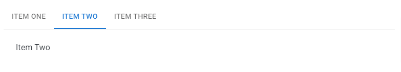
react mui 5 tabs component
2. react mui 5 tabs with experimental api.
import * as React from "react";
import Box from "@mui/material/Box";
import Tab from "@mui/material/Tab";
import TabContext from "@mui/lab/TabContext";
import TabList from "@mui/lab/TabList";
import TabPanel from "@mui/lab/TabPanel";

export default function LabTabs() {
  const [value, setValue] = React.useState("1");

  const handleChange = (event: React.SyntheticEvent, newValue: string) => {
    setValue(newValue);
  };

  return (
    <Box sx={{ width: "100%", typography: "body1" }}>
      <TabContext value={value}>
        <Box sx={{ borderBottom: 1, borderColor: "divider" }}>
          <TabList onChange={handleChange} aria-label="lab API tabs example">
            <Tab label="Item One" value="1" />
            <Tab label="Item Two" value="2" />
            <Tab label="Item Three" value="3" />
          </TabList>
        </Box>
        <TabPanel value="1">Item One</TabPanel>
        <TabPanel value="2">Item Two</TabPanel>
        <TabPanel value="3">Item Three</TabPanel>
      </TabContext>
    </Box>
  );
}
3. react mui 5 tabs with wrapped labels.
import * as React from "react";
import Tabs from "@mui/material/Tabs";
import Tab from "@mui/material/Tab";
import Box from "@mui/material/Box";

export default function TabsWrappedLabel() {
  const [value, setValue] = React.useState("one");

  const handleChange = (event: React.SyntheticEvent, newValue: string) => {
    setValue(newValue);
  };

  return (
    <Box sx={{ width: "100%" }}>
      <Tabs
        value={value}
        onChange={handleChange}
        aria-label="wrapped label tabs example"
      >
        <Tab
          value="one"
          label="New Arrivals in the Longest Text of Nonfiction that should appear in the next line"
          wrapped
        />
        <Tab value="two" label="Item Two" />
        <Tab value="three" label="Item Three" />
      </Tabs>
    </Box>
  );
}
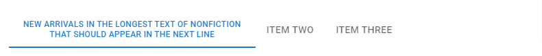
mui 5 tabs with wrapped labels
4. react mui 5 colored tabs.
import * as React from "react";
import Tabs from "@mui/material/Tabs";
import Tab from "@mui/material/Tab";
import Box from "@mui/material/Box";

export default function ColorTabs() {
  const [value, setValue] = React.useState("one");

  const handleChange = (event: React.SyntheticEvent, newValue: string) => {
    setValue(newValue);
  };

  return (
    <Box sx={{ width: "100%" }}>
      <Tabs
        value={value}
        onChange={handleChange}
        textColor="secondary"
        indicatorColor="secondary"
        aria-label="secondary tabs example"
      >
        <Tab value="one" label="Item One" />
        <Tab value="two" label="Item Two" />
        <Tab value="three" label="Item Three" />
      </Tabs>
    </Box>
  );
}
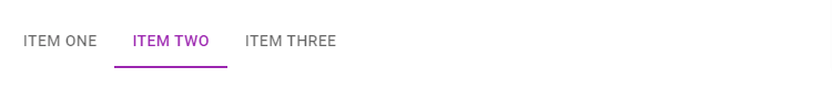
react mui 5 colored tabs
5. react mui 5 disabled tab.
import * as React from "react";
import Tabs from "@mui/material/Tabs";
import Tab from "@mui/material/Tab";

export default function DisabledTabs() {
  const [value, setValue] = React.useState(2);

  const handleChange = (event: React.SyntheticEvent, newValue: number) => {
    setValue(newValue);
  };

  return (
    <Tabs
      value={value}
      onChange={handleChange}
      aria-label="disabled tabs example"
    >
      <Tab label="Active" />
      <Tab label="Disabled" disabled />
      <Tab label="Active" />
    </Tabs>
  );
}
6. react mui 5 centered tabs.
import * as React from "react";
import Tabs from "@mui/material/Tabs";
import Tab from "@mui/material/Tab";
import { Box } from "@mui/material";

export default function CenteredTabs() {
  const [value, setValue] = React.useState(0);

  const handleChange = (event: React.SyntheticEvent, newValue: number) => {
    setValue(newValue);
  };

  return (
    <Box sx={{ width: "100%", bgcolor: "background.paper" }}>
      <Tabs value={value} onChange={handleChange} centered>
        <Tab label="Item One" />
        <Tab label="Item Two" />
        <Tab label="Item Three" />
      </Tabs>
    </Box>
  );
}
7. react mui 5 scrollable tabs.
import * as React from 'react';
import Tabs from '@mui/material/Tabs';
import Tab from '@mui/material/Tab';
import { Box } from '@mui/material';

export default function ScrollableTabsButtonAuto() {
  const [value, setValue] = React.useState(0);

  const handleChange = (event: React.SyntheticEvent, newValue: number) => {
    setValue(newValue);
  };

  return (
    <Box sx={{ maxWidth: { xs: 320, sm: 480 }, bgcolor: 'background.paper' }}>
      <Tabs
        value={value}
        onChange={handleChange}
        variant="scrollable"
        scrollButtons="auto"
        aria-label="scrollable auto tabs example"
      >
        <Tab label="Item One" />
        <Tab label="Item Two" />
        <Tab label="Item Three" />
        <Tab label="Item Four" />
        <Tab label="Item Five" />
        <Tab label="Item Six" />
        <Tab label="Item Seven" />
      </Tabs>
    </Box>
  );
}

react mui 5 scrollable tabs
8. react mui 5 vertical tabs with typescript.
import * as React from "react";
import Tabs from "@mui/material/Tabs";
import Tab from "@mui/material/Tab";
import Typography from "@mui/material/Typography";
import { Box } from "@mui/material";

interface TabPanelProps {
  children?: React.ReactNode;
  index: number;
  value: number;
}

function TabPanel(props: TabPanelProps) {
  const { children, value, index, ...other } = props;

  return (
    <div
      role="tabpanel"
      hidden={value !== index}
      id={`vertical-tabpanel-${index}`}
      aria-labelledby={`vertical-tab-${index}`}
      {...other}
    >
      {value === index && (
        <Box sx={{ p: 3 }}>
          <Typography>{children}</Typography>
        </Box>
      )}
    </div>
  );
}

function a11yProps(index: number) {
  return {
    id: `vertical-tab-${index}`,
    "aria-controls": `vertical-tabpanel-${index}`,
  };
}

export default function VerticalTabs() {
  const [value, setValue] = React.useState(0);

  const handleChange = (event: React.SyntheticEvent, newValue: number) => {
    setValue(newValue);
  };

  return (
    <Box
      sx={{
        flexGrow: 1,
        bgcolor: "background.paper",
        display: "flex",
        height: 224,
      }}
    >
      <Tabs
        orientation="vertical"
        variant="scrollable"
        value={value}
        onChange={handleChange}
        aria-label="Vertical tabs example"
        sx={{ borderRight: 1, borderColor: "divider" }}
      >
        <Tab label="Item One" {...a11yProps(0)} />
        <Tab label="Item Two" {...a11yProps(1)} />
        <Tab label="Item Three" {...a11yProps(2)} />
        <Tab label="Item Four" {...a11yProps(3)} />
        <Tab label="Item Five" {...a11yProps(4)} />
        <Tab label="Item Six" {...a11yProps(5)} />
        <Tab label="Item Seven" {...a11yProps(6)} />
      </Tabs>
      <TabPanel value={value} index={0}>
        Item One
      </TabPanel>
      <TabPanel value={value} index={1}>
        Item Two
      </TabPanel>
      <TabPanel value={value} index={2}>
        Item Three
      </TabPanel>
      <TabPanel value={value} index={3}>
        Item Four
      </TabPanel>
      <TabPanel value={value} index={4}>
        Item Five
      </TabPanel>
      <TabPanel value={value} index={5}>
        Item Six
      </TabPanel>
      <TabPanel value={value} index={6}>
        Item Seven
      </TabPanel>
    </Box>
  );
}
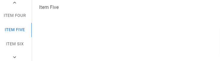
react mui 5 vertical tabs
9. react mui 5 tabs with icons.
import * as React from "react";
import Tabs from "@mui/material/Tabs";
import Tab from "@mui/material/Tab";
import PhoneIcon from "@mui/icons-material/Phone";
import FavoriteIcon from "@mui/icons-material/Favorite";
import PersonPinIcon from "@mui/icons-material/PersonPin";

export default function IconTabs() {
  const [value, setValue] = React.useState(0);

  const handleChange = (event: React.SyntheticEvent, newValue: number) => {
    setValue(newValue);
  };

  return (
    <Tabs value={value} onChange={handleChange} aria-label="icon tabs example">
      <Tab icon={<PhoneIcon />} aria-label="phone" />
      <Tab icon={<FavoriteIcon />} aria-label="favorite" />
      <Tab icon={<PersonPinIcon />} aria-label="person" />
    </Tabs>
  );
}

react mui 5 tabs with icons
10. react mui 5 tabs with Icon position, top start, end, bottom.
import * as React from "react";
import Tabs from "@mui/material/Tabs";
import Tab from "@mui/material/Tab";
import PhoneIcon from "@mui/icons-material/Phone";
import FavoriteIcon from "@mui/icons-material/Favorite";
import PersonPinIcon from "@mui/icons-material/PersonPin";
import PhoneMissedIcon from "@mui/icons-material/PhoneMissed";

export default function IconTabs() {
  const [value, setValue] = React.useState(0);

  const handleChange = (event: React.SyntheticEvent, newValue: number) => {
    setValue(newValue);
  };

  return (
    <Tabs
      value={value}
      onChange={handleChange}
      aria-label="icon position tabs example"
    >
      <Tab icon={<PhoneIcon />} label="top" />
      <Tab icon={<PhoneMissedIcon />} iconPosition="start" label="start" />
      <Tab icon={<FavoriteIcon />} iconPosition="end" label="end" />
      <Tab icon={<PersonPinIcon />} iconPosition="bottom" label="bottom" />
    </Tabs>
  );
}

mui 5 tabs with Icon position, top start, end, bottom
Related Posts
create a chat ui in react with mui 5
create a blog section in react mui 5
create a footer in react mui 5
create a responsive navbar in react with mui 5
react mui 5 search bar example
react mui 5 login page example
react mui 5 image list example
react mui 5 toggle switch example
react mui 5 registration form example
react mui 5 contact us page example
react mui 5 loading skeleton example
react mui 5 gradient button example
react mui 5 social media icons example
react mui 5 snackbar toast notification example
how to use autocomplete react mui 5
dynamically multiple input fields in react mui 5
how to use dropdown menu in react mui 5
how to use background image in react mui 5
how to use pricing table in react mui 5
how to use dark mode in react mui 5
how to use file upload in react mui 5
how to use sticky navbar in react mui 5
how to use box shadow in react mui 5
how to use multi step form in react mui 5
how to use loading button in react mui 5