
In this section, we'll explore the top 5 React style libraries. A React style library typically refers to a collection of tools and components designed to help developers style their React applications. React is a JavaScript library for building user interfaces, and styling is an important aspect of creating visually appealing and functional web applications.
React itself doesn't provide a built-in way to style components; instead, it leaves the choice of styling method up to developers. There are several popular libraries and approaches for styling React applications, and these are often referred to as "React style libraries." Some of the commonly used ones include.
1. Styled-components
Styled-components is a popular CSS-in-JS library for styling React applications. It allows you to write CSS code as JavaScript template literals directly within your React components. Here are some key features and concepts of styled-components.
Styled-components, a notable player in the world of React styling, boasts a total of 39k stars on its GitHub repository, a testament to its popularity and the community's support.
Component-Based Styling: With styled-components, you define styles on a per-component basis. Each styled-component is a JavaScript function that returns a React component with the specified styles.
Tagged Template Literals: Styled-components use tagged template literals to define styles. This allows you to write CSS code inside JavaScript code, making it easy to create dynamic styles based on props or state.
Automatic Class Name Generation: When you create a styled-component, styled-components generates unique class names for your styles to avoid global naming conflicts. These class names are automatically applied to the corresponding component.
Dynamic Styling: You can use JavaScript expressions and props to create dynamic styles. This makes it easy to change styles based on component state or other factors.
Server-Side Rendering (SSR) Support: Styled-components is designed to work well with server-side rendering, making it a good choice for universal/isomorphic applications.
Global Styles: In addition to component-level styling, styled-components also supports defining global styles that affect the entire application.
Here's an illustrative example of how you can employ styled-components within a React component:
import styled from 'styled-components';

// Define a styled component
const Button = styled.button`
 background-color: ${props => props.primary ? 'blue' : 'white'};
 color: ${props => props.primary ? 'white' : 'black'};
 border: 2px solid blue;
 padding: 10px 20px;
 font-size: 16px;
`;

// Usage in a React component
function MyComponent() {
 return (
  <div>
   <Button primary>Primary Button</Button>
   <Button>Secondary Button</Button>
  </div>
 );
}

export default MyComponent;
we define a Button styled-component with dynamic styles based on the primary prop. The styles are defined using tagged template literals within backticks (``) and can include dynamic expressions inside ${}.
Styled-components offers a clean and maintainable way to style your React components, and it has gained popularity for its ease of use and flexibility in managing component-specific styles in modern web development.
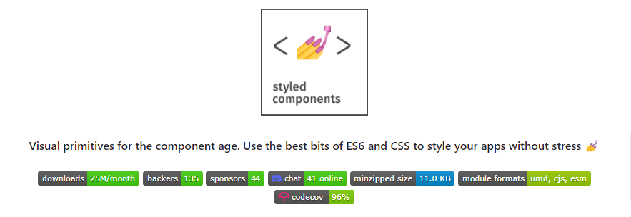
react style library styled-components
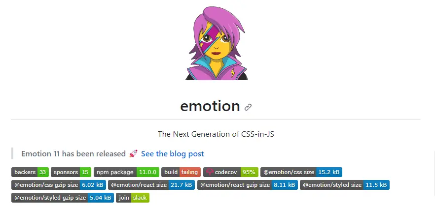
2. Emotion
Emotion is another popular CSS-in-JS library, similar to styled-components, that is commonly used for styling React applications. It provides a way to write and manage CSS styles using JavaScript and offers several features and benefits:
CSS-in-JS: Emotion allows you to define styles using JavaScript, typically using template literals. This enables you to keep your styles co-located with your components, making it easier to manage and maintain your styles.
Performance: Emotion is known for its excellent performance, as it generates minimal and efficient CSS styles. It can generate styles at runtime or compile them ahead of time, depending on your configuration.
Server-Side Rendering (SSR) Support: Emotion is designed to work well with server-side rendering, making it suitable for building universal/isomorphic applications that render on both the client and server.
Dynamic Styles: You can use JavaScript expressions within your styles, allowing you to create dynamic styles based on component props or other variables.
Global Styles: Emotion supports global styles for applying styles across your entire application.
Themability: Emotion can be used in combination with libraries like Theme UI to easily implement theming in your application.
Vendor Prefixing: Emotion can automatically handle vendor prefixing for CSS properties, ensuring cross-browser compatibility.
Here's a simple example of using Emotion to style a React component:
import { css } from '@emotion/react';

const buttonStyle = css`
 background-color: blue;
 color: white;
 padding: 10px 20px;
 font-size: 16px;

 &:hover {
  background-color: darkblue;
 }
`;

function MyComponent() {
 return (
  <div>
   <button css={buttonStyle}>Styled Button</button>
  </div>
 );
}

export default MyComponent;
The css function from Emotion is used to define the button's styles as a JavaScript template literal. These styles can include dynamic expressions or pseudoselectors like :hover. The css function generates and injects the necessary CSS into the document.
react style library emotion
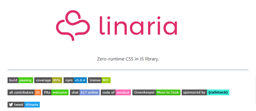
3. Linaria
Linaria is a zero-runtime CSS-in-JS library that is designed for styling JavaScript applications, including React. It offers a unique approach to styling by allowing you to write CSS code in your JavaScript files at build time, which can result in smaller bundle sizes and improved performance compared to some other CSS-in-JS solutions.
Here are some key features and concepts of Linaria:
Build-Time CSS: Linaria transforms your CSS code into efficient, minimal CSS at build time. This means that the styles you write in your JavaScript files are not shipped to the client; instead, only the CSS that is actually used in your application is included in the final bundle.
JavaScript-Based Styling: With Linaria, you write your styles using JavaScript template literals, allowing you to leverage the full power of JavaScript to create dynamic styles.
Scoped Styles: Linaria scopes styles to the component they are defined in, preventing global style collisions.
No Runtime Overhead: As the name "zero-runtime" suggests, Linaria does not add any runtime overhead to your application. It generates static CSS files during the build process, and there is no need for a runtime library on the client side.
Server-Side Rendering (SSR) Support: Linaria is designed to work well with server-side rendering, making it suitable for universal/isomorphic applications.
Vendor Prefixing: Linaria can automatically handle vendor prefixing for CSS properties, ensuring cross-browser compatibility.
Here's a simple example of using Linaria to style a React component:
import { styled } from 'linaria/react';

const Button = styled.button`
 background-color: blue;
 color: white;
 padding: 10px 20px;
 font-size: 16px;

 &:hover {
  background-color: darkblue;
 }
`;

function MyComponent() {
 return (
  <div>
   <Button>Styled Button</Button>
  </div>
 );
}

export default MyComponent;
The styled function from Linaria is used to define the button's styles as a JavaScript template literal. Linaria will generate optimized CSS during the build process and include only the styles that are used in your application.
react style library linaria
4. Vanilla Extract
Vanilla Extract is a CSS-in-JS solution designed for styling applications in a statically-typed and strongly-typed manner, primarily targeting TypeScript projects. It aims to provide a type-safe and highly performant way to style components in modern web applications. Vanilla Extract offers several features and concepts.
Static CSS Generation: Similar to Linaria, Vanilla Extract generates static CSS files at build time. This means that the styles you write in your JavaScript or TypeScript files are compiled into CSS during the build process, resulting in minimal runtime overhead.
Type-Safe Styles: One of Vanilla Extract's standout features is its strong TypeScript integration. It leverages TypeScript's type system to ensure type safety for your styles. This means that you get autocompletion and type checking when defining styles, making it less error-prone.
Composition and Theming: Vanilla Extract supports composition of styles and theming. You can easily compose styles from different sources and create theme-based styling solutions.
Scoped Styles: Styles defined in Vanilla Extract are scoped to the component they are defined in, preventing global style collisions.
Server-Side Rendering (SSR) Support: Vanilla Extract is compatible with server-side rendering, making it suitable for universal/isomorphic applications.
Vendor Prefixing: It can automatically handle vendor prefixing for CSS properties to ensure cross-browser compatibility.
Here's an example of using Vanilla Extract to style a React component:
import { style } from '@vanilla-extract/css';

const buttonStyle = style({
 backgroundColor: 'blue',
 color: 'white',
 padding: '10px 20px',
 fontSize: '16px',

 ':hover': {
  backgroundColor: 'darkblue',
 },
});

function MyComponent() {
 return (
  <div>
   <button className={buttonStyle}>Styled Button</button>
  </div>
 );
}

export default MyComponent;
You define the buttonStyle using Vanilla Extract's style function, which ensures type safety and generates optimized CSS during the build process.

react style library vanilla extract
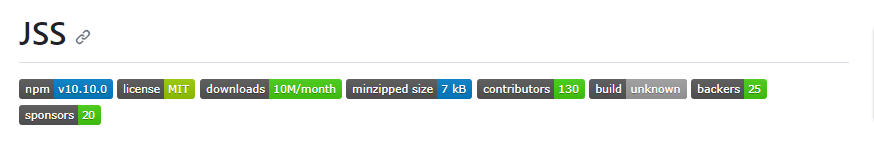
5. JSS
JSS, which stands for "JavaScript Style Sheets," is a JavaScript-based styling solution that allows you to write and manage CSS styles using JavaScript objects. It provides a programmatic way to define styles for your web applications, and it's particularly useful for styling React components. JSS is known for its flexibility, dynamic styling capabilities, and ease of integration with various JavaScript frameworks and libraries.
Key features and concepts of JSS include:
JavaScript-Based Styling: With JSS, you define your styles using JavaScript objects instead of traditional CSS files. This allows you to use JavaScript logic, variables, and functions to create dynamic styles.
Scoped Styles: JSS supports automatically generating unique class names for your styles, which helps prevent style collisions between different components. This makes it easy to scope styles to specific components.
Dynamic Styles: JSS allows you to create styles that change dynamically based on component state, props, or other variables, making it suitable for responsive and interactive user interfaces.
Server-Side Rendering (SSR) Support: JSS is often used in projects that require server-side rendering (SSR) or isomorphic rendering, as it can generate styles on both the server and the client.
Plugin System: JSS has a plugin system that allows you to extend its functionality. You can add plugins for various purposes, such as vendor prefixing, theming, or integrating with other libraries.
Here's a simplified example of using JSS with React:
import { createUseStyles } from 'react-jss';

// Define styles using JSS
const useStyles = createUseStyles({
 button: {
  backgroundColor: 'blue',
  color: 'white',
  padding: '10px 20px',
  fontSize: '16px',
  '&:hover': {
   backgroundColor: 'darkblue',
  },
 },
});

function MyComponent() {
 const classes = useStyles();

 return (
  <div>
   <button className={classes.button}>Styled Button</button>
  </div>
 );
}

export default MyComponent;
You use the createUseStyles function from react-jss to define and apply styles to the button component. JSS will generate and apply unique class names for the styles defined in the useStyles hook.
react style library jss