In this tutorial, we will create alert message in next js 13 with tailwind css. First you need to setup next js 13 with tailwind css project.
how to use tailwind css in next js 13
Next 13 with Tailwind CSS Alert Message Example
1. Create next js 13 with tailwind css simple alert message primary, secondary, success, warning, error.
export default function Home() {
  return (
    <div className="flex flex-col gap-4">
      <div className="rounded-md bg-blue-50 p-4 text-sm text-blue-500">
        A simple primary alert—check it out!
      </div>
      <div className="rounded-md bg-gray-50 p-4 text-sm text-gray-500">
        A simple secondary alert—check it out!
      </div>
      <div className="rounded-md bg-green-50 p-4 text-sm text-green-500">
        A simple success alert—check it out!
      </div>
      <div className="rounded-md bg-yellow-50 p-4 text-sm text-yellow-500">
        A simple Warning alert—check it out!
      </div>
      <div className="rounded-md bg-red-50 p-4 text-sm text-red-500">
        A simple Error alert—check it out!
      </div>
    </div>
  );
}
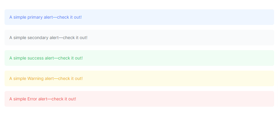
next 13 with tailwind css alert message
You can use Shadcn UI with Next.js 13, as Shadcn UI includes Tailwind CSS
next 13 with shadcn ui alert message example
2. next js 13 with tailwind css alert message with icon.
export default function Home() {
    return (
      <div className="flex flex-col gap-4">
        <div className="flex rounded-md bg-blue-50 p-4 text-sm text-blue-500">
          <svg
            xmlns="http://www.w3.org/2000/svg"
            fill="none"
            viewBox="0 0 24 24"
            strokeWidth={1.5}
            stroke="currentColor"
            className="w-5 h-5 mr-1"
          >
            <path
              strokeLinecap="round"
              strokeLinejoin="round"
              d="M11.25 11.25l.041-.02a.75.75 0 011.063.852l-.708 2.836a.75.75 0 001.063.853l.041-.021M21 12a9 9 0 11-18 0 9 9 0 0118 0zm-9-3.75h.008v.008H12V8.25z"
            />
          </svg>
          A simple primary alert—check it out!
        </div>
        <div className="flex rounded-md bg-green-50 p-4 text-sm text-green-500">
          <svg
            xmlns="http://www.w3.org/2000/svg"
            fill="none"
            viewBox="0 0 24 24"
            strokeWidth={1.5}
            stroke="currentColor"
            className="w-5 h-5 mr-1"
          >
            <path
              strokeLinecap="round"
              strokeLinejoin="round"
              d="M9 12.75L11.25 15 15 9.75M21 12a9 9 0 11-18 0 9 9 0 0118 0z"
            />
          </svg>
          A simple success alert—check it out!
        </div>
        <div className="flex rounded-md bg-yellow-50 p-4 text-sm text-yellow-500">
          <svg
            xmlns="http://www.w3.org/2000/svg"
            fill="none"
            viewBox="0 0 24 24"
            strokeWidth={1.5}
            stroke="currentColor"
            className="w-5 h-5 mr-1"
          >
            <path
              strokeLinecap="round"
              strokeLinejoin="round"
              d="M12 9v3.75m-9.303 3.376c-.866 1.5.217 3.374 1.948 3.374h14.71c1.73 0 2.813-1.874 1.948-3.374L13.949 3.378c-.866-1.5-3.032-1.5-3.898 0L2.697 16.126zM12 15.75h.007v.008H12v-.008z"
            />
          </svg>
          A simple Warning alert—check it out!
        </div>
        <div className="flex rounded-md bg-red-50 p-4 text-sm text-red-500">
          <svg
            xmlns="http://www.w3.org/2000/svg"
            fill="none"
            viewBox="0 0 24 24"
            strokeWidth={1.5}
            stroke="currentColor"
            className="w-5 h-5 mr-1"
          >
            <path
              strokeLinecap="round"
              strokeLinejoin="round"
              d="M9.75 9.75l4.5 4.5m0-4.5l-4.5 4.5M21 12a9 9 0 11-18 0 9 9 0 0118 0z"
            />
          </svg>
          A simple Error alert—check it out!
        </div>
      </div>
    );
  }
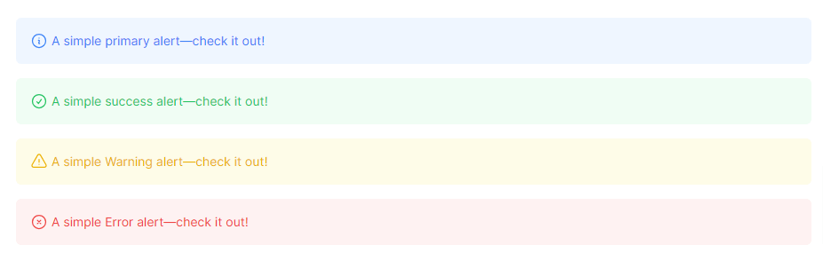
next js 13 with tailwind css alert message with icon
3. next js 13 with tailwind css alert message cross x close button.
"use client";

import * as React from "react";

export default function Home() {
  const [alertVisible, setAlertVisible] = React.useState(true);

  const closeAlert = () => {
    setAlertVisible(false);
  };

  return (
    <div className={`flex flex-col gap-4 ${alertVisible ? "" : "hidden"}`}>
      {alertVisible && (
        <div className="flex rounded-md bg-blue-50 p-4 text-sm text-blue-500">
          <svg
            xmlns="http://www.w3.org/2000/svg"
            fill="none"
            viewBox="0 0 24 24"
            strokeWidth={1.5}
            stroke="currentColor"
            className="w-5 h-5 mr-1"
          >
            <path
              strokeLinecap="round"
              strokeLinejoin="round"
              d="M11.25 11.25l.041-.02a.75.75 0 011.063.852l-.708 2.836a.75.75 0 001.063.853l.041-.021M21 12a9 9 0 11-18 0 9 9 0 0118 0zm-9-3.75h.008v.008H12V8.25z"
            />
          </svg>
          <div> A simple primary alert—check it out! </div>
          <button
            onClick={closeAlert}
            className="ml-auto mr-2 text-blue-500 hover:text-blue-700"
          >
            <svg
              xmlns="http://www.w3.org/2000/svg"
              fill="none"
              viewBox="0 0 24 24"
              strokeWidth={1.5}
              stroke="currentColor"
              className="w-5 h-5"
            >
              <path
                strokeLinecap="round"
                strokeLinejoin="round"
                d="M6 18L18 6M6 6l12 12"
              />
            </svg>
          </button>
        </div>
      )}
    </div>
  );
}
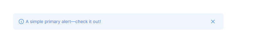
next js 13 with tailwind css close button alert message