In this tutorial, we'll explore creating various types of buttons in Next.js 13 using NextUI 2. These include regular buttons, buttons with icons, icon buttons, custom-styled buttons, and button groups. To get started, make sure you've set up a Next.js 13 project with NextUI 2.
how to use nextui 2 in next js 13
To use an buttons in Next.js 13 with NextUI 2, first, make sure you've installed the NextUI 2 Button component.
yarn add @nextui-org/button
# or
npm i @nextui-org/button
1. Create basic Button in Next.js 13 using the NextUI 2 Button component.
import { Button } from "@nextui-org/button";

export default function App() {
  return <Button color="primary">Button</Button>;
}
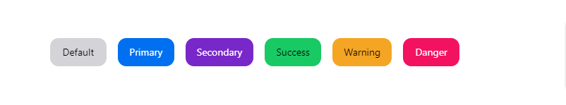
2. Creating Buttons with Different Colors in Next.js 13 with NextUI 2 - Default, Primary, Secondary, Success, Warning, and Danger.
import { Button } from "@nextui-org/button";

export default function App() {
  return (
    <div className="flex flex-wrap gap-4 items-center">
      <Button color="default">Default</Button>
      <Button color="primary">Primary</Button>
      <Button color="secondary">Secondary</Button>
      <Button color="success">Success</Button>
      <Button color="warning">Warning</Button>
      <Button color="danger">Danger</Button>
    </div>
  );
}
nextui 2 color button
3. Disabled Button in Next.js 13 with NextUI 2.
import { Button } from "@nextui-org/button";

export default function App() {
  return (
    <Button isDisabled color="primary">
      Button
    </Button>
  );
}

nextui 2 disabled button
4. Next.js 13 with NextUI 2 Button in Small, Medium, and Large Sizes.
import { Button } from "@nextui-org/button";

export default function App() {
  return (
    <div className="flex gap-4 items-center">
      <Button size="sm">Small</Button>
      <Button size="md">Medium</Button>
      <Button size="lg">Large</Button>
    </div>
  );
}

nextui 2 button sizes
5. Next.js 13 with NextUI 2 Buttons with Different Border Radius Options: Small, Medium, Large, Full, and None.
import { Button } from "@nextui-org/button";

export default function App() {
  return (
    <div className="flex gap-4 items-center">
      <Button radius="full">Full</Button>
      <Button radius="lg">Large</Button>
      <Button radius="md">Medium</Button>
      <Button radius="sm">Small</Button>
      <Button radius="none">None</Button>
    </div>
  );
}

nextui 2 button border radius
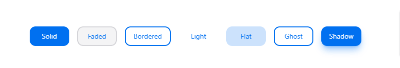
6. Exploring Button Variants in Next.js 13 with NextUI 2: Solid, Faded, Bordered, Light, Flat, Ghost, and Shadow Styles.
import { Button } from "@nextui-org/button";

export default function App() {
  return (
    <div className="flex flex-wrap gap-4 items-center">
      <Button color="primary" variant="solid">
        Solid
      </Button>
      <Button color="primary" variant="faded">
        Faded
      </Button>
      <Button color="primary" variant="bordered">
        Bordered
      </Button>
      <Button color="primary" variant="light">
        Light
      </Button>
      <Button color="primary" variant="flat">
        Flat
      </Button>
      <Button color="primary" variant="ghost">
        Ghost
      </Button>
      <Button color="primary" variant="shadow">
        Shadow
      </Button>
    </div>
  );
}
next 13 with nextui 2 button variants
7. Creating Loading Buttons in Next.js 13 with NextUI 2.
import { Button } from "@nextui-org/button";

export default function App() {
  return (
    <Button color="primary" isLoading>
      Loading
    </Button>
  );
}

nextui 2 loading button
8. Creating Spinner Loading Buttons with icon in Next.js 13 with NextUI 2.
import { Button } from "@nextui-org/button";

export default function App() {
  return (
    <Button
      isLoading
      color="secondary"
      spinner={
        <svg
          className="animate-spin h-5 w-5 text-current"
          fill="none"
          viewBox="0 0 24 24"
          xmlns="http://www.w3.org/2000/svg"
        >
          <circle
            className="opacity-25"
            cx="12"
            cy="12"
            r="10"
            stroke="currentColor"
            strokeWidth="4"
          />
          <path
            className="opacity-75"
            d="M4 12a8 8 0 018-8V0C5.373 0 0 5.373 0 12h4zm2 5.291A7.962 7.962 0 014 12H0c0 3.042 1.135 5.824 3 7.938l3-2.647z"
            fill="currentColor"
          />
        </svg>
      }
    >
      Loading
    </Button>
  );
}
9. To create a button with an icon, start by setting up your JSX or TSX file to include icons and import the necessary components.
UserIcon.jsx or UserIcon.tsx
import React from "react";

export const UserIcon = ({
 fill = 'currentColor',
 filled,
 size,
 height,
 width,
 label,
 ...props
}) => {
 return (
  <svg
   data-name="Iconly/Curved/Profile"
   xmlns="http://www.w3.org/2000/svg"
   viewBox="0 0 24 24"
   width={size || width || 24}
   height={size || height || 24}
   {...props}
  >
   <g
    fill="none"
    stroke={fill}
    strokeLinecap="round"
    strokeLinejoin="round"
    strokeMiterlimit={10}
    strokeWidth={1.5}
   >
    <path
     data-name="Stroke 1"
     d="M11.845 21.662C8.153 21.662 5 21.088 5 18.787s3.133-4.425 6.845-4.425c3.692 0 6.845 2.1 6.845 4.4s-3.134 2.9-6.845 2.9z"
    />
    <path
     data-name="Stroke 3"
     d="M11.837 11.174a4.372 4.372 0 10-.031 0z"
    />
   </g>
  </svg>
 );
};
CameraIcon.jsx or CameraIcon.tsx
import React from "react";

export const CameraIcon = ({
 fill = 'currentColor',
 filled,
 size,
 height,
 width,
 label,
 ...props
}) => {
 return (
  <svg
   width={size || width || 24}
   height={size || height || 24}
   viewBox="0 0 24 24"
   fill="none"
   xmlns="http://www.w3.org/2000/svg"
   {...props}
  >
   <path
    fillRule="evenodd"
    clipRule="evenodd"
    d="M17.44 6.236c.04.07.11.12.2.12 2.4 0 4.36 1.958 4.36 4.355v5.934A4.368 4.368 0 0117.64 21H6.36A4.361 4.361 0 012 16.645V10.71a4.361 4.361 0 014.36-4.355c.08 0 .16-.04.19-.12l.06-.12.106-.222a97.79 97.79 0 01.714-1.486C7.89 3.51 8.67 3.01 9.64 3h4.71c.97.01 1.76.51 2.22 1.408.157.315.397.822.629 1.31l.141.299.1.22zm-.73 3.836c0 .5.4.9.9.9s.91-.4.91-.9-.41-.909-.91-.909-.9.41-.9.91zm-6.44 1.548c.47-.47 1.08-.719 1.73-.719.65 0 1.26.25 1.72.71.46.459.71 1.068.71 1.717A2.438 2.438 0 0112 15.756c-.65 0-1.26-.25-1.72-.71a2.408 2.408 0 01-.71-1.717v-.01c-.01-.63.24-1.24.7-1.699zm4.5 4.485a3.91 3.91 0 01-2.77 1.15 3.921 3.921 0 01-3.93-3.926 3.865 3.865 0 011.14-2.767A3.921 3.921 0 0112 9.402c1.05 0 2.04.41 2.78 1.15.74.749 1.15 1.738 1.15 2.777a3.958 3.958 0 01-1.16 2.776z"
    fill={fill}
   />
  </svg>
 );
};
Now, import the 'UserIcon.tsx' and 'CameraIcon.tsx' components into your 'page.tsx' file.
page.tsx
import { Button } from "@nextui-org/button";
import { UserIcon } from "./UserIcon";
import { CameraIcon } from "./CameraIcon";

export default function App() {
  return (
    <div className="flex gap-4 items-center">
      <Button color="success" endContent={<CameraIcon />}>
        Take a photo
      </Button>
      <Button color="danger" variant="bordered" startContent={<UserIcon />}>
        Delete user
      </Button>
    </div>
  );
}

nextui 2 button with icon
10. Create Gradient Button with Custom Style in Next.js 13 with NextUI 2.
import { Button } from "@nextui-org/button";

export default function App() {
  return (
    <Button
      radius="full"
      className="bg-gradient-to-tr from-pink-500 to-yellow-500 text-white shadow-lg">
      Button
    </Button>
  );
}

nextui 2 gradient button
11. Creating Button Groups in Next.js 13 with NextUI 2.
import { Button, ButtonGroup } from "@nextui-org/button";

export default function App() {
  return (
    <ButtonGroup>
      <Button>One</Button>
      <Button>Two</Button>
      <Button>Three</Button>
    </ButtonGroup>
  );
}

nextui 2 groups button