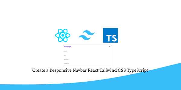
Learn to Build a Responsive Navbar Menu in React with TypeScript and Tailwind CSS. Make sure React, TypeScript, and Tailwind CSS are set up in your project before you start.
Install & Setup Tailwind CSS + React 18+ Typescript + Vite
Create a Basic Responsive Navbar Menu with React Hooks, Tailwind CSS, and TypeScript.
import React, { useState } from 'react';

const Navbar: React.FC = () => {
  const [isOpen, setIsOpen] = useState<boolean>(false);

  return (
    <nav className="bg-gray-800 p-4">
      <div className="container mx-auto flex justify-between items-center">
        <div className="flex items-center">
          <a href="#" className="text-white font-bold text-lg">
            YourLogo
          </a>
        </div>
        <div className="hidden md:block">
          <a href="#" className="text-white mr-4">
            Home
          </a>
          <a href="#" className="text-white mr-4">
            About
          </a>
          <a href="#" className="text-white">
            Contact
          </a>
        </div>
        <div className="md:hidden">
          <button
            onClick={() => setIsOpen(!isOpen)}
            className="text-white focus:outline-none"
          >
            <svg
              className="h-6 w-6 fill-current"
              xmlns="http://www.w3.org/2000/svg"
              viewBox="0 0 24 24"
            >
              {isOpen ? (
                <path
                  fillRule="evenodd"
                  clipRule="evenodd"
                  d="M4 6h16v1H4V6zm16 4H4v1h16v-1zm-16 5h16v1H4v-1z"
                />
              ) : (
                <path
                  fillRule="evenodd"
                  clipRule="evenodd"
                  d="M3 18v-2h18v2H3zm0-7h18v2H3v-2zm0-7h18v2H3V4z"
                />
              )}
            </svg>
          </button>
        </div>
      </div>
      {/* Mobile Menu */}
      {isOpen && (
        <div className="md:hidden mt-4">
          <a href="#" className="block text-white my-2">
            Home
          </a>
          <a href="#" className="block text-white my-2">
            About
          </a>
          <a href="#" className="block text-white my-2">
            Contact
          </a>
        </div>
      )}
    </nav>
  );
};

export default Navbar;

react typescript tailwind css navbar
Build a Responsive Navbar with Hamburger Menu and Close (X) Button Using React Hooks, Tailwind CSS, and TypeScript. Discover the Perfect Blend of Functionality and Style for Your Navigation Needs.
import React, { useState } from "react";

const NavBar: React.FC = () => {
  const [navbar, setNavbar] = useState<boolean>(false);

  return (
    <nav className="w-full bg-white shadow">
      <div className="justify-between px-4 mx-auto lg:max-w-7xl md:items-center md:flex md:px-8">
        <div>
          <div className="flex items-center justify-between py-3 md:py-5 md:block">
            <h2 className="text-2xl font-bold text-purple-600">YourLogo</h2>
            <div className="md:hidden">
              <button
                className="p-2 text-gray-700 rounded-md outline-none focus:border-gray-400 focus:border"
                onClick={() => setNavbar(!navbar)}
              >
                {navbar ? (
                  <svg
                    xmlns="http://www.w3.org/2000/svg"
                    className="w-6 h-6"
                    viewBox="0 0 20 20"
                    fill="currentColor"
                  >
                    <path
                      fillRule="evenodd"
                      d="M4.293 4.293a1 1 0 011.414 0L10 8.586l4.293-4.293a1 1 0 111.414 1.414L11.414 10l4.293 4.293a1 1 0 01-1.414 1.414L10 11.414l-4.293 4.293a1 1 0 01-1.414-1.414L8.586 10 4.293 5.707a1 1 0 010-1.414z"
                      clipRule="evenodd"
                    />
                  </svg>
                ) : (
                  <svg
                    xmlns="http://www.w3.org/2000/svg"
                    className="w-6 h-6"
                    fill="none"
                    viewBox="0 0 24 24"
                    stroke="currentColor"
                    strokeWidth={2}
                  >
                    <path
                      strokeLinecap="round"
                      strokeLinejoin="round"
                      d="M4 6h16M4 12h16M4 18h16"
                    />
                  </svg>
                )}
              </button>
            </div>
          </div>
        </div>
        <div>
          <div
            className={`flex-1 justify-self-center pb-3 mt-8 md:block md:pb-0 md:mt-0 ${
              navbar ? "block" : "hidden"
            }`}
          >
            <ul className="items-center justify-center space-y-8 md:flex md:space-x-6 md:space-y-0">
              <li className="text-gray-600 hover:text-purple-600 cursor-pointer">
                Home
              </li>
              <li className="text-gray-600 hover:text-purple-600 cursor-pointer">
                Blog
              </li>
              <li className="text-gray-600 hover:text-purple-600 cursor-pointer">
                About US
              </li>
              <li className="text-gray-600 hover:text-purple-600 cursor-pointer">
                Contact US
              </li>
            </ul>
          </div>
        </div>
      </div>
    </nav>
  );
};

export default NavBar;

react typescript tailwind css navbar with hamburger menu
Related Posts
React TypeScript Tailwind CSS Popup Modal Tutorial
How to Use Toastify in React with Tailwind CSS
React with Tailwind CSS File Upload Example
React Tailwind CSS Forgot Password Example
How to Add Drag-and-Drop Image Upload with Dropzone in React Using Tailwind CSS
