In this tutorial, we’ll create a popup modal in your React TypeScript project using Tailwind CSS. Before you begin, ensure your project has React, TypeScript, and Tailwind CSS installed and configured.
React TypeScript Simple Popup Modal with Tailwind CSS
Create a new file named Modal.tsx in your src/components folder.
import React from 'react';

interface ModalProps {
  isOpen: boolean;
  onClose: () => void;
}

const Modal: React.FC<ModalProps> = ({ isOpen, onClose }) => {
  if (!isOpen) {
    return null;
  }

  return (
    <div className="fixed inset-0 bg-gray-500 bg-opacity-75 flex items-center justify-center">
      <div className="bg-white p-8 rounded w-96 text-center">
        <h2 className="text-2xl font-bold mb-4">Modal Content</h2>
        <p>This is the content of the modal.</p>
        <button
          className="mt-4 bg-red-500 hover:bg-red-700 text-white py-2 px-4 rounded"
          onClick={onClose}
        >
          Close Modal
        </button>
      </div>
    </div>
  );
};

export default Modal;
Update your src/App.tsx file to import and use the Modal.tsx component.
import React, { useState } from 'react';
import Modal from './components/Modal';

const App: React.FC = () => {
  const [isModalOpen, setModalOpen] = useState(false);

  const openModal = () => {
    setModalOpen(true);
  };

  const closeModal = () => {
    setModalOpen(false);
  };

  return (
    <div className="min-h-screen flex items-center justify-center">
      <button
        className="bg-blue-500 hover:bg-blue-700 text-white py-2 px-4 rounded"
        onClick={openModal}
      >
        Open Modal
      </button>

      <Modal isOpen={isModalOpen} onClose={closeModal} />
    </div>
  );
};

export default App;
React TypeScript Tailwind CSS Popup Modal Outside Click to Close
Create a React modal component with TypeScript and Tailwind CSS. Include a close button, implement outside click functionality, and add a cross SVG icon.
Create a reusable CloseButton.tsx component:
import React from 'react';

interface CloseButtonProps {
  onClick: () => void;
}

const CloseButton: React.FC<CloseButtonProps> = ({ onClick }) => (
  <button
    className="absolute top-4 right-4 text-gray-600 hover:text-gray-800"
    onClick={onClick}
  >
    <svg
      xmlns="http://www.w3.org/2000/svg"
      fill="none"
      viewBox="0 0 24 24"
      stroke="currentColor"
      className="h-6 w-6"
    >
      <path
        strokeLinecap="round"
        strokeLinejoin="round"
        strokeWidth={2}
        d="M6 18L18 6M6 6l12 12"
      />
    </svg>
  </button>
);

export default CloseButton;
Update the Modal component to use the CloseButton.tsx and handle outside click:
import React, { useEffect, useRef } from 'react';
import CloseButton from './CloseButton';

interface ModalProps {
  isOpen: boolean;
  onClose: () => void;
  children: React.ReactNode;
}

const Modal: React.FC<ModalProps> = ({ isOpen, onClose, children }) => {
  const modalRef = useRef<HTMLDivElement>(null);

  useEffect(() => {
    const handleOutsideClick = (event: MouseEvent) => {
      if (modalRef.current && !modalRef.current.contains(event.target as Node)) {
        onClose();
      }
    };

    if (isOpen) {
      document.addEventListener('mousedown', handleOutsideClick);
    }

    return () => {
      document.removeEventListener('mousedown', handleOutsideClick);
    };
  }, [isOpen, onClose]);

  return (
    <>
      {isOpen && (
        <div className="fixed inset-0 bg-gray-500 bg-opacity-75 flex items-center justify-center">
          <div ref={modalRef} className="bg-white p-8 rounded w-96 relative text-center">
            <CloseButton onClick={onClose} />
            {children}
          </div>
        </div>
      )}
    </>
  );
};

export default Modal;
Update the App.tsx file to use the enhanced Modal.tsx component:
import React, { useState } from 'react';
import Modal from './components/Modal';

const App: React.FC = () => {
  const [isModalOpen, setModalOpen] = useState(false);

  const openModal = () => {
    setModalOpen(true);
  };

  const closeModal = () => {
    setModalOpen(false);
  };

  return (
    <div className="min-h-screen flex items-center justify-center">
      <button
        className="bg-blue-500 hover:bg-blue-700 text-white font-bold py-2 px-4 rounded"
        onClick={openModal}
      >
        Open Modal
      </button>

      <Modal isOpen={isModalOpen} onClose={closeModal}>
        <h2 className="text-2xl font-bold mb-4">Modal Content</h2>
        <p>This is the content of the modal.</p>
        <button
          className="mt-4 bg-red-500 hover:bg-red-700 text-white py-2 px-4 rounded"
          onClick={closeModal}
        >
          Close Modal
        </button>
      </Modal>
    </div>
  );
};

export default App;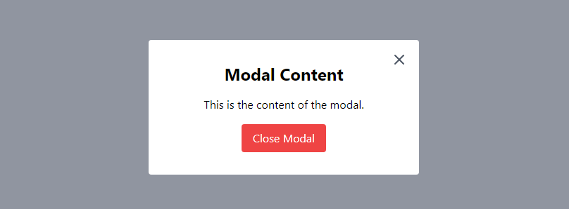
React TypeScript Tailwind CSS Confirmation Modal
Create a reusable CloseButton.tsx component:
import React from 'react';

interface CloseButtonProps {
  onClick: () => void;
}

const CloseButton: React.FC<CloseButtonProps> = ({ onClick }) => (
  <button
    className="absolute top-4 right-4 text-gray-600 hover:text-gray-800"
    onClick={onClick}
  >
    <svg
      xmlns="http://www.w3.org/2000/svg"
      fill="none"
      viewBox="0 0 24 24"
      stroke="currentColor"
      className="h-6 w-6"
    >
      <path
        strokeLinecap="round"
        strokeLinejoin="round"
        strokeWidth={2}
        d="M6 18L18 6M6 6l12 12"
      />
    </svg>
  </button>
);

export default CloseButton;
Create a new component named ConfirmationModal.tsx:
import React from 'react';
import CloseButton from './CloseButton';

interface ConfirmationModalProps {
  isOpen: boolean;
  onClose: () => void;
  onConfirm: () => void;
}

const ConfirmationModal: React.FC<ConfirmationModalProps> = ({ isOpen, onClose, onConfirm }) => {
  return (
    <>
      {isOpen && (
        <div className="fixed inset-0 bg-gray-500 bg-opacity-75 flex items-center justify-center">
          <div className="bg-white p-8 rounded w-96 relative">
            <CloseButton onClick={onClose} />

            <h2 className="text-2xl font-bold mb-4">Confirmation</h2>
            <p>Are you sure you want to perform this action?</p>

            <div className="flex justify-between mt-4">
              <button
                className="bg-gray-500 hover:bg-gray-700 text-white font-bold py-2 px-4 rounded mr-2"
                onClick={onClose}
              >
                Cancel
              </button>
              <button
                className="bg-red-500 hover:bg-red-700 text-white font-bold py-2 px-4 rounded"
                onClick={() => {
                  onConfirm();
                  onClose();
                }}
              >
                Confirm
              </button>
            </div>
          </div>
        </div>
      )}
    </>
  );
};

export default ConfirmationModal;
Update the App.tsx file to use the ConfirmationModal component:
import React, { useState } from 'react';
import ConfirmationModal from './components/ConfirmationModal';

const App: React.FC = () => {
  const [isConfirmationModalOpen, setConfirmationModalOpen] = useState(false);

  const openConfirmationModal = () => {
    setConfirmationModalOpen(true);
  };

  const closeConfirmationModal = () => {
    setConfirmationModalOpen(false);
  };

  const handleConfirm = () => {
    console.log('Confirmed!');
    // Add your confirmation logic here
  };

  return (
    <div className="min-h-screen flex items-center justify-center">
      <button
        className="bg-blue-500 hover:bg-blue-700 text-white font-bold py-2 px-4 rounded"
        onClick={openConfirmationModal}
      >
        Open Confirmation Modal
      </button>

      <ConfirmationModal
        isOpen={isConfirmationModalOpen}
        onClose={closeConfirmationModal}
        onConfirm={handleConfirm}
      />
    </div>
  );
};

export default App;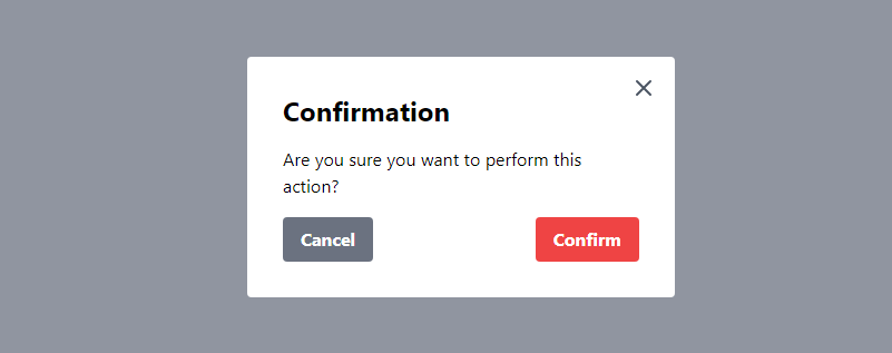
Sources
- react useState (react.dev)
- Tailwind CSS (tailwindcss.com)
See Also
How to Add Drag-and-Drop Image Upload with Dropzone in React Using Tailwind CSS
