In this tutorial, we will create buttons in next js 13 with shadcn ui. First you need to setup next js 13 with shadcn ui project.
how to use shadcn ui in next js 13
Before use button in next js 13 with shadcn ui you need to install npx shadcn-ui add button.
npx shadcn-ui add button
or
npx shadcn-ui@latest add
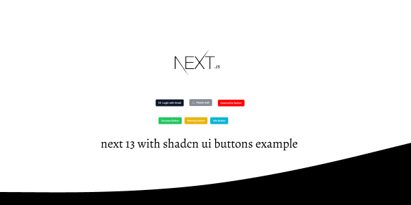
Next 13 with Shadcn UI Buttons Example
1. Create next js 13 with shadcn ui simple primary button using shadcn-ui Button component.
import { Button } from "@/components/ui/button"

export default function ButtonDemo() {
  return <Button>Button</Button>
}

next js 13 with shadcn ui button
2. next js 13 with shadcn ui secondary button.
import { Button } from "@/components/ui/button"

export default function ButtonSecondary() {
  return <Button variant="secondary">Secondary</Button>
}

next js 13 with shadcn ui secondary button
3. next js 13 with shadcn ui error destructive button.
import { Button } from "@/components/ui/button"

export default function ButtonDestructive() {
  return <Button variant="destructive">Destructive Button</Button>
}

shadcn ui error destructive button
4. next js 13 with shadcn ui outline button.
import { Button } from "@/components/ui/button"

export default function ButtonOutline() {
  return <Button variant="outline">Outline Button</Button>
}

shadcn ui outline button
5. next js 13 with shadcn ui ghost button.
import { Button } from "@/components/ui/button"

export default function ButtonGhost() {
  return <Button variant="ghost">Shost Button</Button>
}
6. next js 13 with shadcn ui link button.
import { Button } from "@/components/ui/button"

export default function ButtonLink() {
  return <Button variant="link">Link Button</Button>
}
7. next js 13 with shadcn ui custom button with success, warning, info.
import { Button } from "@/components/ui/button"

export default function CustomButton() {
  return (
    <div className="flex justify-center items-center  gap-4 mt-20">
      <Button className="bg-green-500">Success Button</Button>
      <Button className="bg-yellow-500">Warning Button</Button>
      <Button className="bg-cyan-500">Info Button</Button>
    </div>
  )
}

next 13 with shadcn ui custom button
8. next js 13 with shadcn ui button with icon.
import { Mail } from "lucide-react"

import { Button } from "@/components/ui/button"

export default function ButtonWithIcon() {
  return (
    <Button>
      <Mail className="mr-2 h-4 w-4" /> Login with Email
    </Button>
  )
}

next 13 with shadcn ui button with icon
9. next js 13 with shadcn ui loading button with icon.
import { Loader2 } from "lucide-react"

import { Button } from "@/components/ui/button"

export default function ButtonLoading() {
  return (
    <Button disabled>
      <Loader2 className="mr-2 h-4 w-4 animate-spin" />
      Please wait
    </Button>
  )
}

next 13 with shadcn ui loading button
Related Posts
create a accordion in nextjs 13 with shadcn ui
create sidebar in next 13 with shadcn ui
create footer section in next 13 with shadcn ui
create file upload in nextjs 13 with shadcn ui
next 13 with shadcn ui input field example
next 13 with shadcn ui cards example
next 13 with shadcn ui search bar example
next 13 with shadcn ui login page example
next 13 with shadcn ui sign up form example
next 13 with shadcn ui radio group example
next 13 with shadcn ui pagination example
next 13 with shadcn ui table example
next 13 with shadcn ui checkbox example
next 13 with shadcn ui dropdown menu example
how to use skeleton loading next 13 with shadcn ui
how to use data table next 13 with shadcn ui
how to use modal dialog next 13 with shadcn ui
how to use tabs next 13 with shadcn ui
how to use toggle switch next 13 with shadcn ui
