In this tutorial, we will create login page in next js 13 with shadcn ui. First you need to setup next js 13 with shadcn ui project.
how to use shadcn ui in next js 13
Before create sign in page you need to install shadcn ui card, button, lablel, checkbox component.
npx shadcn-ui@latest add
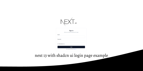
Next 13 with Shadcn UI Login Page Example
1. Create next js 13 with shadcn ui responsive login page using shadcn-ui Button, Card, CardContent, CardDescription, CardFooter, CardHeader, CardTitle, Checkbox, Input, Label component.
"use client"

import { Button } from "@/components/ui/button"
import {
  Card,
  CardContent,
  CardDescription,
  CardFooter,
  CardHeader,
  CardTitle,
} from "@/components/ui/card"
import { Checkbox } from "@/components/ui/checkbox"
import { Input } from "@/components/ui/input"
import { Label } from "@/components/ui/label"

export default function LoginAccount() {
  return (
    <div className="relative flex flex-col justify-center items-center min-h-screen overflow-hidden">
      <div className="w-full m-auto bg-white lg:max-w-lg">
        <Card>
          <CardHeader className="space-y-1">
            <CardTitle className="text-2xl text-center">Sign in</CardTitle>
            <CardDescription className="text-center">
              Enter your email and password to login
            </CardDescription>
          </CardHeader>
          <CardContent className="grid gap-4">
            <div className="grid gap-2">
              <Label htmlFor="email">Email</Label>
              <Input id="email" type="email" placeholder="" />
            </div>
            <div className="grid gap-2">
              <Label htmlFor="password">Password</Label>
              <Input id="password" type="password" />
            </div>
            <div className="flex items-center space-x-2">
              <Checkbox id="terms" />
              <label
                htmlFor="terms"
                className="text-sm font-medium leading-none peer-disabled:cursor-not-allowed peer-disabled:opacity-70"
              >
                Remember me
              </label>
            </div>
          </CardContent>
          <CardFooter className="flex flex-col">
            <Button className="w-full">Login</Button>
            <p className="mt-2 text-xs text-center text-gray-700">
              {" "}
              Don't have an account?{" "}
              <span className=" text-blue-600 hover:underline">Sign up</span>
            </p>
          </CardFooter>
        </Card>
      </div>
    </div>
  )
}
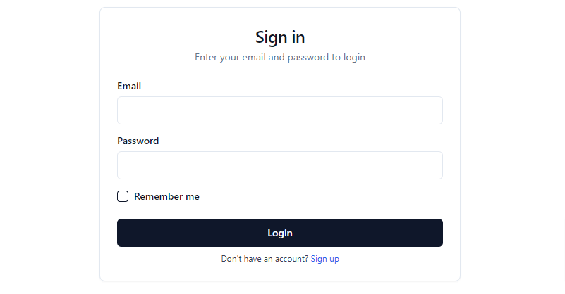
shadcn-ui sign in form
2. next js 13 with shadcn ui responsive login page with social media icon.
"use client"

import { Button } from "@/components/ui/button"
import {
  Card,
  CardContent,
  CardDescription,
  CardFooter,
  CardHeader,
  CardTitle,
} from "@/components/ui/card"
import { Checkbox } from "@/components/ui/checkbox"
import { Input } from "@/components/ui/input"
import { Label } from "@/components/ui/label"
import { Icons } from "@/components/icons"

export default function LoginAccount() {
  return (
    <div className="relative flex flex-col justify-center items-center min-h-screen overflow-hidden">
      <div className="w-full m-auto bg-white lg:max-w-lg">
        <Card>
          <CardHeader className="space-y-1">
            <CardTitle className="text-2xl text-center">Sign in</CardTitle>
            <CardDescription className="text-center">
              Enter your email and password to login
            </CardDescription>
          </CardHeader>
          <CardContent className="grid gap-4">
            <div className="grid gap-2">
              <Label htmlFor="email">Email</Label>
              <Input id="email" type="email" placeholder="" />
            </div>
            <div className="grid gap-2">
              <Label htmlFor="password">Password</Label>
              <Input id="password" type="password" />
            </div>
            <div className="flex items-center space-x-2">
              <Checkbox id="terms" />
              <label
                htmlFor="terms"
                className="text-sm font-medium leading-none peer-disabled:cursor-not-allowed peer-disabled:opacity-70"
              >
                Remember me
              </label>
            </div>
          </CardContent>
          <CardFooter className="flex flex-col">
            <Button className="w-full">Login</Button>
          </CardFooter>
          <div className="relative mb-2">
            <div className="absolute inset-0 flex items-center">
              <span className="w-full border-t" />
            </div>
            <div className="relative flex justify-center text-xs uppercase">
              <span className="bg-background px-2 text-muted-foreground">
                Or continue with
              </span>
            </div>
          </div>
          <div className="grid grid-cols-2 gap-6 m-2">
            <Button variant="outline">
              <Icons.gitHub className="mr-2 h-4 w-4" />
              Github
            </Button>
            <Button variant="outline">
              <Icons.twitter className="mr-2 h-4 w-4" />
              Twitter
            </Button>
          </div>

          <p className="mt-2 text-xs text-center text-gray-700 mb-2">
            {" "}
            Don't have an account?{" "}
            <span className=" text-blue-600 hover:underline">Sign up</span>
          </p>
        </Card>
      </div>
    </div>
  )
}
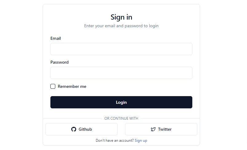
shadcn ui responsive login page with social media icon
3. next js 13 with shadcn ui sign in page with image.
import { Metadata } from "next"
import Image from "next/image"
import Link from "next/link"
import { cn } from "@/lib/utils"
import { Button, buttonVariants } from "@/components/ui/button"
import {
Card,
CardContent,
CardDescription,
CardFooter,
CardHeader,
CardTitle,
} from "@/components/ui/card"
import { Checkbox } from "@/components/ui/checkbox"
import { Input } from "@/components/ui/input"
import { Label } from "@/components/ui/label"
export const metadata: Metadata = {
title: "Authentication",
description: "Authentication forms built using the components.",
}
export default function AuthenticationPage() {
return (
<>
<div className="md:hidden">
<Image
src="/examples/authentication-light.png"
width={1280}
height={843}
alt="Authentication"
className="block dark:hidden"
/>
<Image
src="/examples/authentication-dark.png"
width={1280}
height={843}
alt="Authentication"
className="hidden dark:block"
/>
</div>
<div className="container relative hidden h-[800px] flex-col items-center justify-center md:grid lg:max-w-none lg:grid-cols-2 lg:px-0">
<Link
href="/examples/authentication"
className={cn(
buttonVariants({ variant: "ghost" }),
"absolute right-4 top-4 md:right-8 md:top-8"
)}
>
Login
</Link>
<div className="relative hidden h-full flex-col bg-muted p-10 text-white dark:border-r lg:flex">
<div className="absolute inset-0 bg-zinc-900" />
<div className="relative z-20 flex items-center text-lg font-medium">
<svg
xmlns="http://www.w3.org/2000/svg"
viewBox="0 0 24 24"
fill="none"
stroke="currentColor"
strokeWidth="2"
strokeLinecap="round"
strokeLinejoin="round"
className="mr-2 h-6 w-6"
>
<path d="M15 6v12a3 3 0 1 0 3-3H6a3 3 0 1 0 3 3V6a3 3 0 1 0-3 3h12a3 3 0 1 0-3-3" />
</svg>
Acme Inc
</div>
<div className="relative z-20 mt-auto">
<blockquote className="space-y-2">
<p className="text-lg">
“This library has saved me countless hours of work and
helped me deliver stunning designs to my clients faster than
ever before.”
</p>
<footer className="text-sm">Sofia Davis</footer>
</blockquote>
</div>
</div>
<div className="lg:p-8">
<div className="mx-auto flex w-full flex-col justify-center space-y-6 lg:max-w-lg">
<Card>
<CardHeader className="space-y-1">
<CardTitle className="text-2xl text-center">
Sign in
</CardTitle>
<CardDescription className="text-center">
Enter your email and password to login
</CardDescription>
</CardHeader>
<CardContent className="grid gap-4">
<div className="grid gap-2">
<Label htmlFor="email">Email</Label>
<Input id="email" type="email" placeholder="" />
</div>
<div className="grid gap-2">
<Label htmlFor="password">Password</Label>
<Input id="password" type="password" />
</div>
<div className="flex items-center space-x-2">
<Checkbox id="terms" />
<label
htmlFor="terms"
className="text-sm font-medium leading-none peer-disabled:cursor-not-allowed peer-disabled:opacity-70"
>
Remember me
</label>
</div>
</CardContent>
<CardFooter className="flex flex-col">
<Button className="w-full">Login</Button>
<p className="mt-2 text-xs text-center text-gray-700">
{" "}
Don't have an account?{" "}
<span className=" text-blue-600 hover:underline">
Sign up
</span>
</p>
</CardFooter>
</Card>
<p className="px-8 text-center text-sm text-muted-foreground">
By clicking continue, you agree to our{" "}
<Link
href="/terms"
className="underline underline-offset-4 hover:text-primary"
>
Terms of Service
</Link>{" "}
and{" "}
<Link
href="/privacy"
className="underline underline-offset-4 hover:text-primary"
>
Privacy Policy
</Link>
.
</p>
</div>
</div>
</div>
</>
)
}
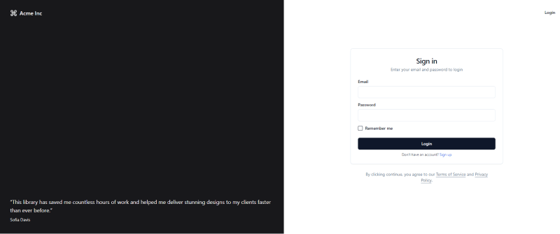
next js 13 shadcn ui sign in form with image
Related Posts
create a accordion in nextjs 13 with shadcn ui
create sidebar in next 13 with shadcn ui
create footer section in next 13 with shadcn ui
create file upload in nextjs 13 with shadcn ui
next 13 with shadcn ui input field example
next 13 with shadcn ui cards example
next 13 with shadcn ui search bar example
next 13 with shadcn ui sign up form example
next 13 with shadcn ui radio group example
next 13 with shadcn ui buttons example
next 13 with shadcn ui pagination example
next 13 with shadcn ui table example
next 13 with shadcn ui checkbox example
next 13 with shadcn ui dropdown menu example
how to use skeleton loading next 13 with shadcn ui
how to use data table next 13 with shadcn ui
how to use modal dialog next 13 with shadcn ui
how to use tabs next 13 with shadcn ui
how to use toggle switch next 13 with shadcn ui
