In this tutorial, we will create cards in next js 13 with shadcn ui. First you need to setup next js 13 with shadcn ui project.
how to use shadcn ui in next js 13
Next.js with Shadcn UI Product Cards Example
Before use card in next js 13 with shadcn ui you need to install npx shadcn-ui add card.
npx shadcn-ui add card
or
npx shadcn-ui@latest add
Next 13 with Shadcn UI Cards Example
1. Create next js 13 with shadcn ui simple card using shadcn-ui Card, CardContent, CardDescription, CardFooter, CardHeader, CardTitle, component.
import {
  Card,
  CardContent,
  CardDescription,
  CardFooter,
  CardHeader,
  CardTitle,
} from "@/components/ui/card"

export default function CardDemo() {
  return (
    <Card className="lg:max-w-md w-full">
      <CardHeader>
        <CardTitle>Card Title</CardTitle>
        <CardDescription>Card Description</CardDescription>
      </CardHeader>
      <CardContent>
        <p>Card Content</p>
      </CardContent>
      <CardFooter>
        <p>Card Footer</p>
      </CardFooter>
    </Card>
  )
}
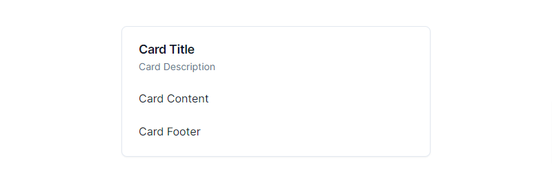
next 13 with shadcn ui cards
2. next js 13 with shadcn ui card with image.
import {
  Card,
  CardContent,
  CardDescription,
  CardFooter,
  CardHeader,
  CardTitle,
} from "@/components/ui/card"

export default function CardDemo() {
  return (
    <Card className="lg:max-w-md w-full">
      <CardHeader>
        <CardTitle>Card Title</CardTitle>
        <CardDescription>Card Description</CardDescription>
      </CardHeader>
      <CardContent>
        <img
          src="https://cdn.pixabay.com/photo/2023/03/16/16/49/watercolor-7857103_640.png"
          alt="Card Image"
          className="w-full"
        />
      </CardContent>
      <CardFooter>
        <p>Card Footer</p>
      </CardFooter>
    </Card>
  )
}
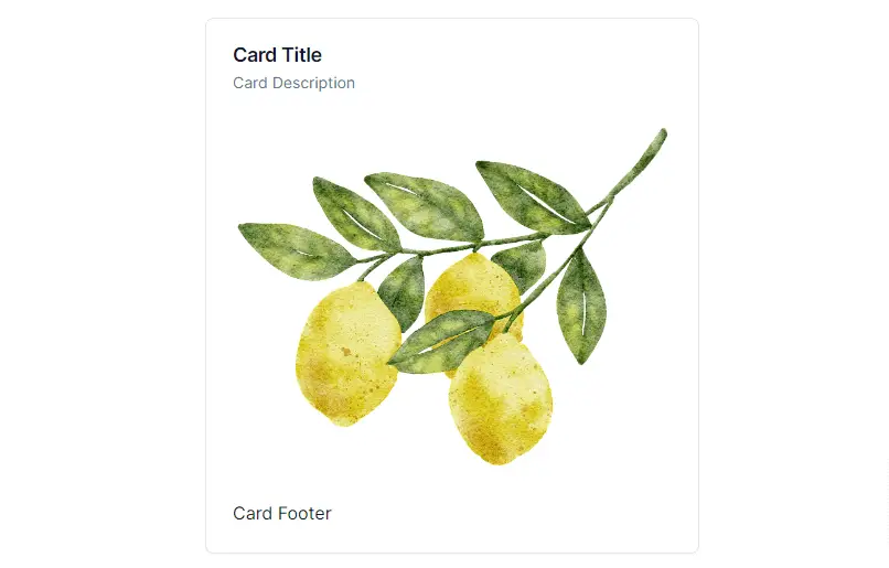
next 13 with shadcn ui card with image
3. next js 13 with shadcn ui notifications card with message.
import { BellRing, Check } from "lucide-react"

import { cn } from "@/lib/utils"
import { Button } from "@/components/ui/button"
import {
  Card,
  CardContent,
  CardDescription,
  CardFooter,
  CardHeader,
  CardTitle,
} from "@/components/ui/card"
import { Switch } from "@/components/ui/switch"

const notifications = [
  {
    title: "Your call has been confirmed.",
    description: "1 hour ago",
  },
  {
    title: "You have a new message!",
    description: "1 hour ago",
  },
  {
    title: "Your subscription is expiring soon!",
    description: "2 hours ago",
  },
]

type CardProps = React.ComponentProps<typeof Card>

export default function CardDemo({ className, ...props }: CardProps) {
  return (
    <Card className={cn("w-[380px]", className)} {...props}>
      <CardHeader>
        <CardTitle>Notifications</CardTitle>
        <CardDescription>You have 3 unread messages.</CardDescription>
      </CardHeader>
      <CardContent className="grid gap-4">
        <div className=" flex items-center space-x-4 rounded-md border p-4">
          <BellRing />
          <div className="flex-1 space-y-1">
            <p className="text-sm font-medium leading-none">
              Push Notifications
            </p>
            <p className="text-sm text-muted-foreground">
              Send notifications to device.
            </p>
          </div>
          <Switch />
        </div>
        <div>
          {notifications.map((notification, index) => (
            <div
              key={index}
              className="mb-4 grid grid-cols-[25px_1fr] items-start pb-4 last:mb-0 last:pb-0"
            >
              <span className="flex h-2 w-2 translate-y-1 rounded-full bg-sky-500" />
              <div className="space-y-1">
                <p className="text-sm font-medium leading-none">
                  {notification.title}
                </p>
                <p className="text-sm text-muted-foreground">
                  {notification.description}
                </p>
              </div>
            </div>
          ))}
        </div>
      </CardContent>
      <CardFooter>
        <Button className="w-full">
          <Check className="mr-2 h-4 w-4" /> Mark all as read
        </Button>
      </CardFooter>
    </Card>
  )
}
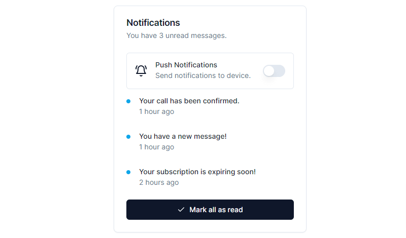
shadcn ui card
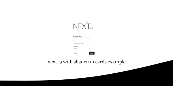
4. next js 13 with shadcn ui card with form.
import * as React from "react"

import { Button } from "@/components/ui/button"
import {
  Card,
  CardContent,
  CardDescription,
  CardFooter,
  CardHeader,
  CardTitle,
} from "@/components/ui/card"
import { Input } from "@/components/ui/input"
import { Label } from "@/components/ui/label"
import {
  Select,
  SelectContent,
  SelectItem,
  SelectTrigger,
  SelectValue,
} from "@/components/ui/select"

export default function CardWithForm() {
  return (
    <Card className="w-[350px]">
      <CardHeader>
        <CardTitle>Create project</CardTitle>
        <CardDescription>Deploy your new project in one-click.</CardDescription>
      </CardHeader>
      <CardContent>
        <form>
          <div className="grid w-full items-center gap-4">
            <div className="flex flex-col space-y-1.5">
              <Label htmlFor="name">Name</Label>
              <Input id="name" placeholder="Name of your project" />
            </div>
            <div className="flex flex-col space-y-1.5">
              <Label htmlFor="name">Framework</Label>
              <Select>
                <SelectTrigger>
                  <SelectValue placeholder="Select" />
                  <SelectContent position="popper">
                    <SelectItem value="next">Next.js</SelectItem>
                    <SelectItem value="sveltekit">SvelteKit</SelectItem>
                    <SelectItem value="astro">Astro</SelectItem>
                    <SelectItem value="nuxt">Nuxt.js</SelectItem>
                  </SelectContent>
                </SelectTrigger>
              </Select>
            </div>
          </div>
        </form>
      </CardContent>
      <CardFooter className="flex justify-between">
        <Button variant="ghost">Cancel</Button>
        <Button>Deploy</Button>
      </CardFooter>
    </Card>
  )
}
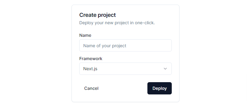
nextjs shadcn ui card with form
Related Posts
create a accordion in nextjs 13 with shadcn ui
create sidebar in next 13 with shadcn ui
create footer section in next 13 with shadcn ui
create file upload in nextjs 13 with shadcn ui
next 13 with shadcn ui input field example
next 13 with shadcn ui search bar example
next 13 with shadcn ui login page example
next 13 with shadcn ui sign up form example
next 13 with shadcn ui radio group example
next 13 with shadcn ui buttons example
next 13 with shadcn ui pagination example
next 13 with shadcn ui table example
next 13 with shadcn ui checkbox example
next 13 with shadcn ui dropdown menu example
how to use skeleton loading next 13 with shadcn ui
how to use data table next 13 with shadcn ui
how to use modal dialog next 13 with shadcn ui
how to use tabs next 13 with shadcn ui
how to use toggle switch next 13 with shadcn ui
