In this tutorial, we will see how to use dark mode & light toggle in next js 13 with shadcn ui. First you need to setup next js 13 with shadcn ui project.
how to use shadcn ui in next js 13
Create a theme provider
First you need to create components/theme-provider.tsx.
components/theme-provider.tsx
"use client"

import * as React from "react"
import { ThemeProvider as NextThemesProvider } from "next-themes"
import { ThemeProviderProps } from "next-themes/dist/types"

export function ThemeProvider({ children, ...props }: ThemeProviderProps) {
  return <NextThemesProvider {...props}>{children}</NextThemesProvider>
}
Wrap your root layout
Add the ThemeProvider to your root layout.
app/layout.tsx
import { ThemeProvider } from "@/components/theme-provider"

export default function RootLayout({ children }: RootLayoutProps) {
 return (
  <>
   <html lang="en" suppressHydrationWarning>
    <head />
    <body>
     <ThemeProvider attribute="class" defaultTheme="system" enableSystem>
      {children}
     </ThemeProvider>
    </body>
   </html>
  </>
 )
}
Add a mode toggle
Place a mode toggle on your site to toggle between light and dark mode.
"use client"
import * as React from "react"
import { Moon, Sun } from "lucide-react"
import { useTheme } from "next-themes"
import { Button } from "@/components/ui/button"
import {
DropdownMenu,
DropdownMenuContent,
DropdownMenuItem,
DropdownMenuTrigger,
} from "@/components/ui/dropdown-menu"
export default function ModeToggle() {
const { setTheme } = useTheme()
return (
<div className="flex justify-center items-center min-h-screen flex-col">
<DropdownMenu>
<DropdownMenuTrigger asChild>
<Button variant="outline" size="sm">
<Sun className="h-[1.2rem] w-[1.2rem] rotate-0 scale-100 transition-all dark:-rotate-90 dark:scale-0" />
<Moon className="absolute h-[1.2rem] w-[1.2rem] rotate-90 scale-0 transition-all dark:rotate-0 dark:scale-100" />
<span className="sr-only">Toggle theme</span>
</Button>
</DropdownMenuTrigger>
<DropdownMenuContent align="end">
<DropdownMenuItem onClick={() => setTheme("light")}>
Light
</DropdownMenuItem>
<DropdownMenuItem onClick={() => setTheme("dark")}>
Dark
</DropdownMenuItem>
<DropdownMenuItem onClick={() => setTheme("system")}>
System
</DropdownMenuItem>
</DropdownMenuContent>
</DropdownMenu>
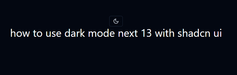
<h1 className="text-4xl font-extrabol dark:text-white">
how to use dark mode next 13 with shadcn ui
</h1>
</div>
)
}

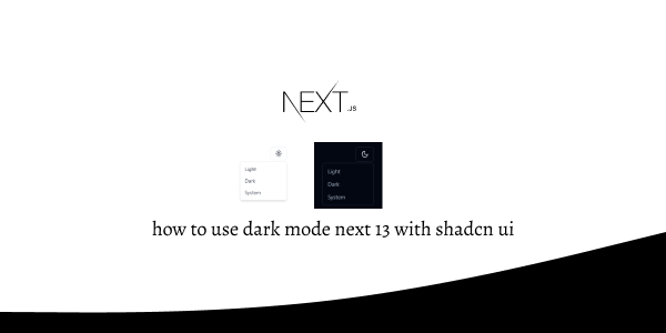
light toggle in next js 13 with shadcn ui
dark mode toggle in next js 13 with shadcn ui
Related Posts
create a accordion in nextjs 13 with shadcn ui
create sidebar in next 13 with shadcn ui
create footer section in next 13 with shadcn ui
create file upload in nextjs 13 with shadcn ui
next 13 with shadcn ui input field example
next 13 with shadcn ui cards example
next 13 with shadcn ui search bar example
next 13 with shadcn ui login page example
next 13 with shadcn ui sign up form example
next 13 with shadcn ui radio group example
next 13 with shadcn ui buttons example
next 13 with shadcn ui pagination example
next 13 with shadcn ui table example
next 13 with shadcn ui checkbox example
next 13 with shadcn ui dropdown menu example
how to use skeleton loading next 13 with shadcn ui
how to use data table next 13 with shadcn ui
how to use modal dialog next 13 with shadcn ui
