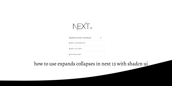
In this tutorial, we will see how to use expands collapses in next js 13 with shadcn ui. First you need to setup next js 13 with shadcn ui project.
how to use shadcn ui in next js 13
Before use expands collapses in next js 13 with shadcn ui you need to npx shadcn-ui@latest add collapsible.
npx shadcn-ui@latest add collapsible
or
npx shadcn-ui@latest add
1. Create next js 13 with shadcn ui simple expands collapses using shadcn-ui Collapsible, CollapsibleContent, CollapsibleTrigger component.
import {
  Collapsible,
  CollapsibleContent,
  CollapsibleTrigger,
} from "@/components/ui/collapsible"

export default function CollapsibleDemo() {
  return (
    <Collapsible>
      <CollapsibleTrigger>Can I use this in my project?</CollapsibleTrigger>
      <CollapsibleContent>
        Yes. Free to use for personal and commercial projects. No attribution
        required.
      </CollapsibleContent>
    </Collapsible>
  )
}
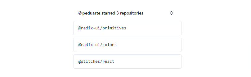
2. next js 13 with shadcn ui expands collapses panel with usestate hook.
"use client"

import * as React from "react"
import { ChevronsUpDown, Plus, X } from "lucide-react"

import { Button } from "@/components/ui/button"
import {
  Collapsible,
  CollapsibleContent,
  CollapsibleTrigger,
} from "@/components/ui/collapsible"

export default function CollapsibleDemo() {
  const [isOpen, setIsOpen] = React.useState(false)

  return (
    <Collapsible
      open={isOpen}
      onOpenChange={setIsOpen}
      className="w-[350px] space-y-2"
    >
      <div className="flex items-center justify-between space-x-4 px-4">
        <h4 className="text-sm font-semibold">
          @peduarte starred 3 repositories
        </h4>
        <CollapsibleTrigger asChild>
          <Button variant="ghost" size="sm" className="w-9 p-0">
            <ChevronsUpDown className="h-4 w-4" />
            <span className="sr-only">Toggle</span>
          </Button>
        </CollapsibleTrigger>
      </div>
      <div className="rounded-md border px-4 py-3 font-mono text-sm">
        @radix-ui/primitives
      </div>
      <CollapsibleContent className="space-y-2">
        <div className="rounded-md border px-4 py-3 font-mono text-sm">
          @radix-ui/colors
        </div>
        <div className="rounded-md border px-4 py-3 font-mono text-sm">
          @stitches/react
        </div>
      </CollapsibleContent>
    </Collapsible>
  )
}
expands collapses in next 13 with shadcn ui
Related Posts
create a accordion in nextjs 13 with shadcn ui
create sidebar in next 13 with shadcn ui
create footer section in next 13 with shadcn ui
create file upload in nextjs 13 with shadcn ui
next 13 with shadcn ui input field example
next 13 with shadcn ui cards example
next 13 with shadcn ui search bar example
next 13 with shadcn ui login page example
next 13 with shadcn ui sign up form example
next 13 with shadcn ui radio group example
next 13 with shadcn ui buttons example
next 13 with shadcn ui pagination example
next 13 with shadcn ui table example
next 13 with shadcn ui checkbox example
next 13 with shadcn ui dropdown menu example
how to use skeleton loading next 13 with shadcn ui
how to use data table next 13 with shadcn ui
how to use modal dialog next 13 with shadcn ui
how to use tabs next 13 with shadcn ui
how to use toggle switch next 13 with shadcn ui
