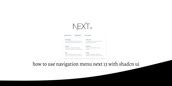
In this tutorial, we will see how to use navigation menu in next js 13 with shadcn ui. First you need to setup next js 13 with shadcn ui project.
how to use shadcn ui in next js 13
Before use navigation-menu in next js 13 with shadcn ui you need to install npx shadcn-ui@latest add navigation-menu.
npx shadcn-ui@latest add navigation-menu
or
npx shadcn-ui@latest add
1. Create next js 13 with shadcn ui navigation menu using shadcn-ui NavigationMenu, NavigationMenuContent, NavigationMenuItem, NavigationMenuLink, NavigationMenuList, NavigationMenuTrigger, navigationMenuTriggerStyle component.
"use client"
import * as React from "react"
import Link from "next/link"
import { cn } from "@/lib/utils"
import { Icons } from "@/components/icons"
import {
NavigationMenu,
NavigationMenuContent,
NavigationMenuItem,
NavigationMenuLink,
NavigationMenuList,
NavigationMenuTrigger,
navigationMenuTriggerStyle,
} from "@/components/ui/navigation-menu"
const components: { title: string; href: string; description: string }[] = [
{
title: "Alert Dialog",
href: "/docs/primitives/alert-dialog",
description:
"A modal dialog that interrupts the user with important content and expects a response.",
},
{
title: "Hover Card",
href: "/docs/primitives/hover-card",
description:
"For sighted users to preview content available behind a link.",
},
{
title: "Progress",
href: "/docs/primitives/progress",
description:
"Displays an indicator showing the completion progress of a task, typically displayed as a progress bar.",
},
{
title: "Scroll-area",
href: "/docs/primitives/scroll-area",
description: "Visually or semantically separates content.",
},
{
title: "Tabs",
href: "/docs/primitives/tabs",
description:
"A set of layered sections of content—known as tab panels—that are displayed one at a time.",
},
{
title: "Tooltip",
href: "/docs/primitives/tooltip",
description:
"A popup that displays information related to an element when the element receives keyboard focus or the mouse hovers over it.",
},
]
export default function NavigationMenuDemo() {
return (
<NavigationMenu>
<NavigationMenuList>
<NavigationMenuItem>
<NavigationMenuTrigger>Getting started</NavigationMenuTrigger>
<NavigationMenuContent>
<ul className="grid gap-3 p-6 md:w-[400px] lg:w-[500px] lg:grid-cols-[.75fr_1fr]">
<li className="row-span-3">
<NavigationMenuLink asChild>
<a
className="flex h-full w-full select-none flex-col justify-end rounded-md bg-gradient-to-b from-muted/50 to-muted p-6 no-underline outline-none focus:shadow-md"
href="/"
>
<Icons.logo className="h-6 w-6" />
<div className="mb-2 mt-4 text-lg font-medium">
shadcn/ui
</div>
<p className="text-sm leading-tight text-muted-foreground">
Beautifully designed components built with Radix UI and
Tailwind CSS.
</p>
</a>
</NavigationMenuLink>
</li>
<ListItem href="/docs" title="Introduction">
Re-usable components built using Radix UI and Tailwind CSS.
</ListItem>
<ListItem href="/docs/installation" title="Installation">
How to install dependencies and structure your app.
</ListItem>
<ListItem href="/docs/primitives/typography" title="Typography">
Styles for headings, paragraphs, lists...etc
</ListItem>
</ul>
</NavigationMenuContent>
</NavigationMenuItem>
<NavigationMenuItem>
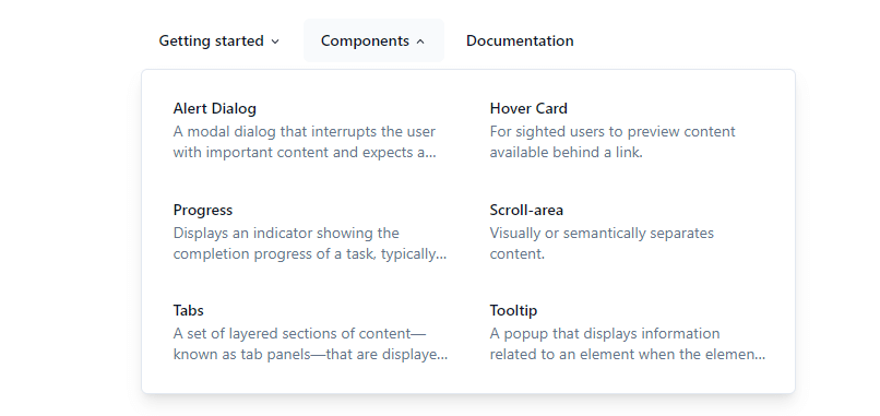
<NavigationMenuTrigger>Components</NavigationMenuTrigger>
<NavigationMenuContent>
<ul className="grid w-[400px] gap-3 p-4 md:w-[500px] md:grid-cols-2 lg:w-[600px] ">
{components.map((component) => (
<ListItem
key={component.title}
title={component.title}
href={component.href}
>
{component.description}
</ListItem>
))}
</ul>
</NavigationMenuContent>
</NavigationMenuItem>
<NavigationMenuItem>
<Link href="/docs" legacyBehavior passHref>
<NavigationMenuLink className={navigationMenuTriggerStyle()}>
Documentation
</NavigationMenuLink>
</Link>
</NavigationMenuItem>
</NavigationMenuList>
</NavigationMenu>
)
}
const ListItem = React.forwardRef<
React.ElementRef<"a">,
React.ComponentPropsWithoutRef<"a">
>(({ className, title, children, ...props }, ref) => {
return (
<li>
<NavigationMenuLink asChild>
<a
ref={ref}
className={cn(
"block select-none space-y-1 rounded-md p-3 leading-none no-underline outline-none transition-colors hover:bg-accent hover:text-accent-foreground focus:bg-accent focus:text-accent-foreground",
className
)}
{...props}
>
<div className="text-sm font-medium leading-none">{title}</div>
<p className="line-clamp-2 text-sm leading-snug text-muted-foreground">
{children}
</p>
</a>
</NavigationMenuLink>
</li>
)
})
ListItem.displayName = "ListItem"
navigation menu next 13 with shadcn ui
Related Posts
create a accordion in nextjs 13 with shadcn ui
create sidebar in next 13 with shadcn ui
create footer section in next 13 with shadcn ui
create file upload in nextjs 13 with shadcn ui
next 13 with shadcn ui input field example
next 13 with shadcn ui cards example
next 13 with shadcn ui search bar example
next 13 with shadcn ui login page example
next 13 with shadcn ui sign up form example
next 13 with shadcn ui radio group example
next 13 with shadcn ui buttons example
next 13 with shadcn ui pagination example
next 13 with shadcn ui table example
next 13 with shadcn ui checkbox example
next 13 with shadcn ui dropdown menu example
how to use skeleton loading next 13 with shadcn ui
how to use data table next 13 with shadcn ui
how to use modal dialog next 13 with shadcn ui
how to use tabs next 13 with shadcn ui
how to use toggle switch next 13 with shadcn ui
