In this tutorial, we will see how to use popover in next js 13 with shadcn ui. First you need to setup next js 13 with shadcn ui project.
how to use shadcn ui in next js 13
Before use popover in next js 13 with shadcn ui you need to install npx shadcn-ui@latest add popover.
npx shadcn-ui@latest add popover
or
npx shadcn-ui@latest add
1. Create next js 13 with shadcn ui popover using shadcn-ui Popover, PopoverContent, PopoverTrigger component.
import {
  Popover,
  PopoverContent,
  PopoverTrigger,
} from "@/components/ui/popover"

export default function PopoverDemo() {
  return (
    <Popover>
      <PopoverTrigger>Open</PopoverTrigger>
      <PopoverContent>Place content for the popover here.</PopoverContent>
    </Popover>
  )
}

next js 13 with shadcn ui popover
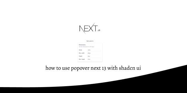
2. next js 13 with shadcn ui popover with content.
import { Button } from "@/components/ui/button"
import { Input } from "@/components/ui/input"
import { Label } from "@/components/ui/label"
import {
  Popover,
  PopoverContent,
  PopoverTrigger,
} from "@/components/ui/popover"

export default function PopoverDemo() {
  return (
    <Popover>
      <PopoverTrigger asChild>
        <Button variant="outline">Open popover</Button>
      </PopoverTrigger>
      <PopoverContent className="w-80">
        <div className="grid gap-4">
          <div className="space-y-2">
            <h4 className="font-medium leading-none">Dimensions</h4>
            <p className="text-sm text-muted-foreground">
              Set the dimensions for the layer.
            </p>
          </div>
          <div className="grid gap-2">
            <div className="grid grid-cols-3 items-center gap-4">
              <Label htmlFor="width">Width</Label>
              <Input
                id="width"
                defaultValue="100%"
                className="col-span-2 h-8"
              />
            </div>
            <div className="grid grid-cols-3 items-center gap-4">
              <Label htmlFor="maxWidth">Max. width</Label>
              <Input
                id="maxWidth"
                defaultValue="300px"
                className="col-span-2 h-8"
              />
            </div>
            <div className="grid grid-cols-3 items-center gap-4">
              <Label htmlFor="height">Height</Label>
              <Input
                id="height"
                defaultValue="25px"
                className="col-span-2 h-8"
              />
            </div>
            <div className="grid grid-cols-3 items-center gap-4">
              <Label htmlFor="maxHeight">Max. height</Label>
              <Input
                id="maxHeight"
                defaultValue="none"
                className="col-span-2 h-8"
              />
            </div>
          </div>
        </div>
      </PopoverContent>
    </Popover>
  )
}
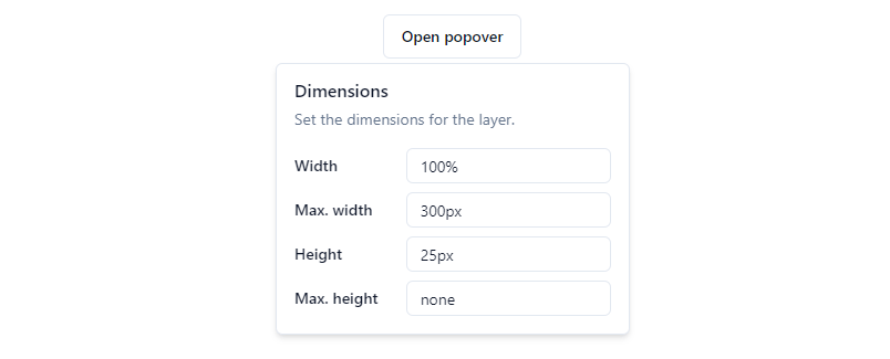
shadcn ui popover
Related Posts
create a accordion in nextjs 13 with shadcn ui
create sidebar in next 13 with shadcn ui
create footer section in next 13 with shadcn ui
create file upload in nextjs 13 with shadcn ui
next 13 with shadcn ui input field example
next 13 with shadcn ui cards example
next 13 with shadcn ui search bar example
next 13 with shadcn ui login page example
next 13 with shadcn ui sign up form example
next 13 with shadcn ui radio group example
next 13 with shadcn ui buttons example
next 13 with shadcn ui pagination example
next 13 with shadcn ui table example
next 13 with shadcn ui checkbox example
next 13 with shadcn ui dropdown menu example
how to use skeleton loading next 13 with shadcn ui
how to use data table next 13 with shadcn ui
how to use modal dialog next 13 with shadcn ui
how to use tabs next 13 with shadcn ui
how to use toggle switch next 13 with shadcn ui
