In this tutorial, we will create sidebar in react with material ui (mui 5). We will see mui 5 responsive sidebar using drawer component, sidebar list icon with search example with react material UI 5.
Install & Setup Vite + React + Typescript + MUI 5
To use material ui icons you need to install @mui/icons-material.
Install the package in your project directory with:
# with npm
npm install @mui/icons-material

# with yarn
yarn add @mui/icons-material
React Material UI 5 Sidebar Example
1. Create react mui 5 sidebar using react-mui Drawer, List, ListItem component.
import { styled } from "@mui/material/styles";
import Drawer from "@mui/material/Drawer";
import List from "@mui/material/List";
import ListItem from "@mui/material/ListItem";
import ListItemIcon from "@mui/material/ListItemIcon";
import ListItemText from "@mui/material/ListItemText";
import InboxIcon from "@mui/icons-material/MoveToInbox";
import MailIcon from "@mui/icons-material/Mail";
import DraftsIcon from "@mui/icons-material/Drafts";
import DeleteIcon from "@mui/icons-material/Delete";
import ReportIcon from "@mui/icons-material/Report";

const drawerWidth = 240;

const StyledDrawer = styled(Drawer)(({ theme }) => ({
  width: drawerWidth,
  flexShrink: 0,
  "& .MuiDrawer-paper": {
    width: drawerWidth,
    boxSizing: "border-box",
  },
}));

export default function Sidebar() {
  return (
    <StyledDrawer variant="permanent" anchor="left">
      <List>
        <ListItem>
          <ListItemIcon>
            <InboxIcon />
          </ListItemIcon>
          <ListItemText primary="Inbox" />
        </ListItem>
        <ListItem>
          <ListItemIcon>
            <MailIcon />
          </ListItemIcon>
          <ListItemText primary="Mail" />
        </ListItem>
        <ListItem>
          <ListItemIcon>
            <DraftsIcon />
          </ListItemIcon>
          <ListItemText primary="Drafts" />
        </ListItem>
        <ListItem>
          <ListItemIcon>
            <DeleteIcon />
          </ListItemIcon>
          <ListItemText primary="Trash" />
        </ListItem>
        <ListItem>
          <ListItemIcon>
            <ReportIcon />
          </ListItemIcon>
          <ListItemText primary="Spam" />
        </ListItem>
      </List>
    </StyledDrawer>
  );
}
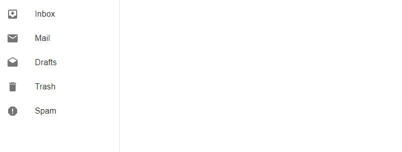
react mui 5 sidebar
2. react mui 5 sidebar with search bar.
import { styled } from "@mui/material/styles";
import Drawer from "@mui/material/Drawer";
import List from "@mui/material/List";
import ListItem from "@mui/material/ListItem";
import ListItemIcon from "@mui/material/ListItemIcon";
import ListItemText from "@mui/material/ListItemText";
import InboxIcon from "@mui/icons-material/MoveToInbox";
import MailIcon from "@mui/icons-material/Mail";
import DraftsIcon from "@mui/icons-material/Drafts";
import DeleteIcon from "@mui/icons-material/Delete";
import ReportIcon from "@mui/icons-material/Report";
import SearchIcon from "@mui/icons-material/Search";
import InputBase from "@mui/material/InputBase";
import { InputAdornment, TextField } from "@mui/material";

const drawerWidth = 240;

const StyledDrawer = styled(Drawer)(({ theme }) => ({
  width: drawerWidth,
  flexShrink: 0,
  "& .MuiDrawer-paper": {
    width: drawerWidth,
    boxSizing: "border-box",
  },
}));

const SearchBar = styled("div")(({ theme }) => ({
  display: "flex",
  alignItems: "center",
  padding: theme.spacing(0, 2),
  ...theme.typography.body2,
}));

const SearchIconWrapper = styled("div")(({ theme }) => ({
  marginRight: theme.spacing(1),
}));

const SearchInput = styled(InputBase)(({ theme }) => ({
  flexGrow: 1,
}));

export default function Sidebar() {
  return (
    <StyledDrawer variant="permanent" anchor="left">
      <TextField
        id="search"
        type="search"
        label="Search"
        size="small"
        InputProps={{
          endAdornment: (
            <InputAdornment position="end">
              <SearchIcon />
            </InputAdornment>
          ),
        }}
      />
      <List>
        <ListItem>
          <ListItemIcon>
            <InboxIcon />
          </ListItemIcon>
          <ListItemText primary="Inbox" />
        </ListItem>
        <ListItem>
          <ListItemIcon>
            <MailIcon />
          </ListItemIcon>
          <ListItemText primary="Mail" />
        </ListItem>
        <ListItem>
          <ListItemIcon>
            <DraftsIcon />
          </ListItemIcon>
          <ListItemText primary="Drafts" />
        </ListItem>
        <ListItem>
          <ListItemIcon>
            <DeleteIcon />
          </ListItemIcon>
          <ListItemText primary="Trash" />
        </ListItem>
        <ListItem>
          <ListItemIcon>
            <ReportIcon />
          </ListItemIcon>
          <ListItemText primary="Spam" />
        </ListItem>
      </List>
    </StyledDrawer>
  );
}
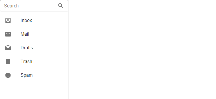
react mui 5 sidebar with search
3. react mui 5 responsive sidebar with typescript using usestate hook.
import * as React from 'react';
import AppBar from '@mui/material/AppBar';
import Box from '@mui/material/Box';
import CssBaseline from '@mui/material/CssBaseline';
import Divider from '@mui/material/Divider';
import Drawer from '@mui/material/Drawer';
import IconButton from '@mui/material/IconButton';
import InboxIcon from '@mui/icons-material/MoveToInbox';
import List from '@mui/material/List';
import ListItem from '@mui/material/ListItem';
import ListItemButton from '@mui/material/ListItemButton';
import ListItemIcon from '@mui/material/ListItemIcon';
import ListItemText from '@mui/material/ListItemText';
import MailIcon from '@mui/icons-material/Mail';
import MenuIcon from '@mui/icons-material/Menu';
import Toolbar from '@mui/material/Toolbar';
import Typography from '@mui/material/Typography';

const drawerWidth = 240;

interface Props {
  /**
   * Injected by the documentation to work in an iframe.
   * You won't need it on your project.
   */
  window?: () => Window;
}

export default function ResponsiveDrawer(props: Props) {
  const { window } = props;
  const [mobileOpen, setMobileOpen] = React.useState(false);

  const handleDrawerToggle = () => {
    setMobileOpen(!mobileOpen);
  };

  const drawer = (
    <div>
      <Toolbar />
      <Divider />
      <List>
        {['Inbox', 'Starred', 'Send email', 'Drafts'].map((text, index) => (
          <ListItem key={text} disablePadding>
            <ListItemButton>
              <ListItemIcon>
                {index % 2 === 0 ? <InboxIcon /> : <MailIcon />}
              </ListItemIcon>
              <ListItemText primary={text} />
            </ListItemButton>
          </ListItem>
        ))}
      </List>
      <Divider />
      <List>
        {['All mail', 'Trash', 'Spam'].map((text, index) => (
          <ListItem key={text} disablePadding>
            <ListItemButton>
              <ListItemIcon>
                {index % 2 === 0 ? <InboxIcon /> : <MailIcon />}
              </ListItemIcon>
              <ListItemText primary={text} />
            </ListItemButton>
          </ListItem>
        ))}
      </List>
    </div>
  );

  const container = window !== undefined ? () => window().document.body : undefined;

  return (
    <Box sx={{ display: 'flex' }}>
      <CssBaseline />
      <AppBar
        position="fixed"
        sx={{
          width: { sm: `calc(100% - ${drawerWidth}px)` },
          ml: { sm: `${drawerWidth}px` },
        }}
      >
        <Toolbar>
          <IconButton
            color="inherit"
            aria-label="open drawer"
            edge="start"
            onClick={handleDrawerToggle}
            sx={{ mr: 2, display: { sm: 'none' } }}
          >
            <MenuIcon />
          </IconButton>
          <Typography variant="h6" noWrap component="div">
            Responsive drawer
          </Typography>
        </Toolbar>
      </AppBar>
      <Box
        component="nav"
        sx={{ width: { sm: drawerWidth }, flexShrink: { sm: 0 } }}
        aria-label="mailbox folders"
      >
        {/* The implementation can be swapped with js to avoid SEO duplication of links. */}
        <Drawer
          container={container}
          variant="temporary"
          open={mobileOpen}
          onClose={handleDrawerToggle}
          ModalProps={{
            keepMounted: true, // Better open performance on mobile.
          }}
          sx={{
            display: { xs: 'block', sm: 'none' },
            '& .MuiDrawer-paper': { boxSizing: 'border-box', width: drawerWidth },
          }}
        >
          {drawer}
        </Drawer>
        <Drawer
          variant="permanent"
          sx={{
            display: { xs: 'none', sm: 'block' },
            '& .MuiDrawer-paper': { boxSizing: 'border-box', width: drawerWidth },
          }}
          open
        >
          {drawer}
        </Drawer>
      </Box>
      <Box
        component="main"
        sx={{ flexGrow: 1, p: 3, width: { sm: `calc(100% - ${drawerWidth}px)` } }}
      >
        <Toolbar />
        <Typography paragraph>
          Lorem ipsum dolor sit amet,
        </Typography>
        <Typography paragraph>
          Consequat mauris.. dummy text
        </Typography>
      </Box>
    </Box>
  );
}
4. react mui 5 sidebar collapse with hamburger menu icon using usestate hook.
import * as React from "react";
import { styled, useTheme, Theme, CSSObject } from "@mui/material/styles";
import Box from "@mui/material/Box";
import MuiDrawer from "@mui/material/Drawer";
import MuiAppBar, { AppBarProps as MuiAppBarProps } from "@mui/material/AppBar";
import Toolbar from "@mui/material/Toolbar";
import List from "@mui/material/List";
import CssBaseline from "@mui/material/CssBaseline";
import Typography from "@mui/material/Typography";
import Divider from "@mui/material/Divider";
import IconButton from "@mui/material/IconButton";
import MenuIcon from "@mui/icons-material/Menu";
import ChevronLeftIcon from "@mui/icons-material/ChevronLeft";
import ChevronRightIcon from "@mui/icons-material/ChevronRight";
import ListItem from "@mui/material/ListItem";
import ListItemButton from "@mui/material/ListItemButton";
import ListItemIcon from "@mui/material/ListItemIcon";
import ListItemText from "@mui/material/ListItemText";
import InboxIcon from "@mui/icons-material/MoveToInbox";
import MailIcon from "@mui/icons-material/Mail";

const drawerWidth = 240;

const openedMixin = (theme: Theme): CSSObject => ({
  width: drawerWidth,
  transition: theme.transitions.create("width", {
    easing: theme.transitions.easing.sharp,
    duration: theme.transitions.duration.enteringScreen,
  }),
  overflowX: "hidden",
});

const closedMixin = (theme: Theme): CSSObject => ({
  transition: theme.transitions.create("width", {
    easing: theme.transitions.easing.sharp,
    duration: theme.transitions.duration.leavingScreen,
  }),
  overflowX: "hidden",
  width: `calc(${theme.spacing(7)} + 1px)`,
  [theme.breakpoints.up("sm")]: {
    width: `calc(${theme.spacing(8)} + 1px)`,
  },
});

const DrawerHeader = styled("div")(({ theme }) => ({
  display: "flex",
  alignItems: "center",
  justifyContent: "flex-end",
  padding: theme.spacing(0, 1),
  // necessary for content to be below app bar
  ...theme.mixins.toolbar,
}));

interface AppBarProps extends MuiAppBarProps {
  open?: boolean;
}

const AppBar = styled(MuiAppBar, {
  shouldForwardProp: (prop) => prop !== "open",
})<AppBarProps>(({ theme, open }) => ({
  zIndex: theme.zIndex.drawer + 1,
  transition: theme.transitions.create(["width", "margin"], {
    easing: theme.transitions.easing.sharp,
    duration: theme.transitions.duration.leavingScreen,
  }),
  ...(open && {
    marginLeft: drawerWidth,
    width: `calc(100% - ${drawerWidth}px)`,
    transition: theme.transitions.create(["width", "margin"], {
      easing: theme.transitions.easing.sharp,
      duration: theme.transitions.duration.enteringScreen,
    }),
  }),
}));

const Drawer = styled(MuiDrawer, {
  shouldForwardProp: (prop) => prop !== "open",
})(({ theme, open }) => ({
  width: drawerWidth,
  flexShrink: 0,
  whiteSpace: "nowrap",
  boxSizing: "border-box",
  ...(open && {
    ...openedMixin(theme),
    "& .MuiDrawer-paper": openedMixin(theme),
  }),
  ...(!open && {
    ...closedMixin(theme),
    "& .MuiDrawer-paper": closedMixin(theme),
  }),
}));

export default function MiniDrawer() {
  const theme = useTheme();
  const [open, setOpen] = React.useState(false);

  const handleDrawerOpen = () => {
    setOpen(true);
  };

  const handleDrawerClose = () => {
    setOpen(false);
  };

  return (
    <Box sx={{ display: "flex" }}>
      <CssBaseline />
      <AppBar position="fixed" open={open}>
        <Toolbar>
          <IconButton
            color="inherit"
            aria-label="open drawer"
            onClick={handleDrawerOpen}
            edge="start"
            sx={{
              marginRight: 5,
              ...(open && { display: "none" }),
            }}
          >
            <MenuIcon />
          </IconButton>
          <Typography variant="h6" noWrap component="div">
            Sidebar Collapse
          </Typography>
        </Toolbar>
      </AppBar>
      <Drawer variant="permanent" open={open}>
        <DrawerHeader>
          <IconButton onClick={handleDrawerClose}>
            {theme.direction === "rtl" ? (
              <ChevronRightIcon />
            ) : (
              <ChevronLeftIcon />
            )}
          </IconButton>
        </DrawerHeader>
        <Divider />
        <List>
          {["Inbox", "Starred", "Send email", "Drafts"].map((text, index) => (
            <ListItem key={text} disablePadding sx={{ display: "block" }}>
              <ListItemButton
                sx={{
                  minHeight: 48,
                  justifyContent: open ? "initial" : "center",
                  px: 2.5,
                }}
              >
                <ListItemIcon
                  sx={{
                    minWidth: 0,
                    mr: open ? 3 : "auto",
                    justifyContent: "center",
                  }}
                >
                  {index % 2 === 0 ? <InboxIcon /> : <MailIcon />}
                </ListItemIcon>
                <ListItemText primary={text} sx={{ opacity: open ? 1 : 0 }} />
              </ListItemButton>
            </ListItem>
          ))}
        </List>
        <Divider />
        <List>
          {["All mail", "Trash", "Spam"].map((text, index) => (
            <ListItem key={text} disablePadding sx={{ display: "block" }}>
              <ListItemButton
                sx={{
                  minHeight: 48,
                  justifyContent: open ? "initial" : "center",
                  px: 2.5,
                }}
              >
                <ListItemIcon
                  sx={{
                    minWidth: 0,
                    mr: open ? 3 : "auto",
                    justifyContent: "center",
                  }}
                >
                  {index % 2 === 0 ? <InboxIcon /> : <MailIcon />}
                </ListItemIcon>
                <ListItemText primary={text} sx={{ opacity: open ? 1 : 0 }} />
              </ListItemButton>
            </ListItem>
          ))}
        </List>
      </Drawer>
      <Box component="main" sx={{ flexGrow: 1, p: 3 }}>
        <DrawerHeader />
        <Typography paragraph>
          Lorem ipsum dolor sit amet, dummy text....
        </Typography>
      </Box>
    </Box>
  );
}
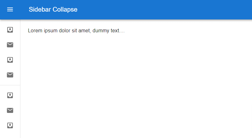
react mui 5 sidebar collapse
Related Posts
create a chat ui in react with mui 5
create a blog section in react mui 5
create a footer in react mui 5
create a responsive navbar in react with mui 5
react mui 5 search bar example
react mui 5 login page example
react mui 5 image list example
react mui 5 toggle switch example
react mui 5 registration form example
react mui 5 contact us page example
react mui 5 loading skeleton example
react mui 5 gradient button example
react mui 5 social media icons example
react mui 5 snackbar toast notification example
how to use autocomplete react mui 5
dynamically multiple input fields in react mui 5
how to use dropdown menu in react mui 5
how to use background image in react mui 5
how to use pricing table in react mui 5
how to use dark mode in react mui 5
how to use file upload in react mui 5
how to use sticky navbar in react mui 5
how to use box shadow in react mui 5
how to use multi step form in react mui 5
how to use loading button in react mui 5