
In this tutorial, we will how to create slider in react with material ui (mui 5). We will see range slider, slider with input field, slider with icon example with react material UI 5.
Install & Setup Vite + React + Typescript + MUI 5
Before using icons you need to install @mui/icons-material.
Install the package in your project directory with:
# with npm
npm install @mui/icons-material

# with yarn
yarn add @mui/icons-material
React Material UI 5 Slider Example
1. Create react mui 5 slider with Volume Up and Volume Down icon using react-mui Slider component.
import * as React from 'react';
import Stack from '@mui/material/Stack';
import Slider from '@mui/material/Slider';
import VolumeDown from '@mui/icons-material/VolumeDown';
import VolumeUp from '@mui/icons-material/VolumeUp';
import { Box } from '@mui/material';

export default function ContinuousSlider() {
  const [value, setValue] = React.useState<number>(30);

  const handleChange = (event: Event, newValue: number | number[]) => {
    setValue(newValue as number);
  };

  return (
    <Box sx={{ width: 200 }}>
      <Stack spacing={2} direction="row" sx={{ mb: 1 }} alignItems="center">
        <VolumeDown />
        <Slider aria-label="Volume" value={value} onChange={handleChange} />
        <VolumeUp />
      </Stack>
      <Slider disabled defaultValue={30} aria-label="Disabled slider" />
    </Box>
  );
}

react mui 5 slider
2. react mui 5 slider for smaller slider, use the prop size="small".
import * as React from 'react';
import Slider from '@mui/material/Slider';
import { Box } from '@mui/material';

export default function SliderSizes() {
  return (
    <Box width={300}>
      <Slider
        size="small"
        defaultValue={70}
        aria-label="Small"
        valueLabelDisplay="auto"
      />
      <Slider defaultValue={50} aria-label="Default" valueLabelDisplay="auto" />
    </Box>
  );
}

react mui 5 slider sizes
3. react mui 5 discrete sliders can be adjusted to a specific value by referencing its value indicator. You can generate a mark for each step with marks={true}.
import * as React from 'react';
import Slider from '@mui/material/Slider';
import { Box } from '@mui/material';

function valuetext(value: number) {
  return `${value}°C`;
}

export default function DiscreteSlider() {
  return (
    <Box sx={{ width: 300 }}>
      <Slider
        aria-label="Temperature"
        defaultValue={30}
        getAriaValueText={valuetext}
        valueLabelDisplay="auto"
        step={10}
        marks
        min={10}
        max={110}
      />
      <Slider defaultValue={30} step={10} marks min={10} max={110} disabled />
    </Box>
  );
}

react mui 5 discrete slider
4. react mui 5 custom slider marks.
import * as React from 'react';
import Slider from '@mui/material/Slider';
import { Box } from '@mui/material';

const marks = [
  {
    value: 0,
    label: '0°C',
  },
  {
    value: 20,
    label: '20°C',
  },
  {
    value: 37,
    label: '37°C',
  },
  {
    value: 100,
    label: '100°C',
  },
];

function valuetext(value: number) {
  return `${value}°C`;
}

export default function DiscreteSliderMarks() {
  return (
    <Box sx={{ width: 300 }}>
      <Slider
        aria-label="Custom marks"
        defaultValue={20}
        getAriaValueText={valuetext}
        step={10}
        valueLabelDisplay="auto"
        marks={marks}
      />
    </Box>
  );
}

react mui 5 custom slider
5. react mui 5 slider with label always visible.
import * as React from 'react';
import Slider from '@mui/material/Slider';
import { Box } from '@mui/material';

const marks = [
  {
    value: 0,
    label: '0°C',
  },
  {
    value: 20,
    label: '20°C',
  },
  {
    value: 37,
    label: '37°C',
  },
  {
    value: 100,
    label: '100°C',
  },
];

function valuetext(value: number) {
  return `${value}°C`;
}

export default function DiscreteSliderLabel() {
  return (
    <Box sx={{ width: 300 }}>
      <Slider
        aria-label="Always visible"
        defaultValue={80}
        getAriaValueText={valuetext}
        step={10}
        marks={marks}
        valueLabelDisplay="on"
      />
    </Box>
  );
}

react mui 5 slider label always
6. react mui 5 ranger slider.
import * as React from 'react';
import Slider from '@mui/material/Slider';
import { Box } from '@mui/material';

function valuetext(value: number) {
  return `${value}°C`;
}

export default function RangeSlider() {
  const [value, setValue] = React.useState<number[]>([20, 37]);

  const handleChange = (event: Event, newValue: number | number[]) => {
    setValue(newValue as number[]);
  };

  return (
    <Box sx={{ width: 300 }}>
      <Slider
        getAriaLabel={() => 'Temperature range'}
        value={value}
        onChange={handleChange}
        valueLabelDisplay="auto"
        getAriaValueText={valuetext}
      />
    </Box>
  );
}

react mui 5 range slider
7. react mui 5 slider with input field.
import * as React from 'react';
import { styled } from '@mui/material/styles';
import Box from '@mui/material/Box';
import Grid from '@mui/material/Grid';
import Typography from '@mui/material/Typography';
import Slider from '@mui/material/Slider';
import MuiInput from '@mui/material/Input';
import VolumeUp from '@mui/icons-material/VolumeUp';

const Input = styled(MuiInput)`
  width: 42px;
`;

export default function InputSlider() {
  const [value, setValue] = React.useState<number | string | Array<number | string>>(
    30,
  );

  const handleSliderChange = (event: Event, newValue: number | number[]) => {
    setValue(newValue);
  };

  const handleInputChange = (event: React.ChangeEvent<HTMLInputElement>) => {
    setValue(event.target.value === '' ? '' : Number(event.target.value));
  };

  const handleBlur = () => {
    if (value < 0) {
      setValue(0);
    } else if (value > 100) {
      setValue(100);
    }
  };

  return (
    <Box sx={{ width: 250 }}>
      <Typography id="input-slider" gutterBottom>
        Volume
      </Typography>
      <Grid container spacing={2} alignItems="center">
        <Grid item>
          <VolumeUp />
        </Grid>
        <Grid item xs>
          <Slider
            value={typeof value === 'number' ? value : 0}
            onChange={handleSliderChange}
            aria-labelledby="input-slider"
          />
        </Grid>
        <Grid item>
          <Input
            value={value}
            size="small"
            onChange={handleInputChange}
            onBlur={handleBlur}
            inputProps={{
              step: 10,
              min: 0,
              max: 100,
              type: 'number',
              'aria-labelledby': 'input-slider',
            }}
          />
        </Grid>
      </Grid>
    </Box>
  );
}

react mui 5 slider with input field
8.react mui 5 vertical sliders.
import * as React from 'react';
import Stack from '@mui/material/Stack';
import Slider from '@mui/material/Slider';

function valuetext(value: number) {
  return `${value}°C`;
}

const marks = [
  {
    value: 0,
    label: '0°C',
  },
  {
    value: 20,
    label: '20°C',
  },
  {
    value: 37,
    label: '37°C',
  },
  {
    value: 100,
    label: '100°C',
  },
];

export default function VerticalSlider() {
  return (
    <Stack sx={{ height: 300 }} spacing={1} direction="row">
      <Slider
        aria-label="Temperature"
        orientation="vertical"
        getAriaValueText={valuetext}
        valueLabelDisplay="auto"
        defaultValue={30}
      />
      <Slider
        aria-label="Temperature"
        orientation="vertical"
        defaultValue={30}
        valueLabelDisplay="auto"
        disabled
      />
      <Slider
        getAriaLabel={() => 'Temperature'}
        orientation="vertical"
        getAriaValueText={valuetext}
        defaultValue={[20, 37]}
        valueLabelDisplay="auto"
        marks={marks}
      />
    </Stack>
  );
}
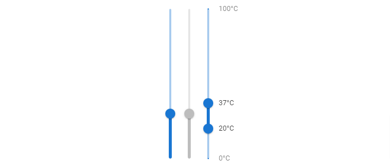
react mui 5 vertical slider
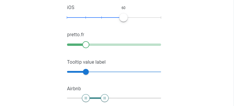
9. react mui 5 customization sliders.
import * as React from 'react';
import Slider, { SliderThumb, SliderValueLabelProps } from '@mui/material/Slider';
import { styled } from '@mui/material/styles';
import Typography from '@mui/material/Typography';
import Tooltip from '@mui/material/Tooltip';
import Box from '@mui/material/Box';

function ValueLabelComponent(props: SliderValueLabelProps) {
  const { children, value } = props;

  return (
    <Tooltip enterTouchDelay={0} placement="top" title={value}>
      {children}
    </Tooltip>
  );
}

const iOSBoxShadow =
  '0 3px 1px rgba(0,0,0,0.1),0 4px 8px rgba(0,0,0,0.13),0 0 0 1px rgba(0,0,0,0.02)';

const marks = [
  {
    value: 0,
  },
  {
    value: 20,
  },
  {
    value: 37,
  },
  {
    value: 100,
  },
];

const IOSSlider = styled(Slider)(({ theme }) => ({
  color: theme.palette.mode === 'dark' ? '#3880ff' : '#3880ff',
  height: 2,
  padding: '15px 0',
  '& .MuiSlider-thumb': {
    height: 28,
    width: 28,
    backgroundColor: '#fff',
    boxShadow: iOSBoxShadow,
    '&:focus, &:hover, &.Mui-active': {
      boxShadow:
        '0 3px 1px rgba(0,0,0,0.1),0 4px 8px rgba(0,0,0,0.3),0 0 0 1px rgba(0,0,0,0.02)',
      // Reset on touch devices, it doesn't add specificity
      '@media (hover: none)': {
        boxShadow: iOSBoxShadow,
      },
    },
  },
  '& .MuiSlider-valueLabel': {
    fontSize: 12,
    fontWeight: 'normal',
    top: -6,
    backgroundColor: 'unset',
    color: theme.palette.text.primary,
    '&:before': {
      display: 'none',
    },
    '& *': {
      background: 'transparent',
      color: theme.palette.mode === 'dark' ? '#fff' : '#000',
    },
  },
  '& .MuiSlider-track': {
    border: 'none',
  },
  '& .MuiSlider-rail': {
    opacity: 0.5,
    backgroundColor: '#bfbfbf',
  },
  '& .MuiSlider-mark': {
    backgroundColor: '#bfbfbf',
    height: 8,
    width: 1,
    '&.MuiSlider-markActive': {
      opacity: 1,
      backgroundColor: 'currentColor',
    },
  },
}));

const PrettoSlider = styled(Slider)({
  color: '#52af77',
  height: 8,
  '& .MuiSlider-track': {
    border: 'none',
  },
  '& .MuiSlider-thumb': {
    height: 24,
    width: 24,
    backgroundColor: '#fff',
    border: '2px solid currentColor',
    '&:focus, &:hover, &.Mui-active, &.Mui-focusVisible': {
      boxShadow: 'inherit',
    },
    '&:before': {
      display: 'none',
    },
  },
  '& .MuiSlider-valueLabel': {
    lineHeight: 1.2,
    fontSize: 12,
    background: 'unset',
    padding: 0,
    width: 32,
    height: 32,
    borderRadius: '50% 50% 50% 0',
    backgroundColor: '#52af77',
    transformOrigin: 'bottom left',
    transform: 'translate(50%, -100%) rotate(-45deg) scale(0)',
    '&:before': { display: 'none' },
    '&.MuiSlider-valueLabelOpen': {
      transform: 'translate(50%, -100%) rotate(-45deg) scale(1)',
    },
    '& > *': {
      transform: 'rotate(45deg)',
    },
  },
});

const AirbnbSlider = styled(Slider)(({ theme }) => ({
  color: '#3a8589',
  height: 3,
  padding: '13px 0',
  '& .MuiSlider-thumb': {
    height: 27,
    width: 27,
    backgroundColor: '#fff',
    border: '1px solid currentColor',
    '&:hover': {
      boxShadow: '0 0 0 8px rgba(58, 133, 137, 0.16)',
    },
    '& .airbnb-bar': {
      height: 9,
      width: 1,
      backgroundColor: 'currentColor',
      marginLeft: 1,
      marginRight: 1,
    },
  },
  '& .MuiSlider-track': {
    height: 3,
  },
  '& .MuiSlider-rail': {
    color: theme.palette.mode === 'dark' ? '#bfbfbf' : '#d8d8d8',
    opacity: theme.palette.mode === 'dark' ? undefined : 1,
    height: 3,
  },
}));

interface AirbnbThumbComponentProps extends React.HTMLAttributes<unknown> {}

function AirbnbThumbComponent(props: AirbnbThumbComponentProps) {
  const { children, ...other } = props;
  return (
    <SliderThumb {...other}>
      {children}
      <span className="airbnb-bar" />
      <span className="airbnb-bar" />
      <span className="airbnb-bar" />
    </SliderThumb>
  );
}

export default function CustomizedSlider() {
  return (
    <Box sx={{ width: 320 }}>
      <Typography gutterBottom>iOS</Typography>
      <IOSSlider
        aria-label="ios slider"
        defaultValue={60}
        marks={marks}
        valueLabelDisplay="on"
      />
      <Box sx={{ m: 3 }} />
      <Typography gutterBottom>pretto.fr</Typography>
      <PrettoSlider
        valueLabelDisplay="auto"
        aria-label="pretto slider"
        defaultValue={20}
      />
      <Box sx={{ m: 3 }} />
      <Typography gutterBottom>Tooltip value label</Typography>
      <Slider
        valueLabelDisplay="auto"
        slots={{
          valueLabel: ValueLabelComponent,
        }}
        aria-label="custom thumb label"
        defaultValue={20}
      />
      <Box sx={{ m: 3 }} />
      <Typography gutterBottom>Airbnb</Typography>
      <AirbnbSlider
        slots={{ thumb: AirbnbThumbComponent }}
        getAriaLabel={(index) => (index === 0 ? 'Minimum price' : 'Maximum price')}
        defaultValue={[20, 40]}
      />
    </Box>
  );
}
react mui 5 customization slider
Related Posts
create a chat ui in react with mui 5
create a blog section in react mui 5
create a footer in react mui 5
create a responsive navbar in react with mui 5
react mui 5 search bar example
react mui 5 login page example
react mui 5 image list example
react mui 5 toggle switch example
react mui 5 registration form example
react mui 5 contact us page example
react mui 5 loading skeleton example
react mui 5 gradient button example
react mui 5 social media icons example
react mui 5 snackbar toast notification example
how to use autocomplete react mui 5
dynamically multiple input fields in react mui 5
how to use dropdown menu in react mui 5
how to use background image in react mui 5
how to use pricing table in react mui 5
how to use dark mode in react mui 5
how to use file upload in react mui 5
how to use sticky navbar in react mui 5
how to use box shadow in react mui 5
how to use multi step form in react mui 5
how to use loading button in react mui 5