In this tutorial, we will see how to use background image in react with material ui (mui 5).
Install & Setup Vite + React + Typescript + MUI 5
React Material UI 5 Background Image Example
1. react mui 5 simple background image using react-mui styled @mui/system.
import * as React from "react";
import { styled } from "@mui/system";

const imageURL = "https://cdn.pixabay.com/photo/2023/05/20/20/39/european-roller-8007340__340.jpg";
const Background = styled("div")({
  position: "absolute",
  width: "100%",
  height: "100%",
  backgroundImage: `url(${imageURL})`,
  backgroundPosition: "center",
  backgroundSize: "cover",
  backgroundRepeat: "no-repeat",
});

export default function App() {
  return <Background />;
}
2. react mui 5 background image using react-mui Box component and sx prop.
import * as React from 'react';
import { Box } from '@mui/material';

export default function App() {
  const imageURL = "https://cdn.pixabay.com/photo/2023/05/20/20/39/european-roller-8007340__340.jpg";
  return (
    <Box
      component="div"
      sx={{
        position: 'absolute',
        width: '100%',
        height: '100%',
        backgroundImage: `url(${imageURL})`,
        backgroundPosition: 'center',
        backgroundSize: 'cover',
        backgroundRepeat: 'no-repeat'
      }}
    />
  );
}
3. react background image using react jsx style.
import React from "react";

export default function App() {
  const imageURL = "https://cdn.pixabay.com/photo/2023/05/20/20/39/european-roller-8007340__340.jpg";
  return (
    <div
      style={{
        backgroundImage: `url(${imageURL})`,
        backgroundPosition: "center",
        backgroundSize: "cover",
        backgroundRepeat: "no-repeat",
        height: "100vh",
        width: "100%",
      }}
    ></div>
  );
}
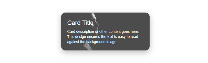
4. Create a card with a background image in React using React MUI 5 and utilize the useTheme for additional styling.
import { Card, CardContent, Typography, Box, useTheme } from '@mui/material';

export default function App() {
  const theme = useTheme(); // Using the theme for consistent styling

  return (
    <Card
      sx={{
        maxWidth: 345,
        mx: 'auto',
        position: 'relative',
        overflow: 'hidden',
        borderRadius: '16px',
        boxShadow: `0 8px 24px ${theme.palette.grey[400]}`,
        transition: 'transform 0.15s ease-in-out', // Smooth transition for hover effect
        '&:hover': {
          transform: 'scale(1.05)',
          boxShadow: `0 12px 36px ${theme.palette.grey[500]}`, // Increased shadow on hover
        },
      }}
    >
      <Box
        sx={{
          position: 'absolute',
          top: 0,
          left: 0,
          right: 0,
          bottom: 0,
          backgroundImage: 'url(https://cdn.pixabay.com/photo/2016/03/12/23/18/man-1253004_640.jpg)',
          backgroundSize: 'cover',
          backgroundPosition: 'center',
          opacity: 0.7,
          transition: 'opacity 0.3s ease-in-out', // Smooth transition for hover effect
          '&:hover': {
            opacity: 0.5,
          }
        }}
      />
      <CardContent sx={{ position: 'relative', zIndex: 2, p: 3 }}>
        <Typography gutterBottom variant="h5" component="div" color="common.white">
          Card Title
        </Typography>
        <Typography variant="body2" color="common.white">
          Card description or other content goes here. This design ensures the text is easy to read against the background image.
        </Typography>
      </CardContent>
    </Card>
  );
};
mui theme background image
Related Posts
create a chat ui in react with mui 5
create a blog section in react mui 5
create a footer in react mui 5
create a responsive navbar in react with mui 5
react mui 5 search bar example
react mui 5 login page example
react mui 5 image list example
react mui 5 toggle switch example
react mui 5 registration form example
react mui 5 contact us page example
react mui 5 loading skeleton example
react mui 5 gradient button example
react mui 5 social media icons example
react mui 5 snackbar toast notification example
how to use autocomplete react mui 5
dynamically multiple input fields in react mui 5
how to use dropdown menu in react mui 5
how to use background image in react mui 5
how to use pricing table in react mui 5
how to use dark mode in react mui 5
how to use file upload in react mui 5
how to use sticky navbar in react mui 5
how to use box shadow in react mui 5
how to use multi step form in react mui 5
how to use loading button in react mui 5