In this tutorial, we will create loading progress indicators known as spinners in react with material ui (mui 5). We will see mui 5 loading spinner, loading spinner success, loading progress with icon example with react material UI 5.
Install & Setup Vite + React + Typescript + MUI 5
React Material UI 5 Loading Progress Example
1. Create react mui 5 simple spinners circular indeterminate using react-mui CircularProgress component.
import * as React from 'react';
import CircularProgress from '@mui/material/CircularProgress';
import Box from '@mui/material/Box';

export default function CircularIndeterminate() {
  return (
    <Box sx={{ display: 'flex' }}>
      <CircularProgress />
    </Box>
  );
}

react mui 5 loading spinners circular
2. react mui 5 loading spinners circular with colors.
import * as React from "react";
import Stack from "@mui/material/Stack";
import CircularProgress from "@mui/material/CircularProgress";
import { Container } from "@mui/material";

export default function CircularColor() {
  return (
    <Container maxWidth="md" sx={{ mt: 8 }}>
      <Stack sx={{ color: "grey.500" }} spacing={2} direction="row">
        <CircularProgress color="secondary" />
        <CircularProgress color="success" />
        <CircularProgress color="inherit" />
        <CircularProgress color="error" />
        <CircularProgress color="info" />
        <CircularProgress color="warning" />
      </Stack>
    </Container>
  );
}

react mui 5 loading spinners circular with colors
3. react mui 5 loading spinners determinate with 25, 50, 75, 100 using useState hook.
 * as React from "react";
import Stack from "@mui/material/Stack";
import CircularProgress from "@mui/material/CircularProgress";
import { Container } from "@mui/material";

export default function CircularDeterminate() {
  const [progress, setProgress] = React.useState(0);

  React.useEffect(() => {
    const timer = setInterval(() => {
      setProgress((prevProgress) =>
        prevProgress >= 100 ? 0 : prevProgress + 10
      );
    }, 800);

    return () => {
      clearInterval(timer);
    };
  }, []);

  return (
    <Container maxWidth="md" sx={{ mt: 8 }}>
      <Stack spacing={2} direction="row">
        <CircularProgress variant="determinate" value={25} />
        <CircularProgress variant="determinate" value={50} />
        <CircularProgress variant="determinate" value={75} />
        <CircularProgress variant="determinate" value={100} />
        <CircularProgress variant="determinate" value={progress} />
      </Stack>
    </Container>
  );
}

mui 5 loading spinners determinate with 25, 50, 75, 100
To use material ui icons you need to install @mui/icons-material.
Install the package in your project directory with:
# with npm
npm install @mui/icons-material

# with yarn
yarn add @mui/icons-material
4. react mui 5 loading spinners success after loading with icon.
import * as React from 'react';
import CircularProgress from '@mui/material/CircularProgress';
import { green } from '@mui/material/colors';
import Button from '@mui/material/Button';
import Fab from '@mui/material/Fab';
import CheckIcon from '@mui/icons-material/Check';
import SaveIcon from '@mui/icons-material/Save';
import { Box } from '@mui/material';

export default function CircularIntegration() {
  const [loading, setLoading] = React.useState(false);
  const [success, setSuccess] = React.useState(false);
  const timer = React.useRef<number>();

  const buttonSx = {
    ...(success && {
      bgcolor: green[500],
      '&:hover': {
        bgcolor: green[700],
      },
    }),
  };

  React.useEffect(() => {
    return () => {
      clearTimeout(timer.current);
    };
  }, []);

  const handleButtonClick = () => {
    if (!loading) {
      setSuccess(false);
      setLoading(true);
      timer.current = window.setTimeout(() => {
        setSuccess(true);
        setLoading(false);
      }, 2000);
    }
  };

  return (
    <Box sx={{ display: 'flex', alignItems: 'center' }}>
      <Box sx={{ m: 1, position: 'relative' }}>
        <Fab
          aria-label="save"
          color="primary"
          sx={buttonSx}
          onClick={handleButtonClick}
        >
          {success ? <CheckIcon /> : <SaveIcon />}
        </Fab>
        {loading && (
          <CircularProgress
            size={68}
            sx={{
              color: green[500],
              position: 'absolute',
              top: -6,
              left: -6,
              zIndex: 1,
            }}
          />
        )}
      </Box>
      <Box sx={{ m: 1, position: 'relative' }}>
        <Button
          variant="contained"
          sx={buttonSx}
          disabled={loading}
          onClick={handleButtonClick}
        >
          Accept terms
        </Button>
        {loading && (
          <CircularProgress
            size={24}
            sx={{
              color: green[500],
              position: 'absolute',
              top: '50%',
              left: '50%',
              marginTop: '-12px',
              marginLeft: '-12px',
            }}
          />
        )}
      </Box>
    </Box>
  );
}

react mui mui 5 loading spinners with icon
5. react mui 5 circular progress with label.
import * as React from 'react';
import CircularProgress, {
  CircularProgressProps,
} from '@mui/material/CircularProgress';
import Typography from '@mui/material/Typography';
import { Box } from '@mui/material';

function CircularProgressWithLabel(
  props: CircularProgressProps & { value: number },
) {
  return (
    <Box sx={{ position: 'relative', display: 'inline-flex' }}>
      <CircularProgress variant="determinate" {...props} />
      <Box
        sx={{
          top: 0,
          left: 0,
          bottom: 0,
          right: 0,
          position: 'absolute',
          display: 'flex',
          alignItems: 'center',
          justifyContent: 'center',
        }}
      >
        <Typography
          variant="caption"
          component="div"
          color="text.secondary"
        >{`${Math.round(props.value)}%`}</Typography>
      </Box>
    </Box>
  );
}

export default function CircularStatic() {
  const [progress, setProgress] = React.useState(10);

  React.useEffect(() => {
    const timer = setInterval(() => {
      setProgress((prevProgress) => (prevProgress >= 100 ? 0 : prevProgress + 10));
    }, 800);
    return () => {
      clearInterval(timer);
    };
  }, []);

  return <CircularProgressWithLabel value={progress} />;
}
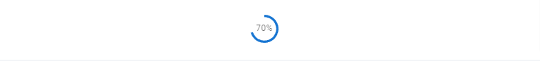
react mui 5 circular progress with label
6. react mui 5 loading Linear progress indeterminate.
import * as React from 'react';
import LinearProgress from '@mui/material/LinearProgress';
import { Box } from '@mui/material';

export default function LinearIndeterminate() {
  return (
    <Box sx={{ width: '100%' }}>
      <LinearProgress />
    </Box>
  );
}

react mui 5 loading linear indeterminate.
7. react mui 5 loading Linear progress with colors.
import * as React from "react";
import Stack from "@mui/material/Stack";
import LinearProgress from "@mui/material/LinearProgress";
import { Container } from "@mui/material";

export default function LinearColor() {
  return (
    <Container maxWidth="md" sx={{ mt: 8 }}>
      <Stack sx={{ width: "100%", color: "grey.500" }} spacing={3}>
        <LinearProgress color="secondary" />
        <LinearProgress color="success" />
        <LinearProgress color="inherit" />
        <LinearProgress color="error" />
        <LinearProgress color="warning" />
      </Stack>
    </Container>
  );
}
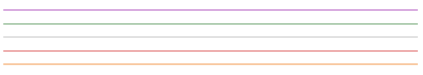
react mui 5 loading linear colors
8. react mui 5 loading Linear progress with buffer.
import * as React from 'react';
import LinearProgress from '@mui/material/LinearProgress';
import { Box } from '@mui/material';

export default function LinearBuffer() {
  const [progress, setProgress] = React.useState(0);
  const [buffer, setBuffer] = React.useState(10);

  const progressRef = React.useRef(() => {});
  React.useEffect(() => {
    progressRef.current = () => {
      if (progress > 100) {
        setProgress(0);
        setBuffer(10);
      } else {
        const diff = Math.random() * 10;
        const diff2 = Math.random() * 10;
        setProgress(progress + diff);
        setBuffer(progress + diff + diff2);
      }
    };
  });

  React.useEffect(() => {
    const timer = setInterval(() => {
      progressRef.current();
    }, 500);

    return () => {
      clearInterval(timer);
    };
  }, []);

  return (
    <Box sx={{ width: '100%' }}>
      <LinearProgress variant="buffer" value={progress} valueBuffer={buffer} />
    </Box>
  );
}

react mui 5 loading linear with buffer
9. react mui 5 loading linear progress with label.
import * as React from "react";
import LinearProgress, {
  LinearProgressProps,
} from "@mui/material/LinearProgress";
import Typography from "@mui/material/Typography";
import { Box } from "@mui/material";

function LinearProgressWithLabel(
  props: LinearProgressProps & { value: number }
) {
  return (
    <Box sx={{ display: "flex", alignItems: "center" }}>
      <Box sx={{ width: "100%", mr: 1 }}>
        <LinearProgress variant="determinate" {...props} />
      </Box>
      <Box sx={{ minWidth: 35 }}>
        <Typography variant="body2" color="text.secondary">{`${Math.round(
          props.value
        )}%`}</Typography>
      </Box>
    </Box>
  );
}

export default function LinearWithValueLabel() {
  const [progress, setProgress] = React.useState(10);

  React.useEffect(() => {
    const timer = setInterval(() => {
      setProgress((prevProgress) =>
        prevProgress >= 100 ? 10 : prevProgress + 10
      );
    }, 800);
    return () => {
      clearInterval(timer);
    };
  }, []);

  return (
    <Box sx={{ width: "100%" }}>
      <LinearProgressWithLabel value={progress} />
    </Box>
  );
}
Related Posts
create a chat ui in react with mui 5
create a blog section in react mui 5
create a footer in react mui 5
create a responsive navbar in react with mui 5
react mui 5 search bar example
react mui 5 login page example
react mui 5 image list example
react mui 5 registration form example
react mui 5 contact us page example
react mui 5 loading skeleton example
react mui 5 gradient button example
react mui 5 social media icons example
react mui 5 snackbar toast notification example
how to use autocomplete react mui 5
dynamically multiple input fields in react mui 5
how to use dropdown menu in react mui 5
how to use background image in react mui 5
how to use pricing table in react mui 5
how to use dark mode in react mui 5
how to use file upload in react mui 5
how to use sticky navbar in react mui 5
how to use box shadow in react mui 5
how to use multi step form in react mui 5
how to use loading button in react mui 5