In this tutorial, we will how to use alert message component in react with material ui (mui 5). We will see alert message, alert message with icon, example with react material UI 5.
Install & Setup Vite + React + Typescript + MUI 5
React Material UI 5 Alert Message Example
1.react mui 5 simple alert message component with success, warning, error, info.
import Alert from "@mui/material/Alert";
import Stack from "@mui/material/Stack";
import { Container } from "@mui/material";

export default function BasicAlerts() {
  return (
    <>
      <Container maxWidth="md" sx={{ mt: 20 }}>
        <Stack sx={{ width: "100%" }} spacing={2}>
          <Alert severity="error">This is an error alert — check it out!</Alert>
          <Alert severity="warning">
            This is a warning alert — check it out!
          </Alert>
          <Alert severity="info">This is an info alert — check it out!</Alert>
          <Alert severity="success">
            This is a success alert — check it out!
          </Alert>
        </Stack>
      </Container>
    </>
  );
}
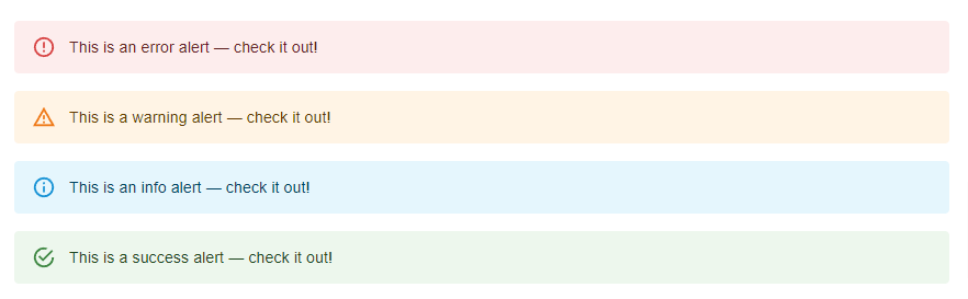
react mui 5 alert message component
2. react mui 5 alert message with description.
import Alert from "@mui/material/Alert";
import AlertTitle from "@mui/material/AlertTitle";
import Stack from "@mui/material/Stack";
import { Container } from "@mui/material";

export default function DescriptionAlerts() {
  return (
    <>
      <Container maxWidth="md" sx={{ mt: 20 }}>
        <Stack sx={{ width: "100%" }} spacing={2}>
          <Alert severity="error">
            <AlertTitle>Error</AlertTitle>
            This is an error alert — <strong>check it out!</strong>
          </Alert>
          <Alert severity="warning">
            <AlertTitle>Warning</AlertTitle>
            This is a warning alert — <strong>check it out!</strong>
          </Alert>
          <Alert severity="info">
            <AlertTitle>Info</AlertTitle>
            This is an info alert — <strong>check it out!</strong>
          </Alert>
          <Alert severity="success">
            <AlertTitle>Success</AlertTitle>
            This is a success alert — <strong>check it out!</strong>
          </Alert>
        </Stack>
      </Container>
    </>
  );
}
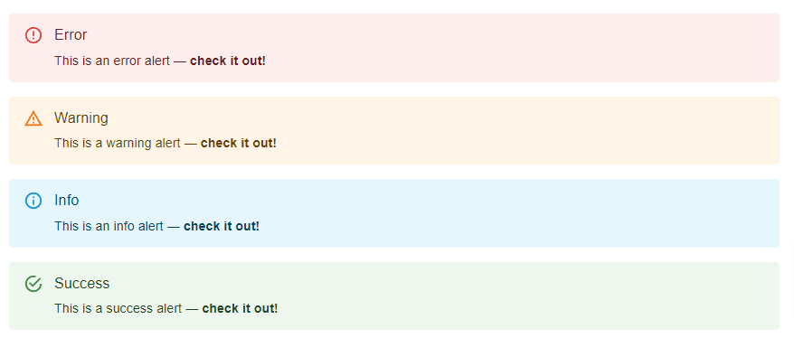
react mui 5 alert message with description
3. react mui 5 alert message with action.
import Alert from '@mui/material/Alert';
import Button from '@mui/material/Button';
import Stack from '@mui/material/Stack';

export default function ActionAlerts() {
 return (
  <Stack sx={{ width: '100%' }} spacing={2}>
   <Alert onClose={() => {}}>This is a success alert — check it out!</Alert>
   <Alert
    action={
     <Button color="inherit" size="small">
      UNDO
     </Button>
    }
   >
    This is a success alert — check it out!
   </Alert>
  </Stack>
 );
}
To use alert message with icon you need to install mui icon.
Install the package in your project directory with:
# with npm
npm install @mui/icons-material

# with yarn
yarn add @mui/icons-material
4.react mui 5 alert message with icon.
import Alert from "@mui/material/Alert";
import CheckIcon from "@mui/icons-material/Check";
import CheckCircleOutlineIcon from "@mui/icons-material/CheckCircleOutline";
import Stack from "@mui/material/Stack";
import { Container } from "@mui/material";

export default function IconAlerts() {
  return (
    <Container maxWidth="md" sx={{ mt: 20 }}>
      <Stack sx={{ width: "100%" }} spacing={2}>
        <Alert icon={<CheckIcon fontSize="inherit" />} severity="success">
          This is a success alert — check it out!
        </Alert>
        <Alert
          iconMapping={{
            success: <CheckCircleOutlineIcon fontSize="inherit" />,
          }}
        >
          This is a success alert — check it out!
        </Alert>
        <Alert icon={false} severity="success">
          This is a success alert — check it out!
        </Alert>
      </Stack>
    </Container>
  );
}
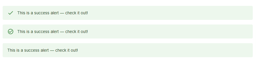
mui 5 alert message with icon
5. react mui 5 outline alert message.
import { Container } from "@mui/material";
import Alert from "@mui/material/Alert";
import Stack from "@mui/material/Stack";

export default function BasicAlerts() {
  return (
    <>
      <Container maxWidth="md" sx={{ mt: 20 }}>
        <Stack sx={{ width: "100%" }} spacing={2}>
          <Alert variant="outlined" severity="error">
            This is an error alert — check it out!
          </Alert>
          <Alert variant="outlined" severity="warning">
            This is a warning alert — check it out!
          </Alert>
          <Alert variant="outlined" severity="info">
            This is an info alert — check it out!
          </Alert>
          <Alert variant="outlined" severity="success">
            This is a success alert — check it out!
          </Alert>
        </Stack>
      </Container>
    </>
  );
}
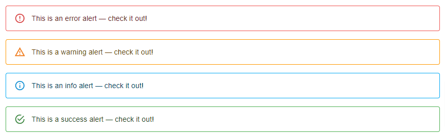
mui 5 outline alert message
6. react mui 5 filled color alert message.
import { Container } from "@mui/material";
import Alert from "@mui/material/Alert";
import Stack from "@mui/material/Stack";

export default function BasicAlerts() {
  return (
    <>
      <Container maxWidth="md" sx={{ mt: 20 }}>
        <Stack sx={{ width: "100%" }} spacing={2}>
          <Alert variant="filled" severity="error">
            This is an error alert — check it out!
          </Alert>
          <Alert variant="filled" severity="warning">
            This is a warning alert — check it out!
          </Alert>
          <Alert variant="filled" severity="info">
            This is an info alert — check it out!
          </Alert>
          <Alert variant="filled" severity="success">
            This is a success alert — check it out!
          </Alert>
        </Stack>
      </Container>
    </>
  );
}
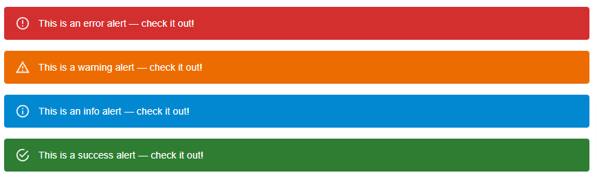
mui 5 filled color alert message
Related Posts
create a chat ui in react with mui 5
create a blog section in react mui 5
create a footer in react mui 5
create a responsive navbar in react with mui 5
react mui 5 search bar example
react mui 5 login page example
react mui 5 image list example
react mui 5 toggle switch example
react mui 5 registration form example
react mui 5 contact us page example
react mui 5 loading skeleton example
react mui 5 gradient button example
react mui 5 social media icons example
react mui 5 snackbar toast notification example
how to use autocomplete react mui 5
dynamically multiple input fields in react mui 5
how to use dropdown menu in react mui 5
how to use background image in react mui 5
how to use pricing table in react mui 5
how to use dark mode in react mui 5
how to use file upload in react mui 5
how to use sticky navbar in react mui 5
how to use box shadow in react mui 5
how to use multi step form in react mui 5
how to use loading button in react mui 5
